How to create a colour chart
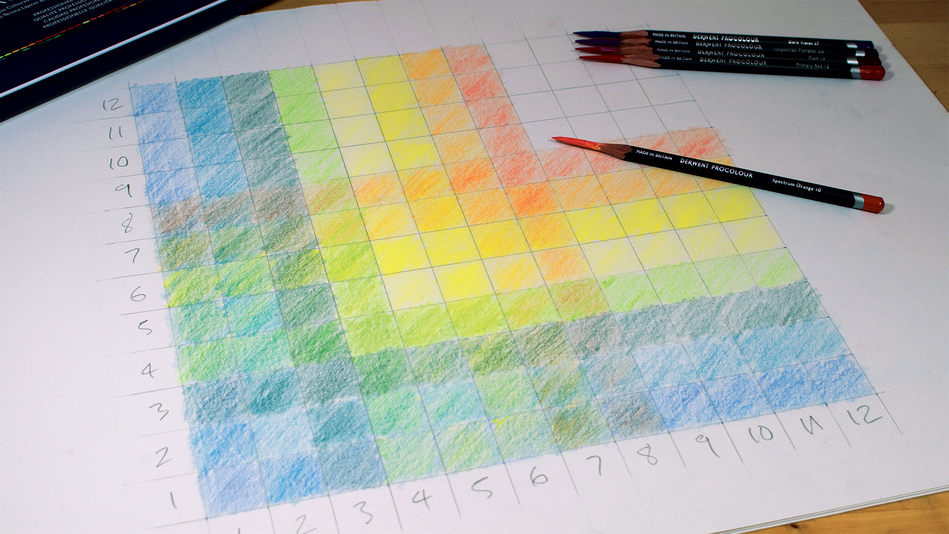
Making your own colour chart might seem daunting as getting to grips with colour theory can sometimes feel a little like learning maths or science. You may feel you just want to be creative and express yourself, not work out calculations. But making a simple colour chart can be both simple and fun.
But colour theory is one of the most fundamental art techniques you need to learn in order to progress and grow as an artist. Read on to learn how to create a colour theory chart that will transform your creative life.
How to create a colour chart
01. Grab some pencils
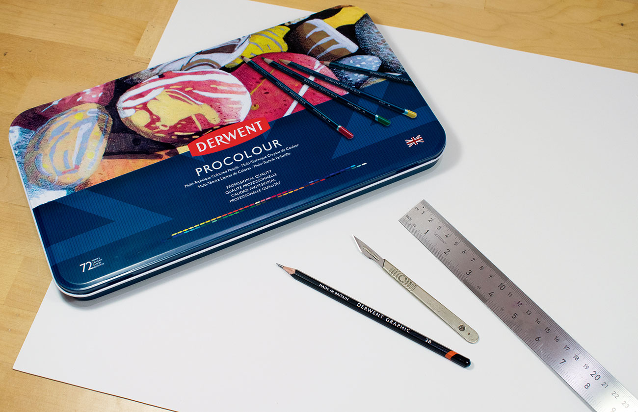
The following exercise can be completed with acrylic, oil or watercolour paints, but colouring pencils are best. Not only do you just need the pencils themselves – there's no need for water, spirits, brushes or a palette – but they're are also a lot less messy than other mediums. And they're so portable – this exercise can be completed on the bus if needs be! If you're not sure which pencils are right for you, read our guide to the best pencils.
Article continues below02. Draw a square
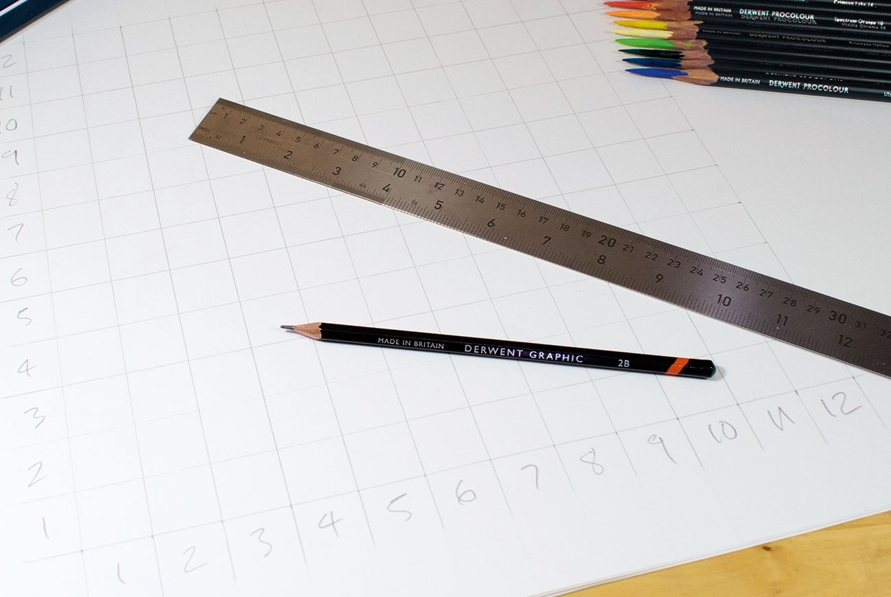
We recommend using an A2 piece of quality cartridge paper, but you could scale the exercise down. Draw a square of 300x300mm (12x 12in). Then divide that square up into 12 equal parts (the squares should be 25x25mm or 1x1in). Starting from the bottom left corner, mark 1–12 running horizontally and vertically as shown above.
03. Choose your colours
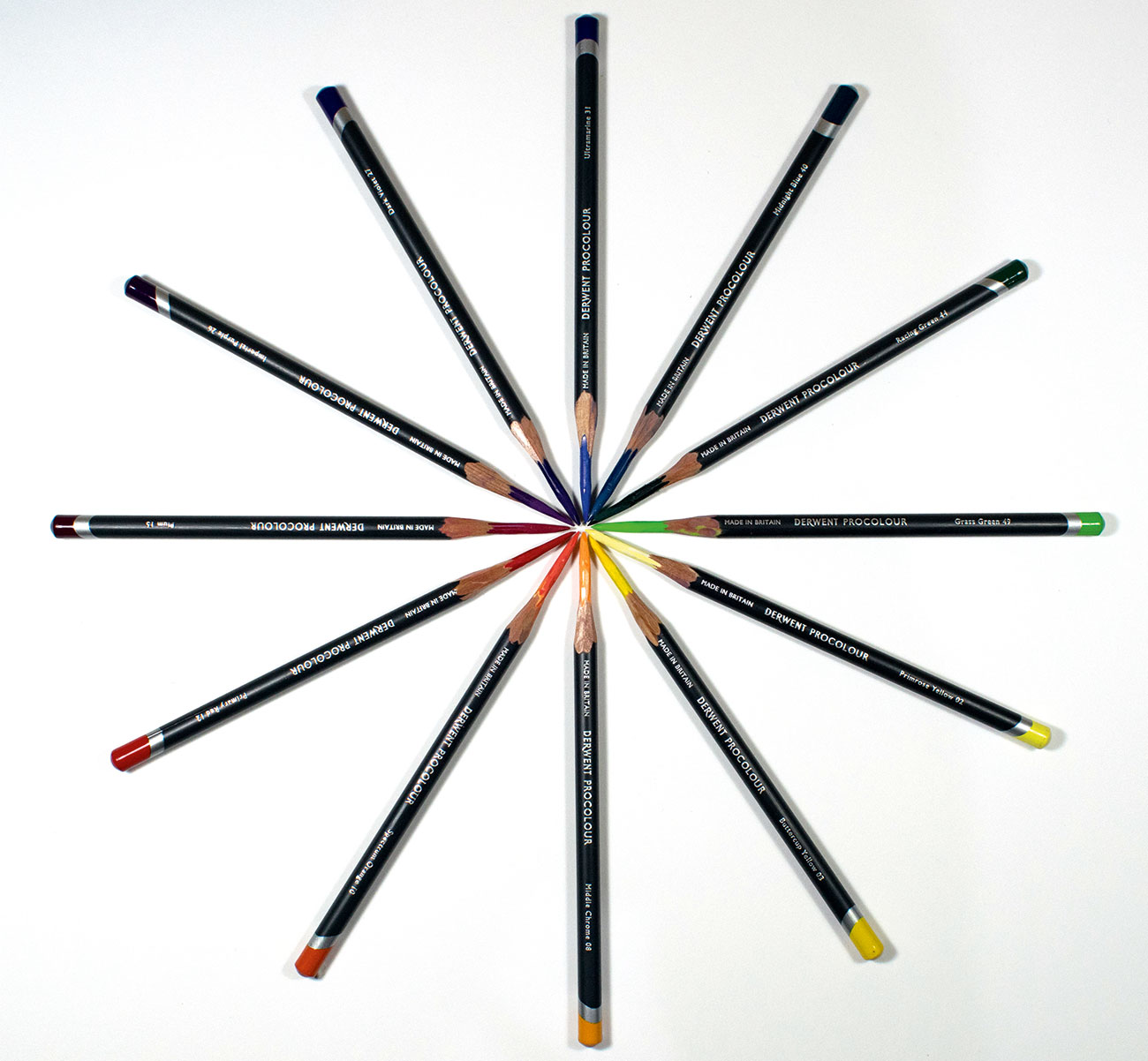
The wonderful thing about the spectrum is how the colours all work together. Understanding the relationships between the colours is key to getting great results while mixing. Using the lovely Derwent Procolour pencils, I chose the following 12 colours to represent the full spectrum:
- Ultramarine (31)
- Midnight Blue (40)
- Racing Green (44)
- Grass Green (49)
- Primrose Yellow (02)
- Buttercup Yellow (03)
- Middle Chrome (08)
- Spectrum Orange (10)
- Primary Red (12)
- Plum (15)
- Imperial Purple (26)
- Dark Violet (27)
04. Pure colour
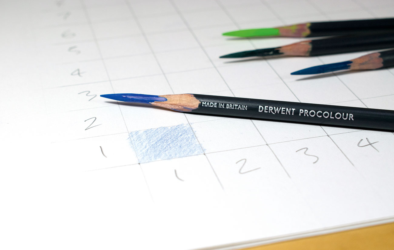
Start with the bottom left corner (square 1–1) and shade it in with the Ultramarine (31) pencil. If you're using good quality pencil, a light touch is all that's needed. This will be one of our 'pure' colour squares. There will be a line of 'pure' colour squares running in a diagonal from bottom left up to top right as the two sets of colours converge.
05. Extend your lines
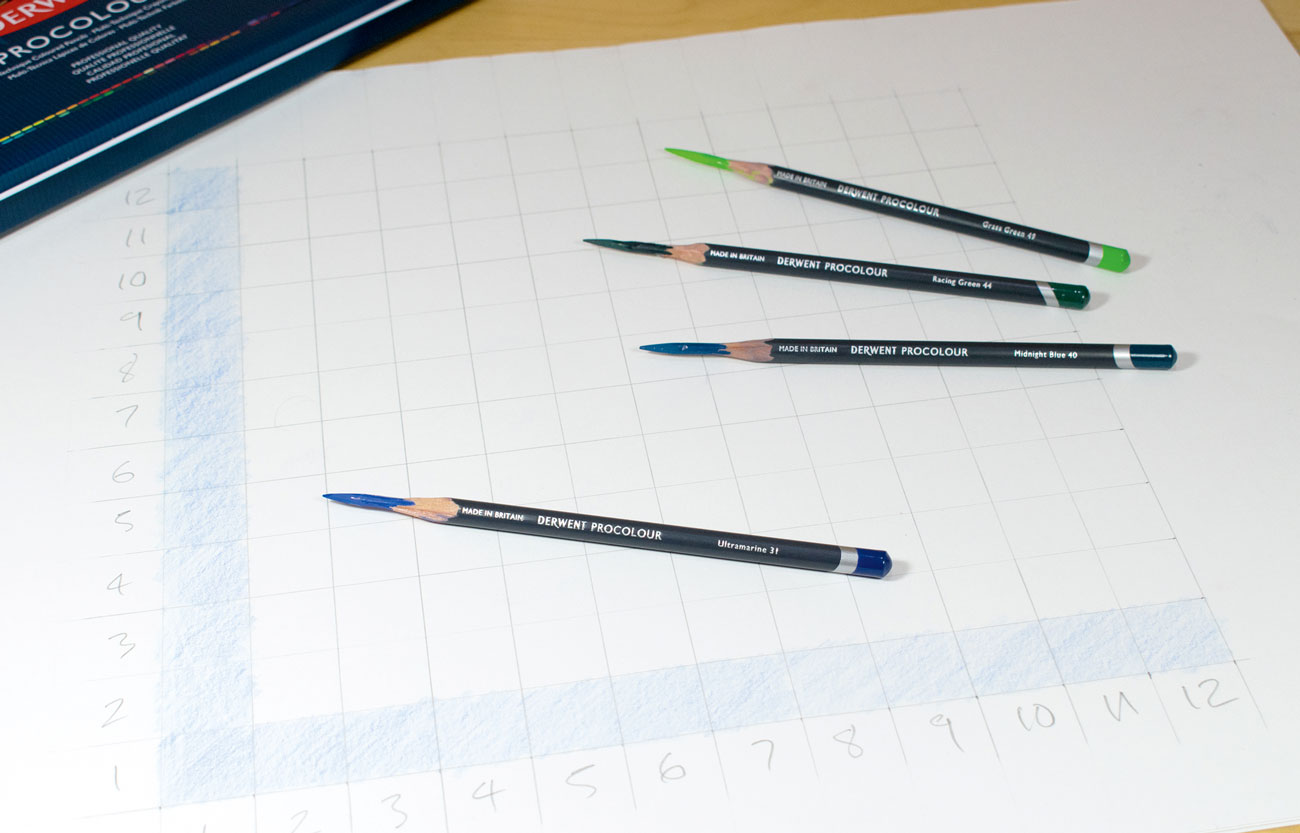
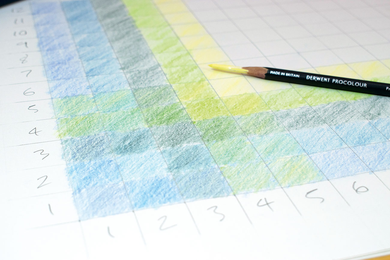
Now it's time to extend the Ultramarine line out horizontally and vertically. Still try to shade each square as an individual though, it will help keep them consistent and stop you from making some much darker than others. Don't worry about going over the lines, just give it a nice relaxed feel.
Sign up to Creative Bloq's daily newsletter, which brings you the latest news and inspiration from the worlds of art, design and technology.
06. Add another colour
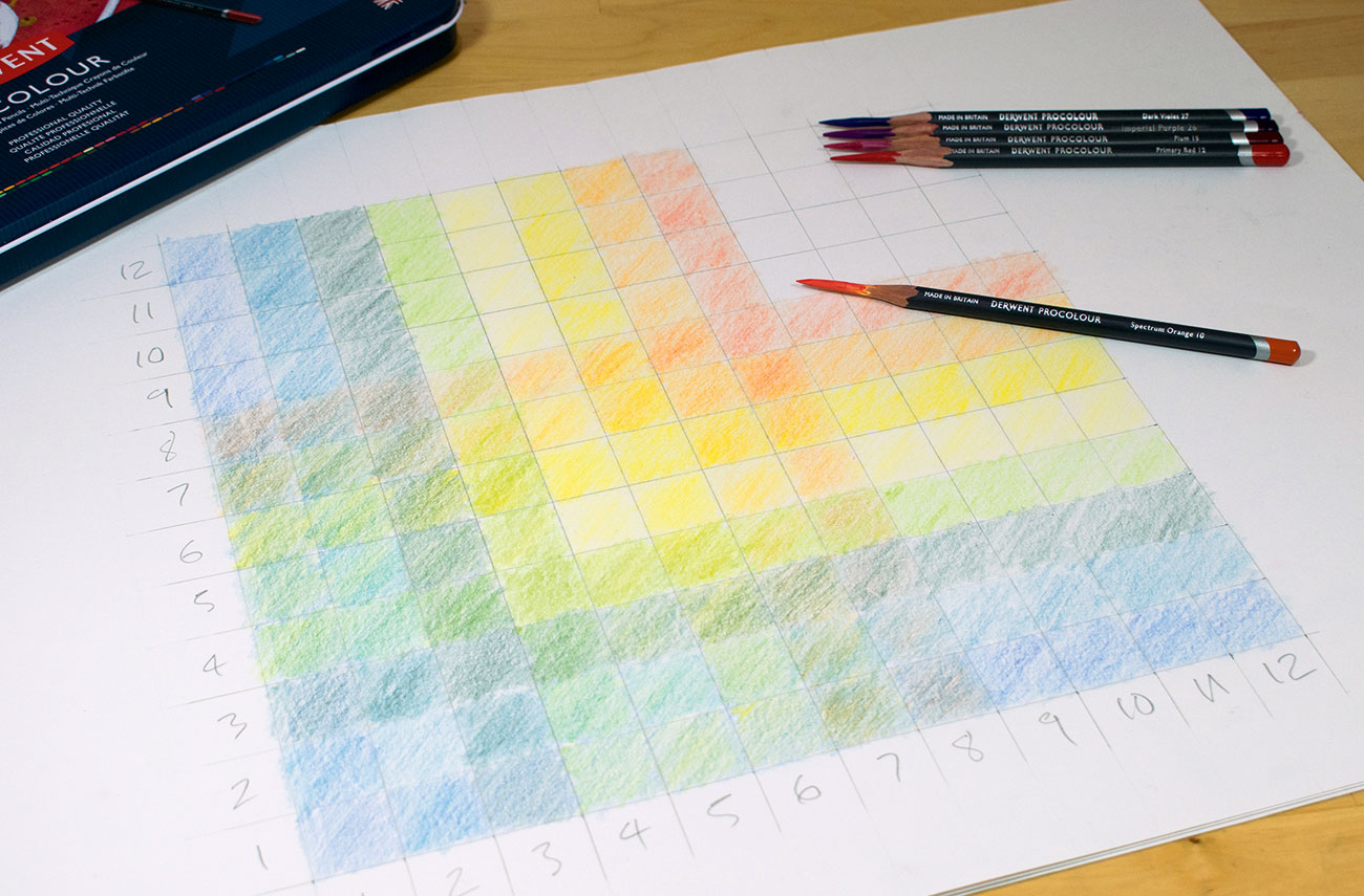
Then move to colour 2, square 2-2, colour in this square as one of your 'pure' colours. Then add Midnight Blue in squares 1-2 and 2-1. Continue with the rest of the colours, colouring in the 'pure' square first and then the surrounding colours. As you're starting off with the blues and greens, the initial effect of mixing won't be obvious at first, but stick with it.
07. Build up your chart
As you move into the oranges and reds, the effects of the 12-step colour mixing wheel becomes more apparent. See how the colours that are opposite each other on the 12-step wheel seem to 'cancel' and 'grey each other down' when mixed together. This effect of desaturating the colour is one of the cornerstones of effective colour mixing.
Read more:
- Art terms: The ultimate artist's glossary
- The best digital art software for creatives
- The 25 best Photoshop plugins

Rob Lunn is a self-taught painter, and loves to paint in oils. His influences are Vincent van Gogh, Caravaggio and Ilya Repin. He has taught art workshops since 2012 and gets a real buzz from teaching people to draw and paint. He has contributed to Paint & Draw magazine and bookazines, and has also provided traditional art tutorials for Creative Bloq.
