How to make delicious textures with pencils
A winning process for creating a variety of gorgeous surface textures in coloured pencil.
Sign up to Creative Bloq's daily newsletter, which brings you the latest news and inspiration from the worlds of art, design and technology.
You are now subscribed
Your newsletter sign-up was successful
Want to add more newsletters?
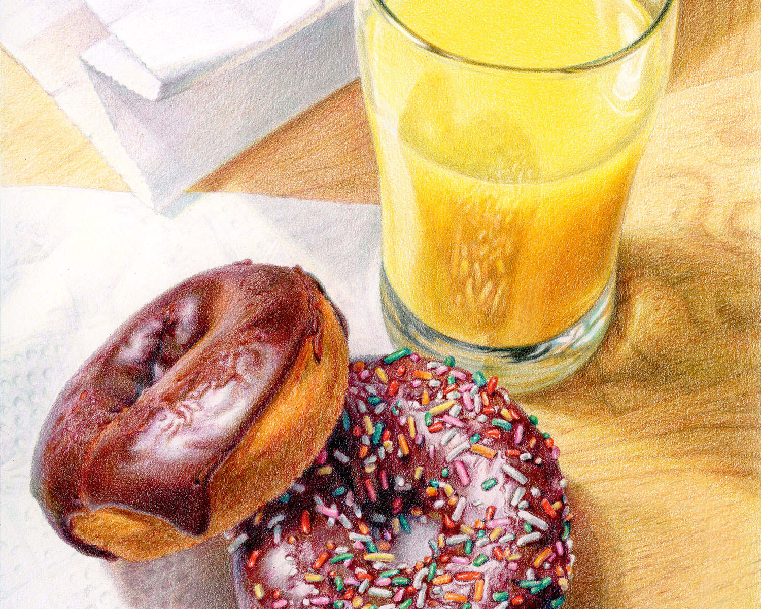
When learning how to draw a still life artwork, it's important to create interest and engage the viewer with a variety of flavours. Colourful sprinkles on a doughnut like this will certainly catch the eye, but what makes someone stop and continue engaging with the piece?
If you're working realistically like this, research and the process of acquiring the objects is a vital first step. In this case that meant a visit to the best doughnut shop in the Upper Peninsula of Michigan, Huron Bakery.
Looking at the contrasts between your props should guide the still life set-up. If something is dark, put it against something light, and vice versa. Play pattern against solid areas and look for repetitions to move the eye across the composition.
Article continues belowOnce the objects are organised, pick up a camera to look at viewpoint and cropping. Taking a photo is an alternative to sketching thumbnails, and does the double duty of providing a reference from which to work. You never know when a hungry kid will run into your studio and grab that carefully positioned doughnut!
Keep the still life set up in position as you draw it, allowing you to go between your photo and real life objects to observe and develop accuracy of colour and depth.
Watch the (rather long, sorry) video above to see how this doughnut still life was created, or follow the steps below to help you create your own deliciously textured pencil art.
For an artwork like this you'll want the best pencils you have. I used Prismacolor Premier (wax-based) coloured pencils on 100lb Vellum Bristol paper. My X-ACTO knife also came in useful for lightening areas of the waxy pencils.
Sign up to Creative Bloq's daily newsletter, which brings you the latest news and inspiration from the worlds of art, design and technology.
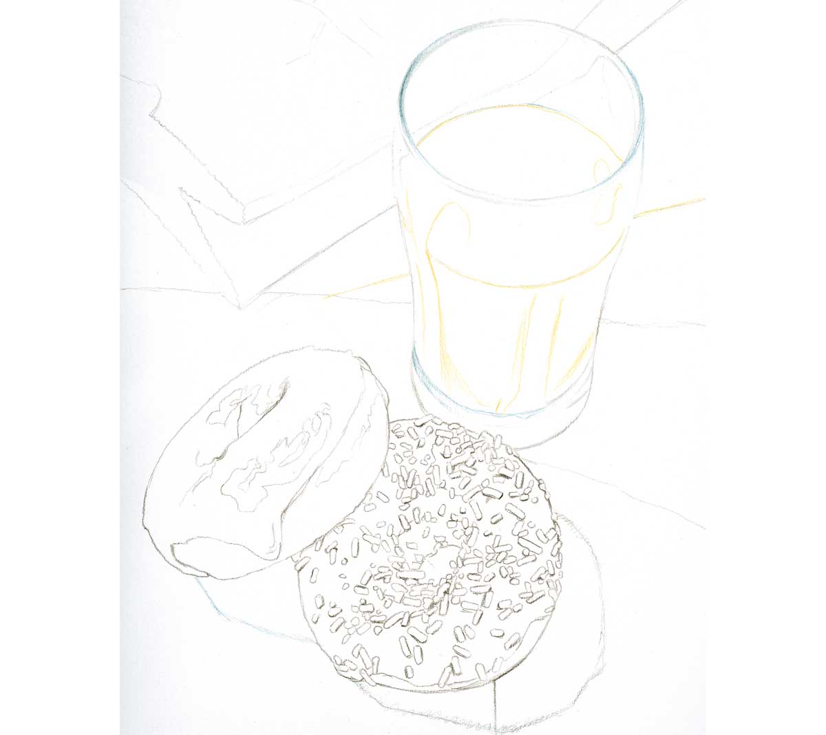
01. Sketch your preliminary drawing
With a coloured pencil that will blend into the form, develop a contour drawing of the subject on Vellum Bristol or similarly heavyweight paper. I avoid using graphite as it can show through the transparency of the coloured pencils and overly grey or darken tones.
If you worry about mistakes, or naturally use a sketchier line, consider working out the drawing on separate paper and transferring it to the final Bristol surface with a light box.
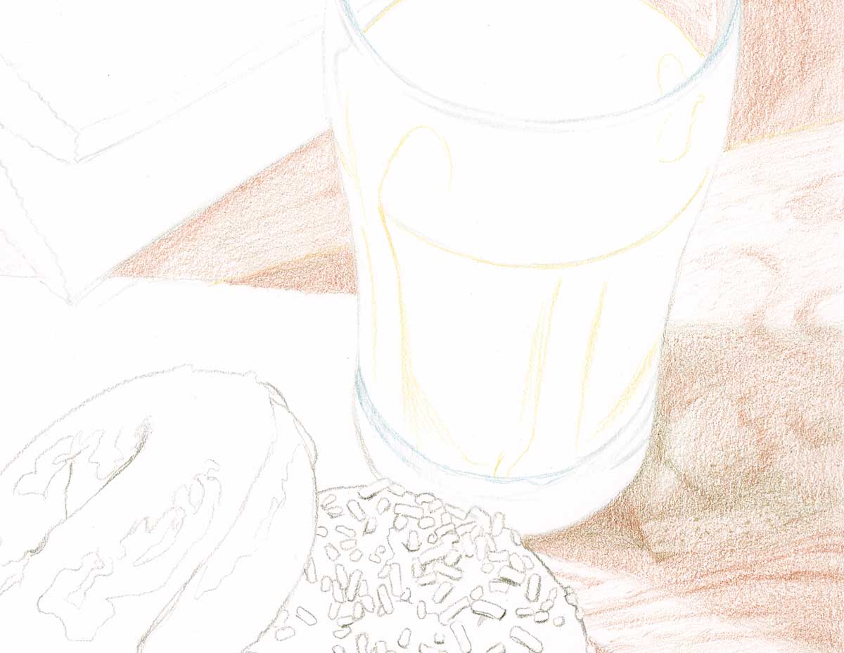
02. Capture patterns in the wood
Colours will vary for other varieties of wood, but here I start by creating the darker pattern of the wood grain with Burnt Ochre and Light Umber. Look for differences in edge and tone. The lower-right corner is darkened with a layer of Tuscan Red to begin establishing a reference point for the image.
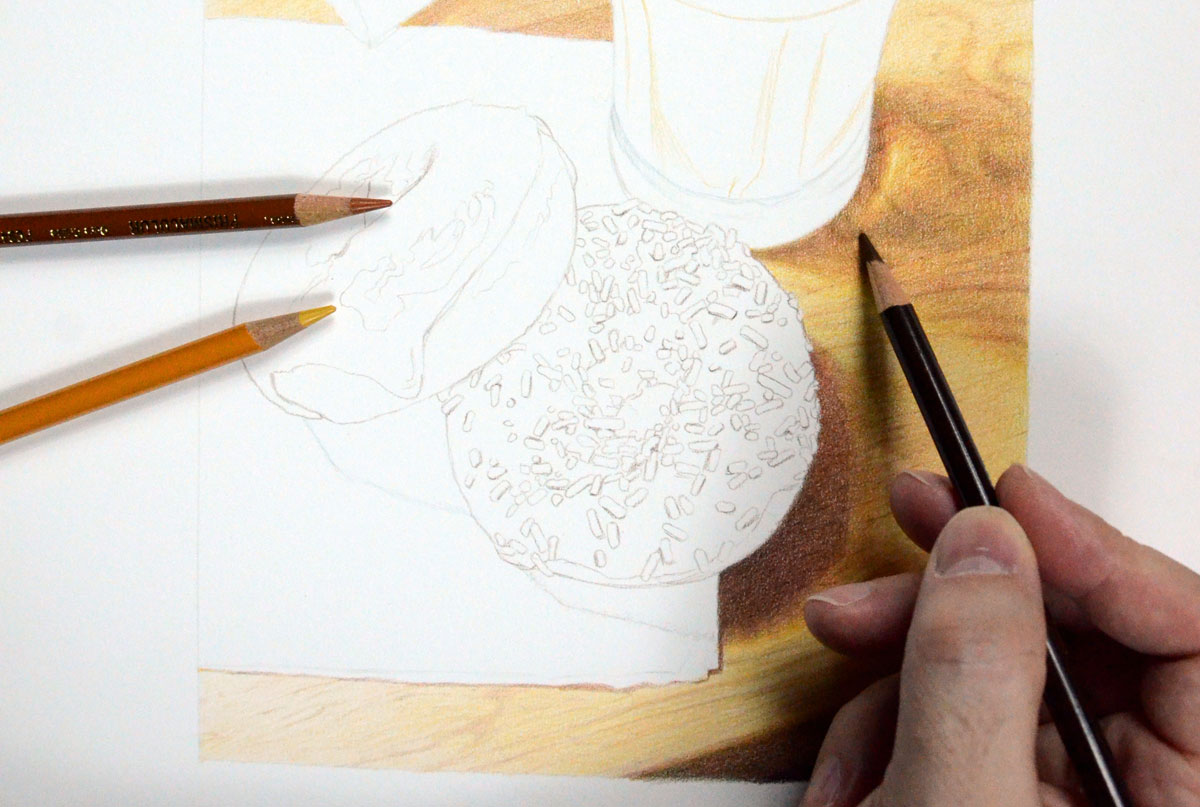
03. Establish local colour
With normal pressure, apply beige and Yellow Ochre pencils over the entire table surface to create a gradient of light to midtone (left to right). I also add Clay Rose to the shadows and some of the stripes in the wood grain. To darken some of the cast shadows, I repeat step 2, while adding dark brown to the mixture. I layer dark green over the corner to increase its value range.
04. Build dark tones
A layer of Indigo Blue completes the dark values of the lower corner. Rather than using black, layers of Tuscan Red, dark green and Indigo Blue create a far more complex tone. The wood grain becomes more visible and the cast shadows darken through the application of Yellow Ochre or Burnt Ochre. A colourless blender helps smooth the shadow tones.
In the light areas of the wood, I burnish with cream and Yellow Ochre, solidifying the gradation of light on the table.
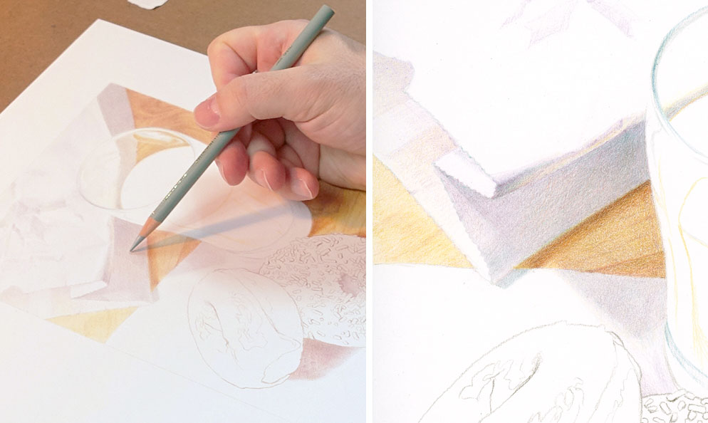
05. Draw white shadows
Putting a layer of Cloud Blue down before the other shadow colours on the bag creates a barrier between the paper and the layers of Jade Green, Clay Rose and Greyed Lavender that I mix into the bag shadows. Reflected from the surrounding wood and orange juice tones, light applications of peach, light peach and cream warm up the grey side plane of the bag.
Burnishing the bag with white helps smooth the tones. I work with the cream and Greyed Lavender pencils to create depth inside the bag and reveal a little translucency as it rests on the wooden table.
The doughnut shadows on the napkin reach a darker contrast through layers of dark brown, Dahlia Purple, Clay Rose and Greyed Lavender.
06. Add paper textures
Using 30% Cool Grey, Jade Green, Greyed Lavender, Cloud Blue and touches of cream, I develop the high key values and planar changes on top of the bag. Cream neutralises the lavender colour a little and warms up the halftones.
With the napkin, I first look at the light affecting the whole surface. I create a gradient across the napkin (from top to bottom) with cream, Greyed Lavender, Cloud Blue and 30% Cool Grey.
Using Greyed Lavender, Cloud Blue and 10% and 30% Cool Grey, I add dots to the napkin. View each as an illuminated bowl, working with dark on one side, drawing around the outside with grey and lavender, leaving a highlight opposite the dark.
07. Shape the glass
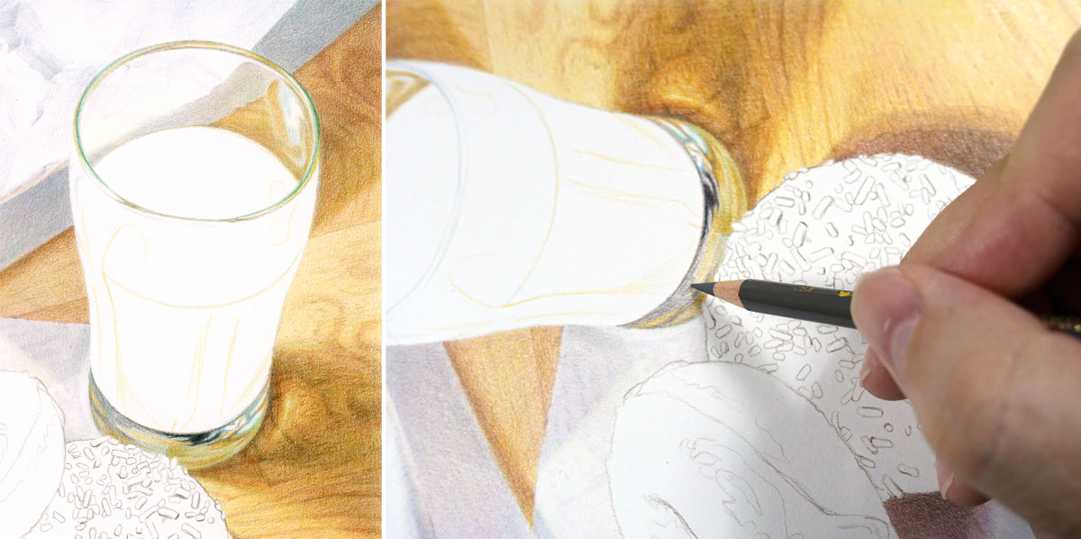
Focusing on the darkest shapes in the base of the glass, I draw with Dark Umber, 50% Warm Grey and a touch of Blue Indigo. To save the white highlights, I outline their shapes with 20% Warm Grey and add a layer of Goldenrod around them, which becomes an undertone for the base. Mixtures of Jade Green and 20% Warm Grey can dull the Goldenrod slightly as needed. Increase the pressure and burnish with white to finalise the smoothness of the tones.
I place small moments of higher saturation colours (Light Cerulean Blue, orange and Light Aqua) along the edges of the bright highlights to capture the prism effect of the glass.
Moving to the rim of the glass, I outline the contours with dark green and Light Umber. Follow the inner edge to the outer edge and watch your contours twist across the rim.
The highlights are covered in white to aid in removing any dark tones that encroach on the shape too much. This is done with an X-ACTO knife if necessary, by lightly scraping the wax from the surface of the paper. The white pencil creates a barrier between the paper and the dark colours. Be sensitive to the quality of the edge. Sharp, firm, soft, or lost edges can all happen along the rim. I do not want a uniform colouring book outline and try to let the line stay responsive to the subject.
08. Create the juice surface
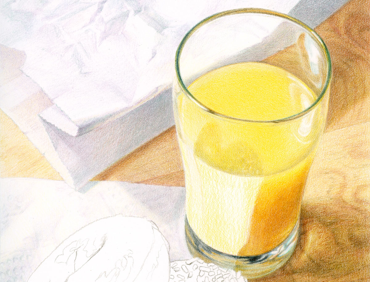
The rim is darkened with more pressure and the green neutralised with Steel Grey, Jade Green and Light Umber. Goldenrod and Sand is used to develop the yellow tones seen in the rim.
With the orange juice, I note that the surface layer has a ring of cooler temperature surrounding a slightly more saturated middle. To develop that subtle contrast, I use light pressure with 10% Cool Grey blending with Yellow Ochre around a middle of Sunburst Yellow.
Canary Yellow is the base layer and Burnt Ochre the darkening pencil as the juice in the lower half of the glass develops. Goldenrod, Yellow Ochre, Sunburst Yellow are laid over top to create the gradation down the glass. I burnish the juice with Yellowed Orange. Note the higher saturation between the liquid level and darker tones. Sand is used to create the translucent brighter tone at the liquid level.
09. Plan for reflections
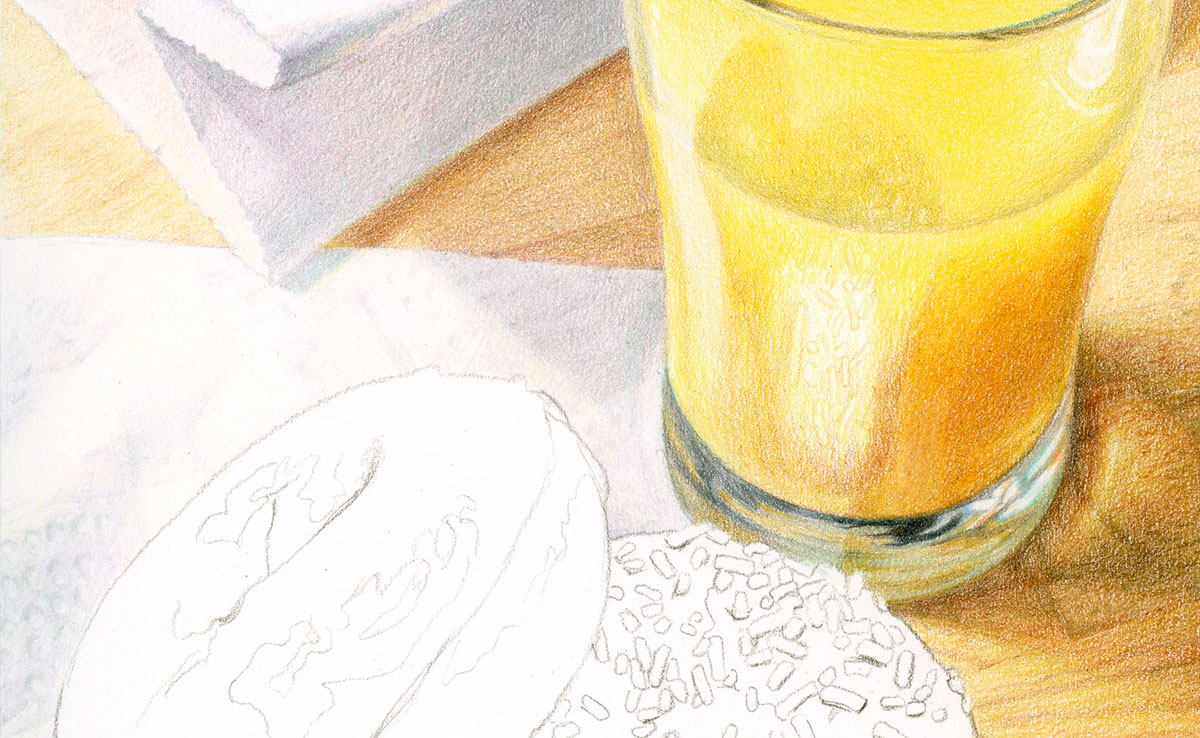
I draw the reflection of the doughnut in the glass very lightly with Goldenrod to ensure the contour edges blend into the darker ground. I lay down Goldenrod, Burnt Ochre and Sunburst Yellow to begin the rendering, 10% Cool Grey and Sand are used on the tall reflection to the left side of the glass.
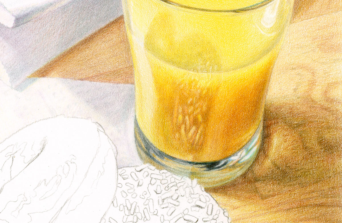
10. Colour the reflection
Filling in the reflection, I introduce small colour variation to the sprinkles. It is important to keep them all within the yellow-orange colour space of the orange juice. Too much hue contrast and the sprinkles will no longer read as reflections on the glass surface.
11. Create the doughnut undertone
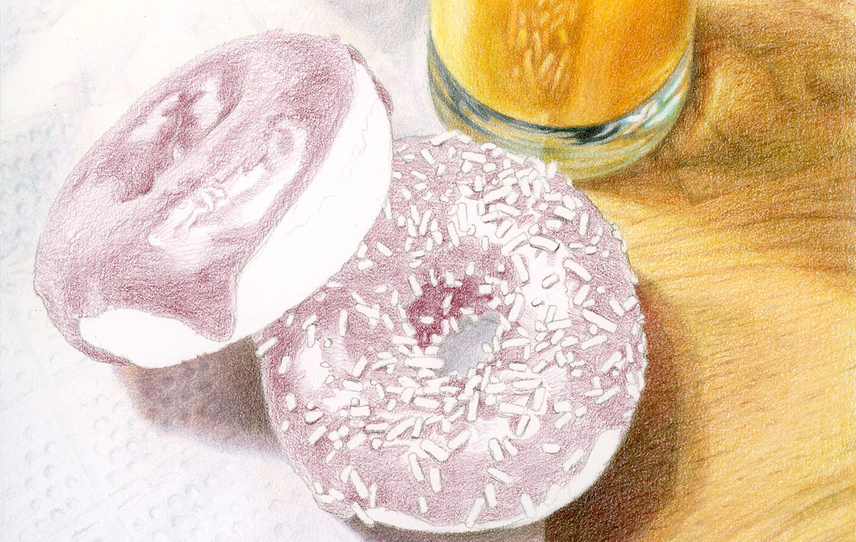
Using Tuscan Red, I lay in an undertone that begins to establish the local colour and value contrast on the doughnuts. While I can render a little more form on the left doughnut, I opt for a flat two-value contrast on the more complex sprinkle doughnut.
12. Put the icing on top
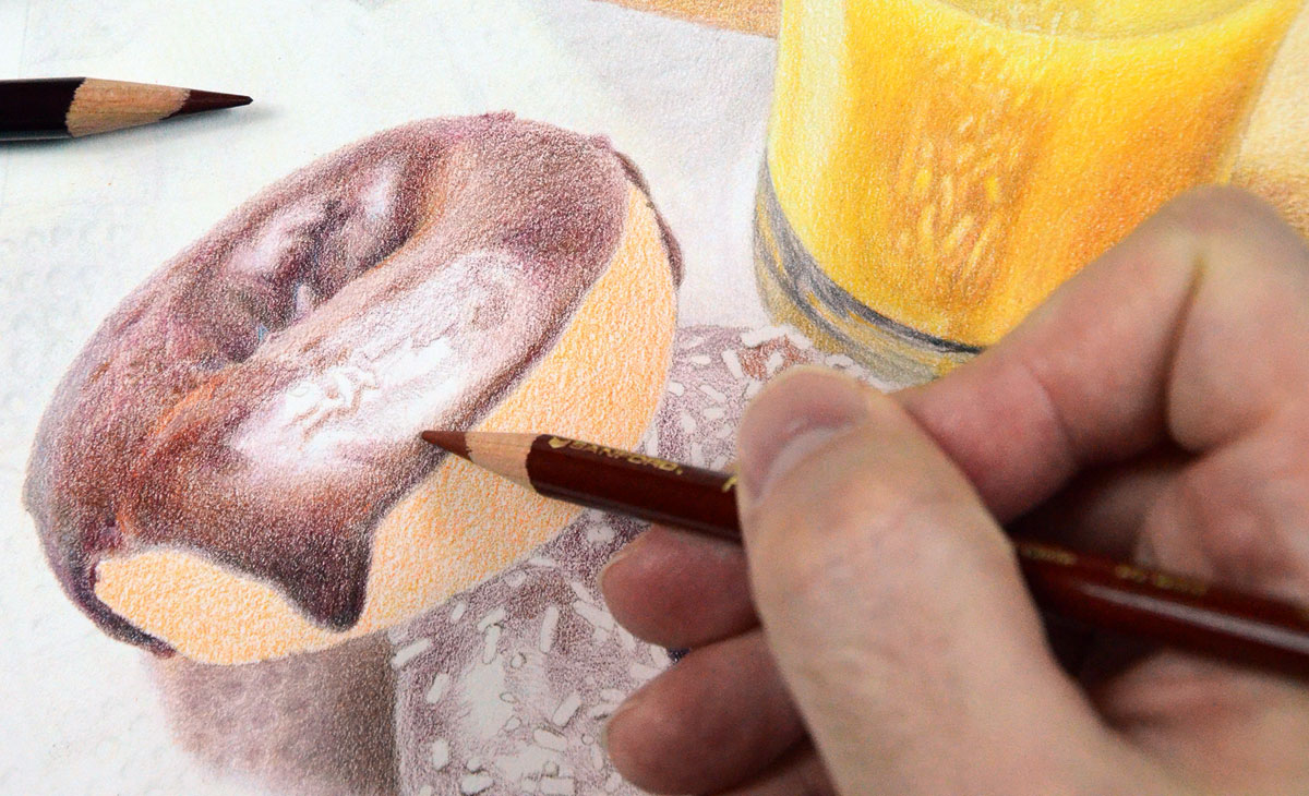
To achieve the subtle variations of colour in the icing, divide the highlights, midtones and shadow areas. I use dark brown and Burnt Ochre pencils in the midtones, and Terra Cotta and orange when more warmth and saturation is needed for the form. Where it needs to go really dark, Indigo Blue and dark green fill out the last step or two of value range.
For the cooler temperature colours, I take a 30% Warm Grey to neutralise the saturation of the Tuscan Red. The warmer (more orange) halftones around the middle also have white applied to smooth over the texture. Greyed Lavender and Sienna Brown or Jade Green work well to dull the saturation of the Tuscan Red in the highlight areas.
Use a colourless blender to smooth the chocolate, especially when beginning to contrast with the cake texture. I also begin laying orange and Goldenrod over the cake part to establish an undertone that mixes with subsequent shading.
13. Use strong transitions for shine
Like darker skin tones, there are fewer light halftones on the chocolate surface. I focus on making strong transitions from the midtones to the highlights, and finalise the rendering of the left doughnut.
The second doughnut is next in line to receive additional form and shading with the Tuscan Red pencil. For more contrast, I also darken the corner behind the glass with dark brown and Sienna Brown.
14. Finish off the icing
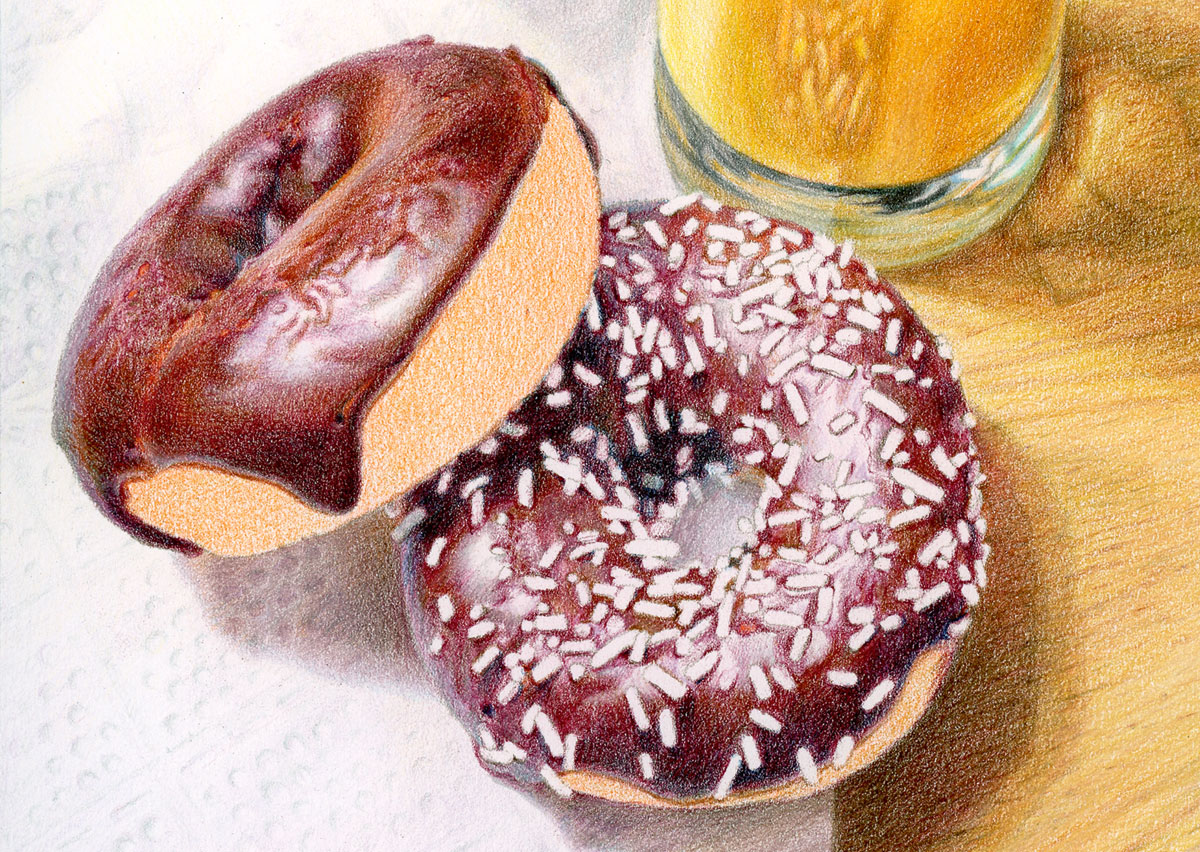
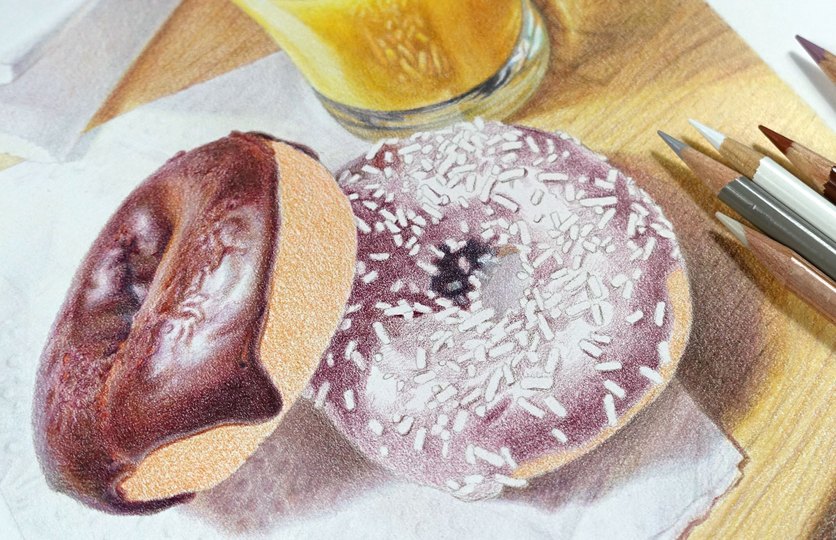
Referencing the colours and contrast on the completed doughnut, I bring the sprinkle doughnut's chocolate icing to a conclusion with Tuscan Red, Sienna Brown, dark brown, Indigo Blue, Burnt Ochre, Clay Rose, Slate Grey and 20% Cool Grey.
15. Put the sprinkles on top
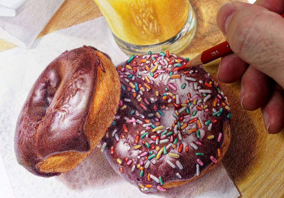
I develop the cake part of the doughnuts with orange, Sienna Brown, Burnt Ochre, Light Umber, Dark Umber and Goldenrod.
To create the sprinkles, I use Tuscan Red, Poppy Red, magenta, Deco Yellow, Canary Yellow, Clay Rose, 30% Warm Grey, True Green, Parrot Green, Indigo Blue, Hot Pink, Blush Pink, and Jade Green.
Using a highlight or shadow tone on each sprinkle provides a cylindrical form, but can be mind-numbingly tedious. Be sure to take breaks and give each one some attention.
Scratching highlights out with an X-ACTO knife (sgraffito technique) is an option, or you can draw around the highlights and save the white of the paper.
This article originally appeared in Paint & Draw issue 10. Buy it here.
Related articles:
- How to blend coloured pencils
- Sharpen your still life painting skills
- Drawing techniques: 7 fundamentals of pencil drawing

