
I've always thought that originality is found somewhere between what you like and what you observe. I love mixing sci-fi and organic elements, so I try to find things around me that let me explore both.
In this Photoshop tutorial, I chose a pot plant on my desk to inspire a focal object. The plant's overlapping shapes and fractal structure enable me to combine a hard surface with organic elements for a more unique design. I've also provided some custom Photoshop brushes you can use to achieve similar results (download them below).
Download the custom brushes for this tutorial.
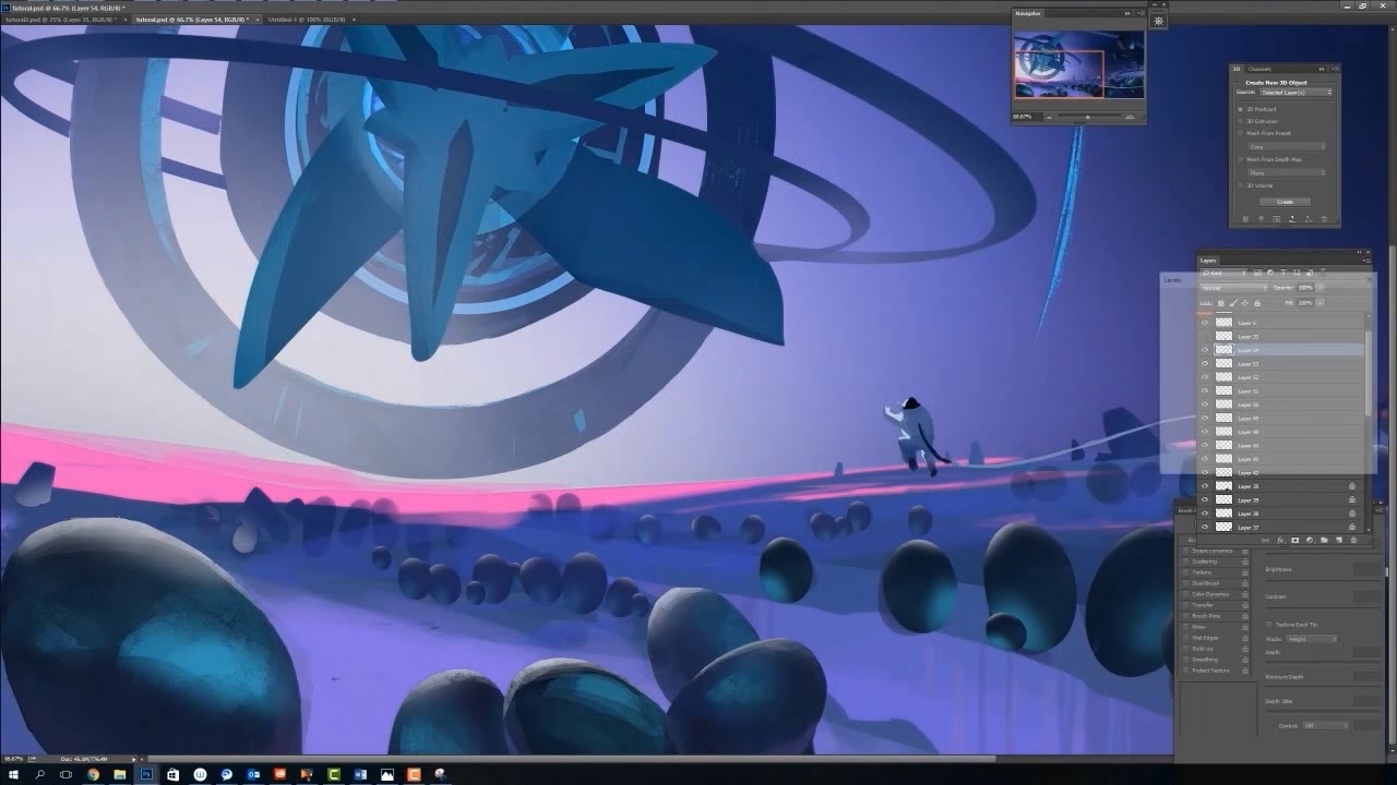
I usually come up with a background story to add context to the design. The scene is a desolate alien planet, where the surface is covered with strange eggs. As a lone astronaut explores this mysterious planet, a huge structure appears in the sky. He's attracted to this magnificent totem, and floats towards it in awe.
With this image, I want to bring the mystery, elegant and sci-fi feeling to the viewer, and introduce an epic alien vista with a mixed sci-fi and organic design language.
01. Produce a rough sketch to visualise the idea

I start by sketching out my scene. I use a light line to draw the overall shape of the image, mainly focusing on developing a clear idea about the narrative, and making sure the focal point doesn't lie in the centre of the image. I don't want to spend time figuring out the details at this point, and only use the most minimal marks to plan out where to place the different elements in this scene so that it tells a coherent story.
02. Rough colour pass

I do a simple colour block out, separating the fore-, mid- and background along with the character on to different layers. I choose a highly saturated colour for the background structure as my main focal point.
The secondary focal point is the astronaut, so I decide on a desaturated but light colour for him, to blend him into the environment slightly more. This is similar to the previous step in that I'm still not thinking about details or designs or textures, and only plotting out where my colours go and how they interact within this image.
03. Searching for a design

I spend a little time working on my focal area. I feel that the background is a little empty, so I duplicate the structure multiple times. The idea here is that there are many floating mystery structures around the planet, and my character is attempting to touch the closest one in front of him.
This is the optimal time to play around with design because I have loosely established all the basic elements in the scene, and can now properly gauge how each change will affect the image as a whole.
04. Polishing the main focal point

The shape of the structure was too simple; I want to make it more sci-fi. So I break up the shape from the large ellipse, adding more detail to the central area. I explore some circular shapes to match the same free-flowing and organic feel of the rest of the piece, while giving it some hard surfaces. I'm still trying things out during this stage.
05. Simplifying and balancing

After developing the design and shape of the structure in the previous step, I feel the whole image is getting busy. So I light up and simplify the background by deleting the repeated structures to the right. To balance this simplification, I add bolder shapes to the big structure. At this point, while I'm slowly finalising the final look of the image, I want to nail down the lighting.
06. Foreground elements

The base colour and lighting are in place, so now I began rendering the eggs in the foreground. I use the teal colour from my main structure on the eggs, which connects these two elements narratively. When setting up the colours in my paintings, every single colour should be affected by the colours around it. As I see it, the colours should have a relationship with each other.
07. Mid-ground elements

I want to make this planet surface look like a canyon using some organic textures on the ground. In addition, I'm trying to paint in some simple architecture in the background. This will support the perspective and scale of the space, as well as break up the monotonous horizon line and add some visual interest.
08. Background elements

I spend some time on my colours, and lighten up the background. The sky now has a strong light source under the horizon line, and this brings a bright glowing colour to the sky. Furthermore, it helps contrast the structure from the sky, and the sky from the ground. These light effects can also generate a stronger sense of narrative and anticipation to the piece.
09. Defining the scale of the character

I realise my astronaut's scale makes the whole image look slightly confusing. Without being able to pin down the position where he's located in relation to the eggs on the ground, it's hard to tell how big he is. To solve this, I attach a spacecraft to the other end of the cord, which establishes that the astronaut's situated in the midground.
10. Scaling up the ship

I work on the spaceship design, adding some glowing exhaust rings to the engines, which serves to bring a little more interest to the right side of the image. I also scale up the ship slightly, so that its size is in keeping with that of the astronaut's. Finally, I add a blue atmosphere to the bottom of the structure to push it further back in space.
11. Adding texture

In my experience, texture can give a painting a greater sense of intensity. I like to add a lot of creative materials to my artworks. I find that taking photos of real-life objects and manipulating them in Photoshop is the best way to create a fresh visual experience. For this piece, I use a photo of a crumpled-up piece of tissue, and apply it to the fore- and midground.
12. Value adjustment and polish

The image is looking a little dark, so I use an adjustment layer to crank up the brightness. At the same time, I'm also continuing to clean up all parts of the image. At this point, because I've established the design, scale and colour of every element in this image, it's safe to dive right into the polishing phase.
13. Colour adjustment

After the value is set, I use the Curve tool to adjust the colour of the whole image: saturating the background and adding a light blue tone on the top area. I also add a hint of blur to the eggs in the foreground. This mimics the field of view that camera lenses and eyes have when perceiving an image, and makes the painting more dynamic.
At this point, the image can be considered finished. Of course, there are always ways to enhance an image even after hitting the point when it can be called complete. The key here is to not over-polish the painting.
14. Adding a greater sense of narrative

There are still ways to push an image further. At this point, I feel that I can still enhance the narrative, so I paint another astronaut in the distance. This adds a more dramatic moment to the scene, as one astronaut loses control and tumbles towards the alien totem, while his partner flies out in an attempt to catch him. I also increase the density of stars in the background to imply a vast galactic setting.
This article was originally published in issue 157 of ImagineFX, the world's best-selling magazine for digital artists. Buy issue 157 or subscribe to ImagineFX here.
Related articles:
