During this Photoshop tutorial, I’ll be going over several key concepts that I use as an illustrator. I’ll be talking about rough concepts, clean line work, colour, light and shadow, and some of the pitfalls that people (including myself) tend to fall into while working through an illustration.
I’ll be using Photoshop to take you step-by-step through the process and talking about some of the tools that the program has and how those different features can be of help.
You can also check out our take on the new features Photoshop CC has to offer in our comprehensive review of the newest update.
Click on the icon at the top right of the image to enlarge it.
01. Sketch a rough concept

Every good drawing begins with a solid foundation. Generating thumbnails and working through different concepts quickly helps me to clear my mind and find the best possible solution to any assignment I’m given.
(Try these 20 top character design tips and How to create new character designs in Photoshop tutorial to get you started).
02. Produce a refined sketch

After I’ve determined which direction I want to go in, I dive into the details. I’m working on a separate layer from what I’ve done previously, and I try to work – as best I can – from large to small. Big shapes to small shapes, general ideas to details. That way I don’t find myself devoting too much time to a weak drawing.
03. Bring in clean lines

Inking is a process I relish. I try my best to keep the line work feeling fresh by avoiding the trap of tracing the sketch underneath. By making a conscious effort to make it feel like I’m drawing this for the first time, I’m able to retain the life that’s inherent in the sketch. I use the sketch as a guide, but not as a crutch.
04. Lay in flat colours

On a layer beneath the clean line work, I lay down flat colours without thinking too much about the form. This comes in handy when I want to adjust the colours or values separate from each other. It’s important to me that all of the colours are harmonious before light and shadow come into the equation. Although a light source can help to harmonise any combination of colours, I find that creating a harmonious colour palette to begin with makes me a better artist.
05. Duplicate and lock a layer

At this stage, I create another layer identical to the colour layer by dragging my current colour layer down to the new layer icon at the bottom of the layer menu. This can also be done by going to Layer > Duplicate Layer. I then lock the transparency of the layer by clicking the chequerboard icon at the top of the layer menu.
06. Fill with grey

Once I have two identical colour layers, I fill the one on top with a mid-value grey. Because the transparency has been locked on the layer, the grey only fills the pixels that are opaque, giving me a grey version of what I’ve already painted. This comes in handy in the next step.
07. Create shadows across the figures

I duplicate my colour layer again and fill it this time with white, then I change the layer mode to Multiply. The Multiply layer mode darkens all of the layers beneath it. White doesn’t show up on a Multiply layer, but any value darker than white does. This is how I create my shadows separate from my colours. The grey layer over the colour layer enables me to think purely about form without the distraction of the colours.
08. Create highlights with the help of Screen layers

I create highlights the same way as the shadows, but rather than use a Multiply layer, I create a duplicate layer and set it to Screen mode. The Screen mode does precisely the opposite of the Multiply layer. Anything lighter than black will lighten any values on layers that are beneath it.
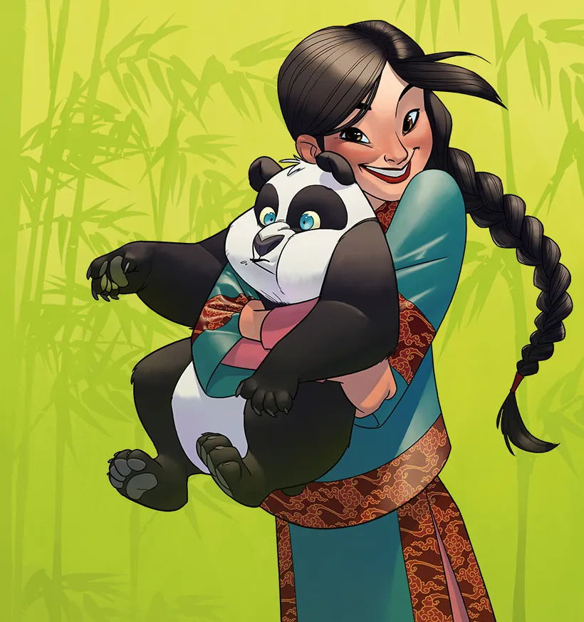
09. Think about surfaces


As I consider the highlights and shadows in this piece, I’m also thinking about the way the light reacts to the different surfaces. The silk dress has the strongest highlights and crispest shadows, whereas the fur of the panda diffuses the light so that the highlights and shadows are much softer.
10. Create patterns

At this point, the illustration is suffering from a lack of visual texture. The girl’s hair provides a little bit of a break from the solid blocks of colour, but not enough. So I design pattern to add to the girl’s clothing, based on what I’ve seen of traditional Chinese textiles.
11. Shape the pattern to the form

To me, the hardest part of designing costuming is creating patterns or graphics that need to wrap around folds and creases in fabric. Fortunately, Photoshop has the very handy Warp tool. To use the tool, I make a selection, then hit (Cmd+T), then right-click and select Warp from the drop-down menu. Alternatively, you can go to Edit > Transform > Warp. By dragging your selection around, you can conform it to all sorts of shapes. Usually, I make selections based on where there are breaks or folds in the fabric.
12. Create a background

Environments are my least favourite thing to do. That’s mostly because I’m not as practised with them and I’m not as comfortable creating them as I am with other things. In this case, the background is blessedly simple and the green in it is easy to bring out in the characters to help harmonise the whole image.
This article was originally published in issue 154 of ImagineFX, the world's best-selling magazine for digital artists. Subscribe to ImagineFX.
Related articles:
