Use Chart.js to turn data into interactive diagrams
Harness the power of the Chart.js library to create dynamic charts and diagrams and make data more engaging.
Sign up to Creative Bloq's daily newsletter, which brings you the latest news and inspiration from the worlds of art, design and technology.
You are now subscribed
Your newsletter sign-up was successful
Want to add more newsletters?
In theory, creating diagrams is not difficult. Handling the trigonometry required for a pie chart is among the most classic jobs used for training programmers. There are a lot of diagramming libraries vying for developers' attentions right now, but in this article, we're going to focus on how to use open source tool Chart.js.
We will put the library through its paces, creating a set of printable diagrams from randomly generated data. Chart.js is an especially popular web design tool because it offers a unique trade-off between ease of use and advanced features, enabling you to create interactive charts and engaging infographics.
With Chart.js, you can choose from eight different chart types to add to your websites with minimal effort. The recently-added animations module enriches the diagrams with snazzy-looking visuals. Creating a new site to house your diagrams? Get your web hosting spot on, and be sure to try a top website builder. Okay, let's get started.
Article continues belowClick the icon in the top right of each image to enlarge it.
01. Deploy the library
As use of Chart.js is widespread, you can find its minified version from various CDNs such as Cloudflare. Simply load it with a <script> tag, and ensure that a <canvas> object is nearby – Chart.js does its magic by using the rendering infrastructure provided in this widget.
<html>
	<head>
	<script src="https://cdnjs.cloudflare.com/ajax/libs/Chart.js/2.4.0/
Chart.min.js">
	</script>
	</head>
	<body>
	<canvas id="workArea">
	</canvas>
	</body>
</html>
02. Start initialisation
When the framework is loaded, the next step involves getting a Canvas2D handle pointing at the <canvas> instance created in the preceding step. This can then be used to create a new instance of the Chart() class, which is responsible for data handling, rendering and interaction.
<script>
	(function() {
		var ctx = document.
getElementById('workArea').getContext('2d');
		var chart = new Chart(ctx,
{
			type: 'line',
			options: {},
			. . .
		});
	})();
</script>
03. Add a data source
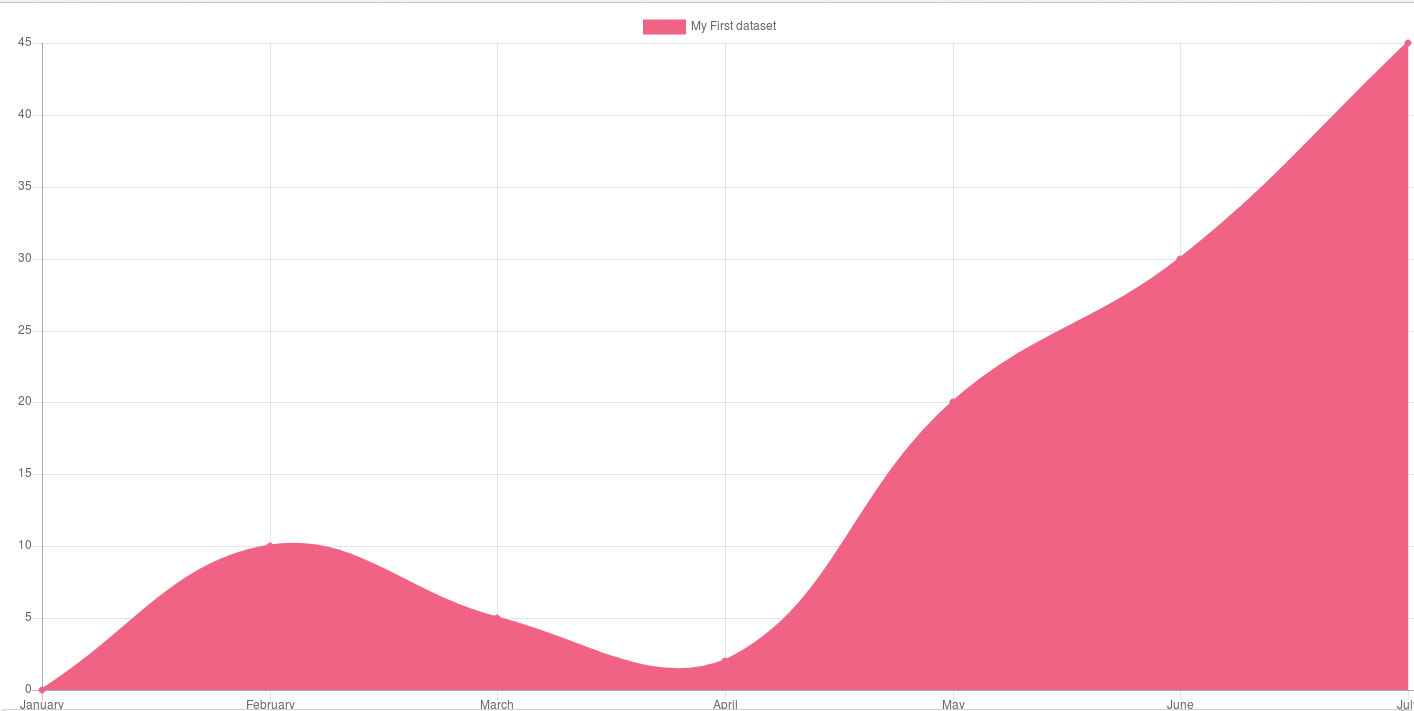
Chart classes take a data pointer which provides one or more DataSet objects containing the actual measurement information. In the case of our line chart, only one DataSet is needed. It comes with the obligatory data element and a few optional parameters governing the actual display process.
Sign up to Creative Bloq's daily newsletter, which brings you the latest news and inspiration from the worlds of art, design and technology.
var chart = new Chart(ctx, {
	type: 'line',
	options: {},
	data: {
	labels: ["January",
"February", "March", "April", "May", "June",
"July"],
	datasets: [{
	label: "My First dataset",
	backgroundColor:
        'rgb(255, 99, 132)',
	borderColor:
'rgb(255, 99, 132)',
	data: [0, 10, 5,
	2, 20, 30, 45],
		}]
	}
});
04. Stop any flickering
Chart.js comes with sophisticated resizing logic, which – unfortunately – tends to get screen sizes wrong from time to time. Limiting the size of the <canvas> element via CSS, sadly, does not do the trick. Instead, both aspect ratio maintenance and responsivity must be disabled via the options field accompanying the Chart classes constructor.
<canvas id="workArea" style="width:800px;
height:600px;"></canvas></canvas>
<script>
	(function() {
		var ctx = document.
getElementById('workArea').getContext('2d');
		var chart = new Chart(ctx,
{
		type: 'line',

options: {
responsive: false,maintainAspectRatio:
false},
05. Add layouts
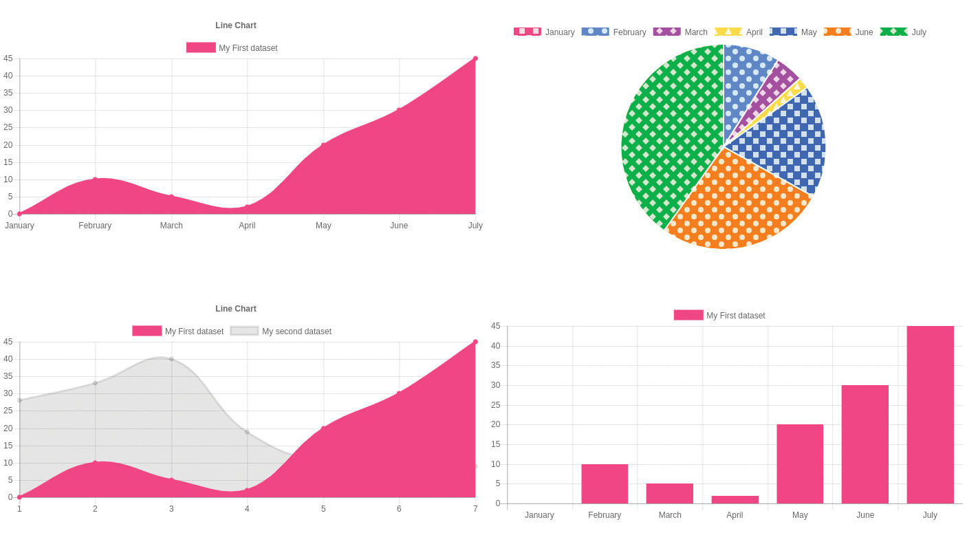
To paraphrase Andrei Tupolev: now that the small one is flying, let us bring up the bigger one. The scaffolding shown accompanying this step 'multiplies' our diagram – instead of working with one Canvas element, we now create a total of four of them and arrange them on the screen in a fashion similar to a LeCroy oscilloscope. Sadly, this does not quite work out as intended.
<canvas id="workArea"
style="position:absolute; top:0%; left: 0%;
width:49%; height:49%;"></canvas></canvas>
<canvas id="workArea2"
style="position:absolute; top:0%; left: 51%;
width:49%; height:49%;"></canvas></canvas>
<canvas id="workArea3"
style="position:absolute; top:51%; left: 0%;
width:49%; height:49%;"></canvas></canvas>
<canvas id="workArea4"
style="position:absolute; top:51%; left: 51%;
width:49%; height:49%;"></canvas></canvas>
06. Tame any rendering errors
The safest way to handle Chart.js diagrams in complex layouts involves using wrapper <div> tags. They enforce a structure from the outside, thereby ensuring that the internal layout engine can not do more harm than necessary. In this case, however, ensure to re-enable the responsivity feature.
<div style="position:absolute; top:0%; left:
0%; width:49%; height:49%;">
	<canvas id="workArea" ></canvas></
canvas>
</div>
<div style="position:absolute; top:0%; left:
51%; width:49%; height:49%;">
	<canvas id="workArea2"></canvas></
canvas>
</div>
<div style="position:absolute; top:51%; left:
0%; width:49%; height:49%;">
	<canvas id="workArea3" ></canvas></
canvas>
</div>
<div style="position:absolute; top:51%; left:
51%; width:49%; height:49%;">
	<canvas id="workArea4" ></canvas></
canvas>
</div>
<script>
	document.addEventListener("DOMContentL
oaded", function(){
	var ctx = document.
getElementById('workArea').getContext('2d');
			var chart = new
Chart(ctx, {
				type:
'line',
				options:
{ },
07. Try bars

Always rendering line charts gets tedious quickly. Let's spruce things up by changing the type property to bar, thereby yielding bar diagrams such as the one shown in the figure accompanying this step. We promote the data field to 'global' scope in order to eliminate reuse.
<script>
	document.addEventListener("DOMContentLoaded", function(){
		var myfield = {
			labels: ["January", "February", "March", "April", "May", "June", "July"],
			datasets: [{
				label:
"My First dataset",

backgroundColor: 'rgb(255, 99, 132)',

borderColor: 'rgb(255, 99, 132)',
				data: [0, 10, 5, 2, 20, 30, 45],
			}]
		};

		. . .
		ctx = document.
getElementById('workArea4').getContext('2d');
		chart = new Chart(ctx, {
			type: 'bar',
			options: { },
			data: myfield
		});
	});
</script>
08. Avoid pies
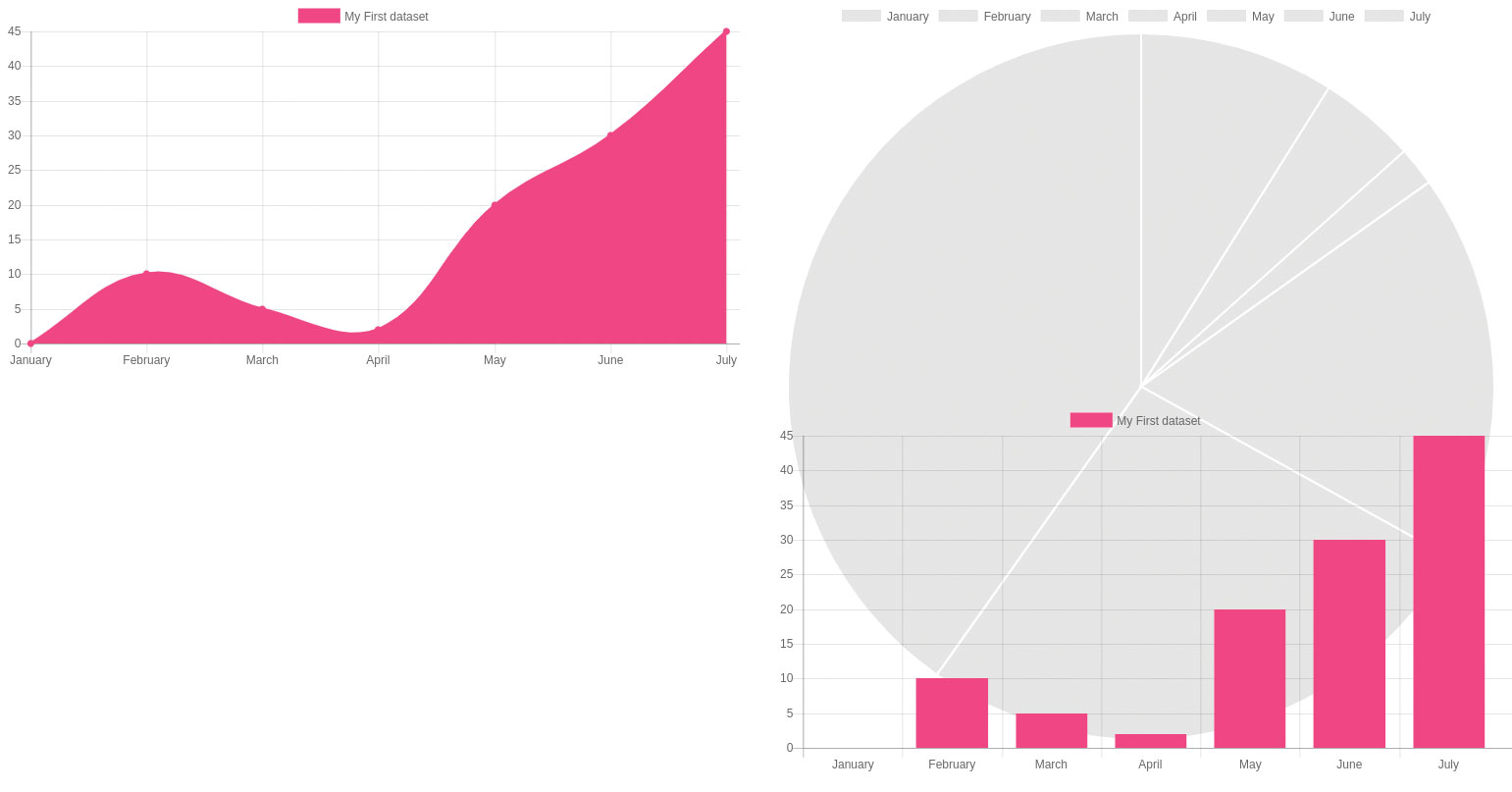
In theory, a pie chart can be rendered along the same lines. Remove the colour properties to prevent uniform appearance, and set the type property to pie. Sadly, this does not quite work out – when done, the pie chart will fill the entire screen. This is caused by a speciality of the pie renderer which uses the 'larger' of the two properties to determine pie radius.
var mypie = {
		labels: ["January", "February", "March", "April", "May", "June", "July"],
		datasets: [{
			label: "My First dataset",
			data: [0, 10, 5, 2, 20, 30, 45],
		}]
	};
ctx = document.getElementById('workArea2').
getContext('2d');
chart = new Chart(ctx, {
	type: 'pie',
	options: { },
	data: mypie
});
09. Solve the problem
Open the 'index.js' file created in step 1. Begin by specifying the graph type as line and adding the data to be visually represented as shown below.
<body>
	<div style="position:absolute; top:0%;
left: 0%; width:49%; height:49%;">
		<canvas id="workArea" ></
canvas></canvas>
	</div>
	<div style="position:absolute; top:0%;
left: 51%; width:29%; height:49%;">
		<canvas id="workArea2"></
canvas></canvas>
	</div>
10. Let Chart.js rescale the diagram
Another approach to solve the problem involves re-disabling the maintainAspectRatio feature. This way, the diagramming engine is allowed to rescale the diagram as it sees fit, ensuring that the entire circle shows up on the screen.
ctx = document.getElementById('workArea2').
getContext('2d');
chart = new Chart(ctx, {
	type: 'pie',
	options: {maintainAspectRatio:false
},
	data: mypie
});
Next page: Finish creating your interactive chart with Chart.js
Web Designer is the premier magazine for aspiring online creatives and industry professionals. The monthly title offers cutting-edge practical projects spanning XHTML, CSS, Flash and WordPress as well as hosting features and interviews with the web community’s most influential people. Each issue also has a dedicated Industry section covering news and views from the trade, website showcases featuring the finest design talent and a free CD of valuable resources.
