Use Chart.js to turn data into interactive diagrams
Harness the power of the Chart.js library to create dynamic charts and diagrams and make data more engaging.
11. Improve pie colouring
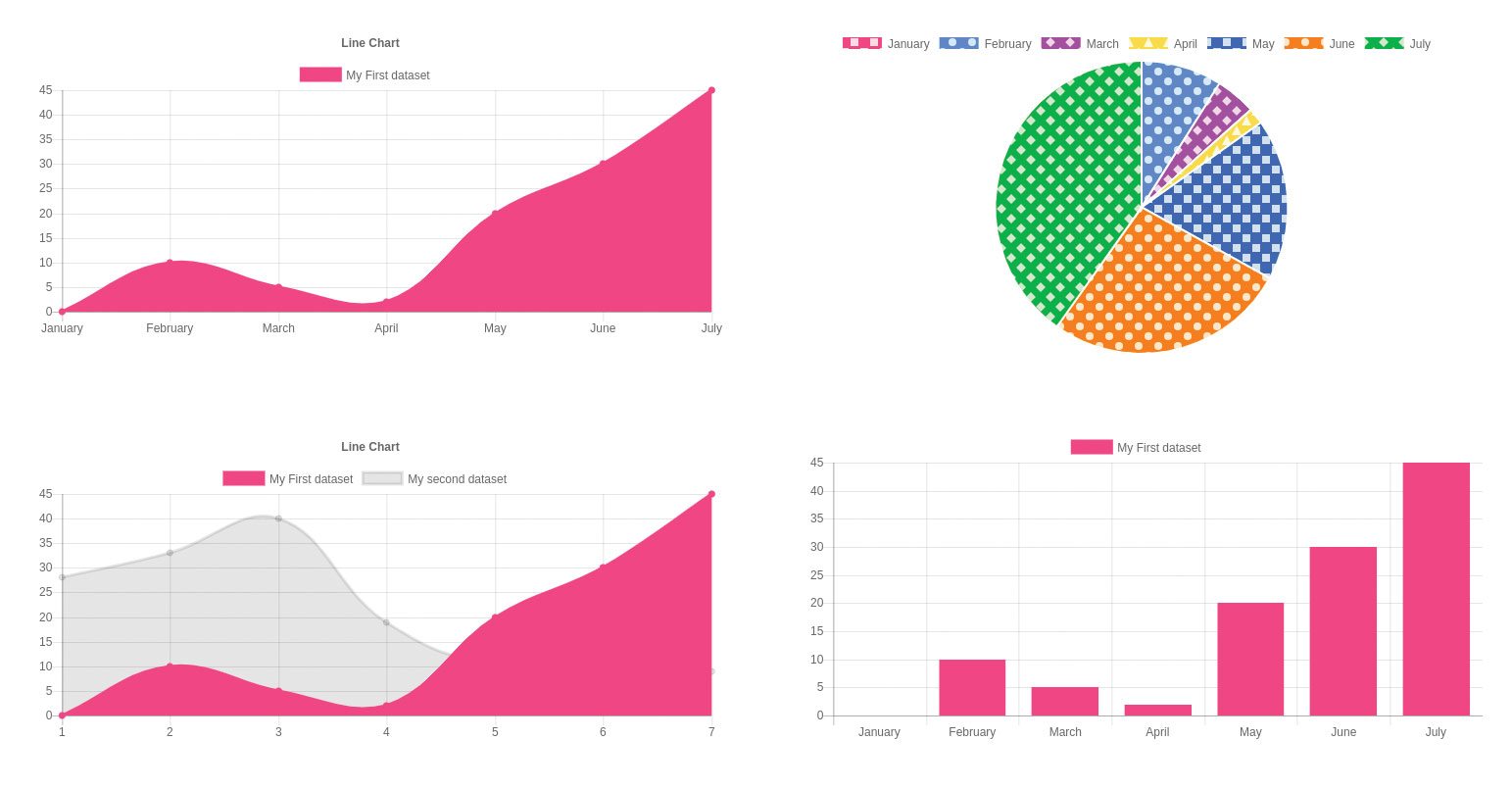
Chart.js does not contain a random colour generator – if you don't provide a colour array, colours won't change. As designing systems based purely on colours is inefficient – many individuals suffer from colour blindness. A nice way around the problem is the patternomaly library.
<script src="https://cdn.jsdelivr.net/npm/
patternomaly@1.3.0/dist/patternomaly.js"></
script>

var mypie = {
	labels: ["January", "February",
"March", "April", "May", "June", "July"],
	datasets: [{
		backgroundColor: [
			pattern.
draw('square', '#ff6384'),
			pattern.
draw('circle', '#36a2eb'),
			pattern.
draw('diamond', '#cc65fe'),
			pattern.
draw('triangle', '#ffce56'),
			pattern.
draw('square', '#1f77b4'),
			pattern.
draw('circle', '#ff7f0e'),
			pattern.
draw('diamond', '#2ca02c'),
			pattern.
draw('zigzag-horizontal', '#17becf'),
			pattern.
draw('triangle', '#7f7f7f')
. . .
12. Use patterns
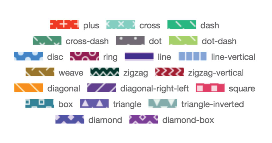
Actually applying a pattern is not difficult. As shown above, simply instantiate them using the name from the figure and a colour screen to be used as a background. Ensure that the array contains enough elements to cover each member of the data field.
13. Address tooltip issues
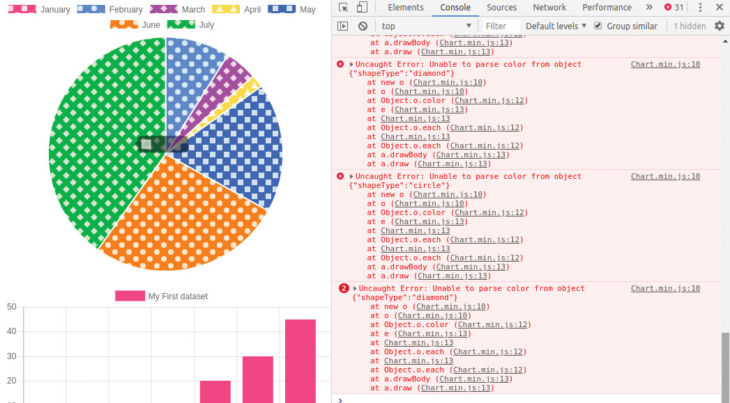
Running the program with enabled developer tools finds an interesting problem. When passing the mouse cursor over the chart elements, errors pop up. This is caused by the tooltip window, which is not able to discern colour information from pie elements loaded with a pattern.
14. Overwrite information
The problem at hand can be remedied by overriding parts of the tooltip's element. Chart.js lets you submit event handlers that get called as a tooltip window pops up – overwriting labelColor disables the snooping algorithm responsible for the emission of the warning seen before.
chart = new Chart(ctx, {
	type: 'pie',
	options: {
	maintainAspectRatio:false,
	tooltips: {
			callbacks: {

labelColor: function(tooltipItem, chart) {
				return {
borderColor: 'rgb(255, 0, 0)',
	backgroundColor: 'rgb(255, 0, 0)'
				}
				},
				labelText
Color:function(tooltipItem, chart){
			return '#543453';
				}
			}
		} },
	data: mypie
});
15. Add a title
Especially when diagrams are intended for export or saving, adding a title improves the meaningfulness of the information displayed. The code shown next to this step takes care of the problem effectively – additional customisation, such as the choice of fonts, can be accomplished with additional parameters.
var chart = new Chart(ctx, {
	type: 'line',
	options: {
		title: {
			display: true,
			text: 'Line Chart'
		}
	 },
data: myfield
16. Add one more chart
So far, our diagrams were limited to one bit of information at a time. Adding a second 'level' to a data field motivates Chart.js to create a chart made up of more than one data set. The Labels array is important, as its omission makes the program skip parts of the data.
var myfield2 = {
labels: ["1", "2", "3", "4", "5", "6", "7"],
datasets: [{
	label: "My First dataset",
	backgroundColor: 'rgb(255, 99, 132)',
	borderColor: 'rgb(255, 99, 132)',
	data: [0, 10, 5, 2, 20, 30, 45],
},
{
	label: "My second dataset",
	fillColor: "rgba(151,187,205,0.2)",
	strokeColor: "rgba(151,187,205,1)",
	data: [28, 33, 40, 19, 12, 27, 9]
}]
};
17. Populate the data array
Generating the label's array can get tedious. If your information is sourced from somewhere where ordinal information is readily available, the data array can also be populated with an array of Point[] fields. In this case, use the syntax shown below.
Sign up to Creative Bloq's daily newsletter, which brings you the latest news and inspiration from the worlds of art, design and technology.
data: [{
        x: 10,
        y: 20
    }, {
        x: 15,
        y: 10
    }]
18. Adjust placement of charts
The above-mentioned spacing problem makes positioning diagrams difficult. Chart.js addresses this problem via the padding attribute found in the options field – it allows you to declare a keep-out zone on each of the four margins of the container, thereby constraining rendering.
var chart = new Chart(ctx, {
	type: 'line',
	options: {
	layout: {
	padding: {
		left: 30,
		right: 30,
		top: 30,
		bottom:30
			}
		},
19. Set the layout globally
Assigning layout settings to each diagram is tedious. A smarter approach involves the Chart.defaults.global element. It exposes the default settings Chart.js will use for new diagrams, and can save a lot of code if multiple diagrams are to be hosted next to one another.
<script>
	document.addEventListener("DOMContentL
oaded", function(){
	Chart.defaults.global.layout
= {
		padding: {
		left: 30,
		right: 30,
		top: 30,
		bottom: 30
			}
};
20. Look at examples
The Chart.js developers provide a set of examples to show the framework in action. Take a look at the various options – the source code, usually, is commented well. The library also comes with extremely detailed documentation. Simply open it in a browser of choice, and navigate to the sector which interests you the most. Got examples to save for later? Here are the best cloud storage options around.
This article was originally published in creative web design magazine Web Designer. Buy issue 281 or subscribe here.
Read more:
Web Designer is the premier magazine for aspiring online creatives and industry professionals. The monthly title offers cutting-edge practical projects spanning XHTML, CSS, Flash and WordPress as well as hosting features and interviews with the web community’s most influential people. Each issue also has a dedicated Industry section covering news and views from the trade, website showcases featuring the finest design talent and a free CD of valuable resources.
