How to create epic environment designs
Think big with your designs and create a stunning environment.
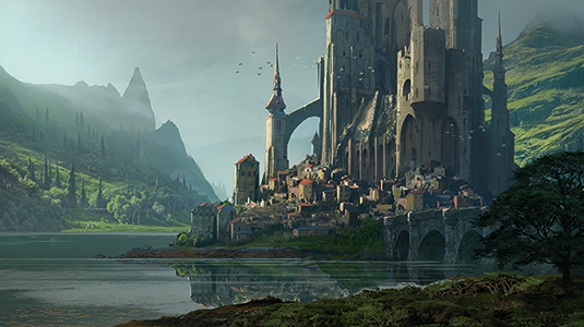
This workshop and Photoshop tutorial will take you through my process for painting a grand, fantasy structure set within an epic landscape, as well as revealing some of my drawing tips. You'll see how to handle light, atmospheric perspective and depth, to create a interesting, moody scene.
My goal is to produce a memorable image of an immersive setting – an epic moment taken from a big-budget film. This workshop will appeal to those with a particular interest in environment design, who are keen to also develop their composition skills.
With this in mind I think it's important to play around with contrasting shapes, apply the golden ratio and then choose an interesting colour palette. I always start with a simple sketch, developing it gradually into a detailed illustration.
Article continues belowThis workshop will appeal to those with a particular interest in environment design, who are keen to also develop their composition skills
It would be a mistake to underestimate the usefulness of the sketches we use to decide on a composition. There's little point working up a detailed image if it lacks a memorable composition and has a dull palette. Such problems would have been highlighted at the sketch stage.
So here's my checklist: I like to make sure I have an interesting topic, and a great balance of shapes, proportions and contrasts in the volumes. I track down interesting references to inspire me: these could be photos I've taken, collections of images online or even masterpieces I've seen in museums.
I prefer to use my personal photo database as much as possible to avoid copyright issues, but if you're only looking for mood reference, you can have a lot more flexibility. Films are also a great source for inspiration, especially when it comes to the lighting and mood of a piece.
The final image should be an invitation to go on a voyage – a journey into a grand fantasy setting, Applying details will help to ground this epic scene, but this isn't the most important thing to get right in the painting process. Remember, composition is key.
Sign up to Creative Bloq's daily newsletter, which brings you the latest news and inspiration from the worlds of art, design and technology.
01. Sketch on paper
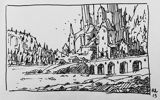
I think it's better to sketch on paper, rather than digitally. I find that my gestures become more direct and spontaneous, and the physical connection between my pen or pencil and paper fires up my imagination.
My aim at this early stage is to quickly generate a range of interesting compositions. I'll draw some sketches and try out various compositions, with either a Uniball pen or Faber Castell pencil in my sketchbook.
I take the time to explore a range of options, from landscape to portrait. I want to develop some elements of composition for the foreground, but at the back of my mind is the need to present an interesting topic, achieve balance in the volumes and generate a detailed composition.
I want to illustrate an immense castle with a medieval village at its base. I don't want the fortress to look too realistic, so I exaggerate the scale and the sense of classic fantasy in the composition, and place very small houses at the bottom, and huge towers, arches and buttresses throughout the castle's structure.
02. Create values and mood sketch
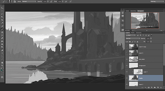
I do a more elaborate sketch in Photoshop, using greys, blacks and whites to develop the mood and atmospheric depth. Using a brush set to 0 per cent Opacity helps me focus on positive and negative spaces, pushing strong contrasts and the composition. I also use the Selection tool to cut out shapes, before filling them with a flat value of grey.
03. Gather references
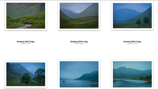
When painting an environment with elements such as recognisable architecture, it's important to use references – and the best inspiration is to go travelling! Being able to choose the right images to help you to create your own design is an important skill. It's a big part of the job.
In fact, when I was working for film as a matte painter, finding the right photos and references was 60 per cent of the work. When you have the right elements to compose with, the work goes much more quickly and efficiently.
04. Block in the composition
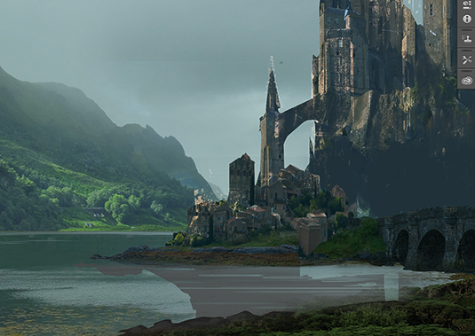
I put the initial drawing on the top of everything in Multiply mode, so I can follow the original concept closely. I try to keep the layers I did in grey values and I group my textures and references inside these.
I don't paint every detail from scratch. This stage of an illustration is one of exploration, but you must know where you're going! This is why a sketch is so important. The other materials are just there to help efficiency and realistic rendering.
I was lucky to go on a fantastic trip to the Isle of Skye in Scotland, thanks to Ian McQue. I took many photos, which I've used here. I keep the composition from the sketch, but gradually replace the drawing with elements from my photos, while keeping a homogeneous colour palette. I also try to maintain consistency with the light direction.
05. Establish colour palette
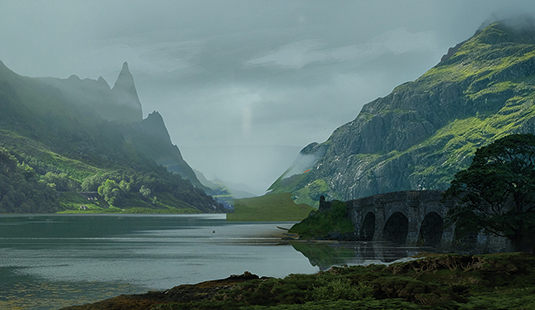
References are important for building a credible palette and atmosphere. When I bring references next to my painting, I try to choose one main direction for the colour palette and the values in the light and shade. For instance, in this painting, the colours of stone in the light and grass in the sun are important and have to be consistent throughout the painting.
06. Refine silhouettes
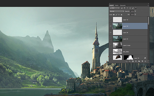
Now I refine the composition in the separate layers. This is also where I try to give the image a distinctive mood and style. Some details are important in the silhouette because they contrast with the sky or the brighter background.
The great thing about working with layers is that you can colour balance them separately and fake atmospheric depth, as well as lose details in the distance (to create mysterious shapes). I create layers of mist between layers of architecture and backlight the silhouettes of the buildings.
07. Add details for scale reference
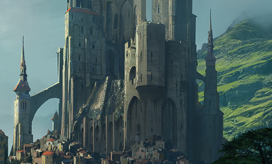
I like the overall mood and composition, but it's not there quite yet. I find that a good scale reference is important, to help the viewer's immersion in the scene.
In conventional architectural design, details such as windows and doors are useful for giving the viewer a sense of scale, but in this more fantastical setting, I need to define the scale in the foreground further. So I spend more time adding organic details such as grass, rocks and trees, which will add some life and proportions to the overall setting.
I want to add some mystery to the picture as well: some huge trees in the mist are a great addition in among the mountains in the background. I also spend time adding highlights, some details in the rooftops and houses, reworking the perspective, and focusing on adding colour variations and local saturation – all to try and generate a richer mood overall.
08. Break the lines
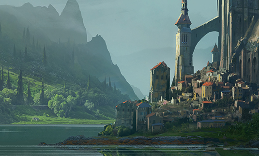
Refining the shape makes everything look more painterly and is fun. It's time to get rid of the photographic texture as much as possible, and refine and stylise the volumes. I add more erosion and break the shapes, break the lines.
Some elements are great for helping to set up the composition, and I like the silhouette to be simple, but it's also important to continue making the setting look less rigid and stiff, to refine lines to make them look more natural and organic. I also add colour variation: I choose more saturated values in the colour palette, but keep the luminance and add some variation in the local colour.
09. Assess your progress
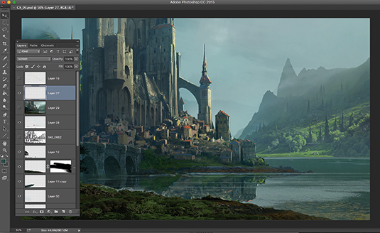
This is the moment to take a little step back. When I've spent a long time on a single image, taking a break, flipping the image horizontally and vertically is useful: you get to see the image with different eyes. In addition, before finishing a painting, it's good to show it to your housemate, partner, or even to your kids.
This is the time when you can still modify important elements of your picture, before going too far in the polish! Remember that polish is good, but first you need to have a good base.
10. Commit yourself
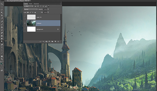
Painting with layers is good and bad. Yes, you can work separately, change local elements without compromising the others and there's great flexibility. But it's also more rigid. It's the moment to either collapse your stack, reduce the number of layers and paint over everything (brave, but interesting!).
Or you can continue to work with separate layers, but blend them with several tricks. What I recommend is picking values and colours from the background and painting them over with a soft Airbrush, at a very low Opacity. This will affect local colour and simulate a fog that brings colours together.
11. Add storytelling elements
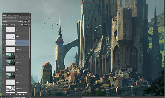
Usually I add some characters to my scenes to enhance the sense of scale, but also to give a sense of storytelling. I find in this case that the fortress itself is enough and I also want to consider it as the main character of the scene.
I add some life, with the birds along the huge towers and buttresses. I also want to have a feeling of a calm, grandiose landscape with an epic, mysterious architecture as a central point of interest.
12. Polish lighting
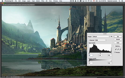
To ensure that the light comes from the same direction, I accentuate some light on a few key spots: the edges of the arches, on the top of the mountain on the left, and on the side of the castle. These touches will reinforce the direction of the light source in the setting.
I also want to have a stronger focal point in the scene, so I use the Dodge tool to darken some areas and lighten others. This stage is key to the whole painting process. I can really polish the lighting in various areas with this tool, and create vignettes in the corners to direct attention away from them.
I use the Dodge Tool in Highlight mode, at 10 per cent. Using the Alt key enables me to switch between the darkening and brightening tool.
13. Re-crop and filter
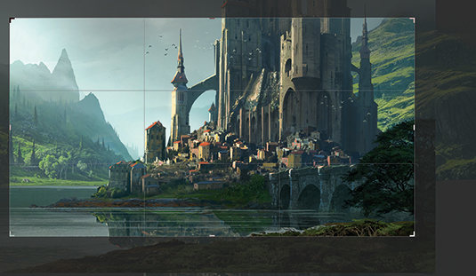
Almost done! It's time to play around with filters a bit and try to crop my image, and again take another step back from the screen. Maybe the image works better if it's cropped? Sometimes, when the focal point feels a little lost, it helps to re-centre it. And it can be interesting to test different options with the rule of thirds.
Often we tend to put too much in the composition. We also might have made the corners too busy. It's time to get rid of these mistakes and crop in on the interesting parts of your image.
Filters can be applied to introduce some texture and blend the colours more. I like to simplify the details with a subtle use of the Smart Blur filter. There's also a way to use textures such as Stucco in Overlay mode on a separate layer at a very low Opacity, to add complexity to the blending of the colours.
And this is the finished image! I hope you like it and have fun creating your own stuff! Remember: composition first, details after.
This article was originally published in ImagineFX, the world's best-selling magazine for digital artists. Subscribe here.
Related articles:
