How to illustrate with watercolours: 7 pro tips
Discover some tricks of the trade when using watercolours.
Sign up to Creative Bloq's daily newsletter, which brings you the latest news and inspiration from the worlds of art, design and technology.
You are now subscribed
Your newsletter sign-up was successful
Want to add more newsletters?
Digital design technology is wonderful, but some of the most amazing artwork is still created using traditional painting techniques and methods. Here, pro children's book illustrator Alina Chau shares some of the secrets to successfully illustrating with watercolours.
01. The right tools
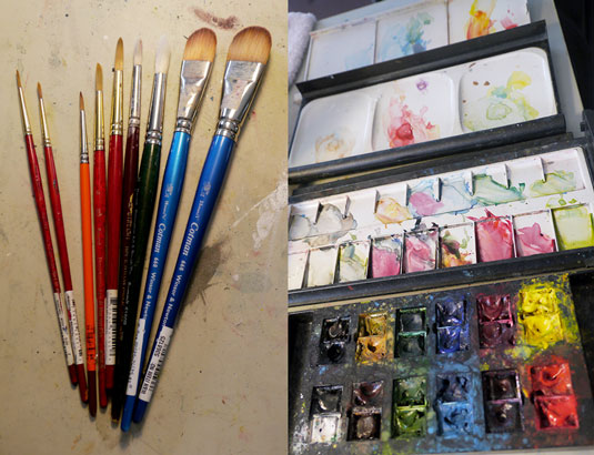
In order to achieve a desirable result with watercolour, it’s important to have the right tools. While you don’t have to invest in an expensive set of supplies, you don’t want to use paint or paper that is not suitable for watercolour either.
I’ve put together a list of the basic supplies you’ll need to kick-start your creative journey into watercolour painting:
Article continues below- Brushes: My favourite are artificial sable brushes. They are affordable and perform similarly to real sable. You want to a range of different sizes; I suggest round brushes in 2, 4, 6, 8, 10, and 12, and one or two bigger flat brushes so you have a good range to start with.
- Palette: Get a palette that will provide enough room to place your colours as well as plenty of room for mixing them.
- Colour: My favourite brand is Winsor & Newton, but there are many good ones out there. If you are on a budget, most manufactures develop colours for students and professionals – Winsor & Newton's Colman series is student grade, while its Artist series is for professionals. Even though the student grade is cheaper, the quality is still very good.
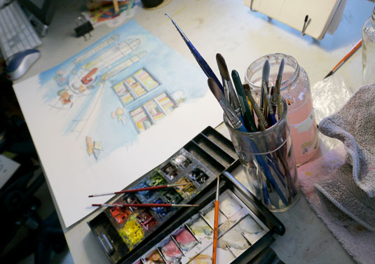
- Water jars: I like to have at least two, one for washing dirty brushes and one for mixing colours.
- Paper: Choose between cold press or hot press. Hot press has a smoother surface, and colours perform differently on both. I use cold press because I love the rougher texture, which I think it gives the watercolour its unique look.
- Gouache white: Watercolour white is usually too transparent to be of any use. I prefer gouache white to do the occasional touchups and highlights.
02. Start with sketches
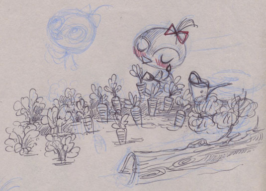
Regardless of whether you are painting from imagination or life, it’s always a good idea to start with sketches. I love doodling on newsprint with a ballpoint pen. The rough texture of newsprint allows me to let my ideas flow without worrying about making mistakes.
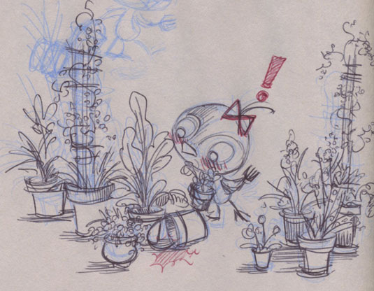
Above are some examples from my children’s book, Pickle: The Little Bird Who Doesn’t Tweet! I start by using a blue pencil to do a very rough sketch. I tend to scribble lines on top of lines, looking for the right form and story moment.
If the lines get too messy to read, I will skip to another clean page. But, when I find the composition I like the most among all the messy blue lines then I use a black ballpoint pen to tidy up the drawing.
03. Colour studies
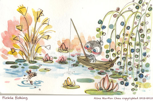
I like to do colour studies before I work on an actual painting. To ensure colour accuracy it’s better to do these on watercolour paper. Keep them small-scale, 4x6 inches or smaller is a good range.
These colour studies do not need to be a perfect painting. Instead, try to pay attention to how the colours bring focus to your point of interest and how you can make your composition more enchanting with your use of light and shade. The goal is to get a good overall sense of how your final painting will 'feel'.
Sign up to Creative Bloq's daily newsletter, which brings you the latest news and inspiration from the worlds of art, design and technology.
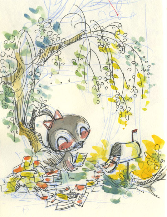
Even though Pickle is a book app, I wanted it to have the charm of a classic children's picture book such as Peter Rabbit, but with contemporary sensibility and humour.
To achieve a classical illustration feel, I used subtle fine lines and textures in the painting. To make Pickle feel contemporary, besides using modern visual references in the story, I used a palette that’s slightly more vivid and brighter than what’s commonly used in classic illustrations.
04. Preparing paint and paper
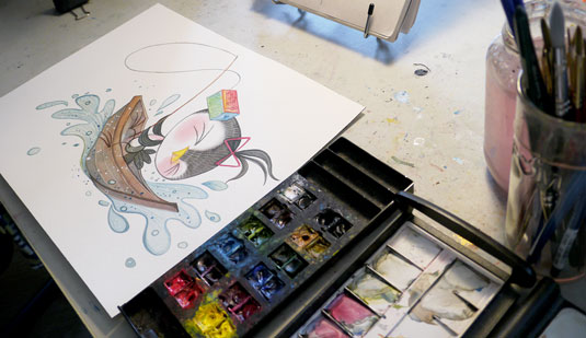
A common misunderstanding is that you have to use the same palette that you used for the colour study when creating your final painting. While it’s true that you will recreate the look of the colour sketch, you should always start a new painting with a clean set of tools and a clean palette. This will prevent the colour on your painting from becoming too muddy and hard to control.
Also, be sure to wash your tools regularly whenever they start to get too dirty. This will also help maintain the purity and accuracy of the colour.
While you don’t need to worry about paper getting buckled in a sketchbook, you do need to watch for this in your final painting. To prepare the paper you can either stretch your paper or get a watercolour block, which is pre-stretched.
Light pencil line
After you are all set to go you can start drawing the sketch of your painting on the watercolour paper. Unless you intend to showcase the pencil line, draw very lightly on the surface so it’s easy for the colour to cover up the pencil.
People often ask me whether I use any special techniques to transfer my sketch to the final painting surface. Personally, I redraw the sketch freehand. This is usually when I fine-tune and make last minute adjustments to improve my draft.
05. Understanding watercolour as a medium

A common misunderstanding is that watercolour is about how much water you have on your brush. Many people think that you have to use plenty of water to get the paint to perform as it should.
On the contrary, watercolour is not about how much water is on your brush; it’s about the evaporation speed of the water on your paper surface. This means you need to account for the weather and humidity when you paint.
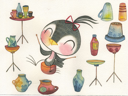
If you are painting on a sunny day with low humidity, you may need to use more water. On the other hand let’s say you are painting near a waterfall – in this case you will need to be very sparse with the water so that the bleeding doesn’t get out of control. In general you want to apply new layers of colour at the right time, which is when the moisture level on the paper surface is at its optimal dampness.
An interesting characteristic of watercolour is that you can apply the paint with little or no added water to achieve a dry effect or to imitate the look of an oil painting. Watercolour is indeed a medium with lots of personality!
06. What to do first
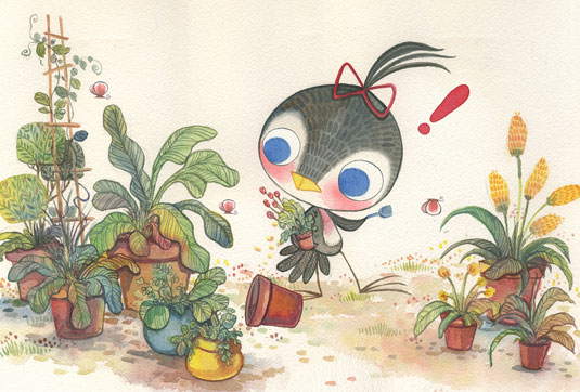
Many art websites and books offer comprehensive watercolour techniques and lessons. Here is a one with good example of all the various techniques. But what I would most like to share with you is how to approach the painting as a whole.
There are different theories on what is the proper step to start a watercolour painting with. The most common approach is to work from light to dark. However, I don’t think there is any definite rule you must follow – I have seen artists create amazing watercolour pieces working from the darkest colour to the lightest.
When I paint, I like to start from the main point of interest, such as Pickle the bird, then spread out from there to the secondary visual elements. Afterwards, I apply a general background colour layer with a big brush.
I wouldn’t worry too much when colour doesn’t land on the right spot or goes outside of the line. This is part of the fun of using watercolours. It’s a medium that easily creates a fun and spontaneous effect every time you paint.

Usually the surface is quite wet after applying the background, so I like to allow the paint to dry before I approach the details. On the next round, I keep the bleeding of colour under more control.
I tend to skip the decorative elements during all these stages, and keep those areas loose or unattended until the very end. This is because I often use the decorative elements to enhance the composition or frame my point of interest, and I don’t want to accidentally make those areas stand out too much.
With my children’s book, since a lot of the story takes place in natural settings, I often wait until the end to paint the plants, leaves and flowers. Even though these elements are a big part of the overall composition I leave them until last to frame Pickle as well as the key story moments.
07. Getting experimental
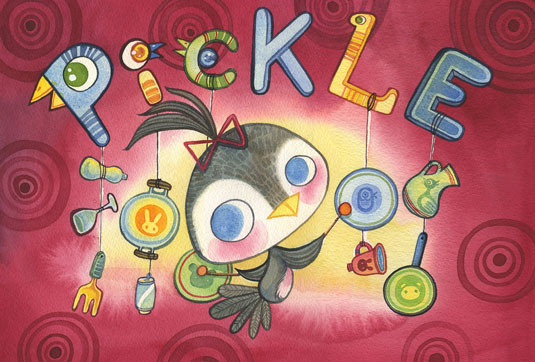
There are no rules, only tools! Like any art form, there are many approaches to creating a beautiful watercolour painting. Experiment and explore techniques that are suitable for your art style. It’s okay to use white, it’s okay to scrape the paper surface, and it’s okay to apply the paint generously on the paper surface. Most importantly, have fun!
If you’d like to watch my paint process here’s a time-lapse recording of myself painting the image below from start to finish. The video is three minutes long but the actual painting took about me about seven hours to complete:
Related articles:
