20 best designs in video games
Forget the obsession with photorealism, we pick out the bits of games that focus on gorgeous design.
11. Project-K – Rez
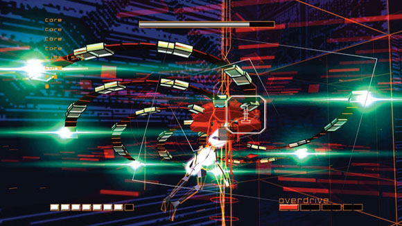
Rez is set inside a computer being invaded by a virus. This digital world is presented as a series of abstract environments that represent the 'data' of the computer you're in. The minimalist, almost psychedelic, visuals are designed to work in conjuction with the soundtrack, which player's create themselves by interacting with the game.
As the music plays, the world pulses in time with the beat. The enemies you battle make different musical sounds when destroyed, and are visual representations of each instrument. It's a visual type of music creation, and lead designer Tetsuya Mizuguchi wanted players to experience a kind of synesthesia as they played.
Rez designer view
Tetsuya Mizuguchi, Rez creator, says: "I think the goal of the Rez experience is that everything is moving and activating with music, like a MIDI controller. It's like a synthesizer. Not only sounds, but in the visuals it crafts, and the vibrations."
Article continues below12. The classes – Team Fortress 2
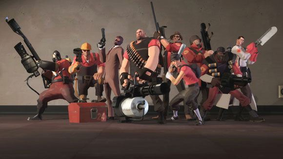
The first Team Fortress game had no real visual style, but Valve had the inspired idea to make its sequel look visually distinct from other shooters. The result is a cast of characters who look like they've been taken straight out of a Pixar movie.
But it's not just their appearance that makes them superb examples of design: it's their shape. The game is incredibly fast-paced, and the battlefield is often a blur. Because each class serves a specific function – be it healing, repairing, or providing support – and teamplay is important, you have to be able to recognise the players around you.
So by giving each class a unique shape and outline, Valve were able to give players visual cues to make them aware of their surroundings; even in the thick of a frenzied battle. Normally proportioned soldiers wouldn't work, so the exaggerated cartoon art style is a perfect blend of form and function – and looks really cool to boot.
Team Fortress 2 designer view
Charlie Brown, software developer at Valve, says: "It was the gameplay that dictated the style. Team Fortress has a variety of weapons that aren't even realistic, the physics forces are really high, so that humor content gets ratcheted up, and so we decided instead of fighting that with something realistic to do something a lot more stylised and fun and inviting."
Sign up to Creative Bloq's daily newsletter, which brings you the latest news and inspiration from the worlds of art, design and technology.
13. The dolls – Stacking
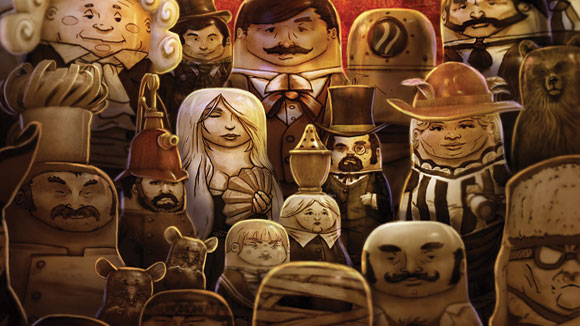
Double Fine artist Lee Petty dreamed up the bizarre world of Stacking. Its imagery is based on silent films of the '20s as well as the Victorian and depression eras of history, but the world is inhabited, strangely, by living Russian dolls. You have to solve puzzles in the game by 'stacking' different dolls on top of one another.
The dolls were chosen because people would see them and instantly understand how the game works. This would give the game appeal to casual and hardcore gamers alike, something Double Fine excel at. It was also convenient from a gameplay perspetive, as the dolls could serve multiple functions, as both characters, and the player's inventory.
Petty came upon the idea when he saw his daughter playing with a set of Matryoshka dolls. The game was released via digital distribution; a platform that's less risky for publishers, meaning they're able to let developers make more conceptually and artistically interesting games. Stacking would never have been the same or even made if it were a boxed off-the-shelf title.
Stacking designer view
Lee Petty, project lead on Stacking, says: "When I set out to design Stacking, I knew that I wanted to make a contemporary version of the classic adventure game. I was looking for a way to distill the adventure game experience down to a more approachable, compact experience without losing the charm and character driven story telling of the classic adventure games.
"At the same time, I saw my daughter playing with a set of matryoshkas, and I realized that they would be a perfect way to create a new game mechanic, condense the experience, and add a unique personality to the game. The matryoshaka dolls became the verbs, the inventory, and the characters that the player interacts with to solve puzzles."
14. The Land of the Dead – Grim Fandango
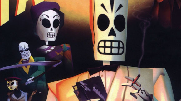
The design team behind LucasArts' legendary adventure, Grim Fandango, brought together two art styles – film noir, and Aztec culture – and fused them together. This might sound like it would be jarring, but it worked superbly well.
Based on the imagery of the Day of the Dead, a Mexican holiday where people pay tribute to deceased friends and relatives, the game is set in the afterlife. Here, people are either fast-tracked to heaven, or have to spend years in the Land of the Dead (a kind of purgatory), working to pay their way to eternal happiness.
So while it's a fantastical world, it's also grounded in reality, full of depressed office workers going about their daily routine, trying to pay off their life debt. The story is a classic noir mystery, with seedy detectives, sleazy jazz music, and dames in distress, but the Latin American influence gives it an idiosyncratic feel.
Grim Fandango designer view
3D artist and co-owner of CG production studio MDI-Digital, AJ Jefferies, says: "This world shouldn't work. Somehow the designers have managed to take the disparate aesthetics of ancient Aztec architecture and 1920s art deco and blend them into a cohesive, functioning universe. Why it works so well, and why I adore the game, is that it's a fusion of the surreal and the mundane. While there are elements of the fantastic, they are handled in such a way that it never pulls you too far out of the universe."
15. Nippon – Okami
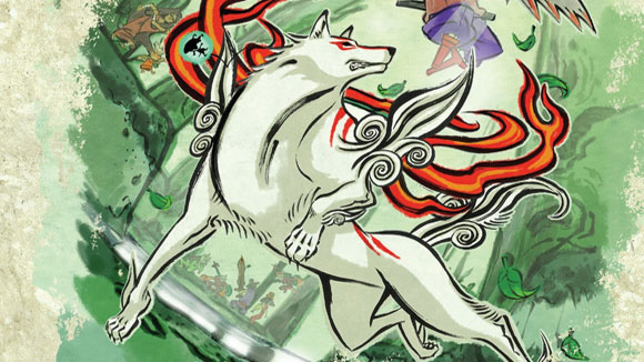
Inspired by traditional Japanese watercolour and wood carving art, Nippon is one of the most beautiful video game worlds we've ever inhabited. This 'sumi-e' style made the game look like an ink wash painting come to life, and painting is actually incorporated into the gameplay: you damage enemies by 'drawing' the attacks with a magic brush, which is a nice touch.
The idea of the game was to restore nature to the world. When you first visit an environment, the world is covered in a dark soup of ink. But as the hero, Amaterasu, runs through the world, colour is restored. It's as if she's painting the environment; again, tying the visuals into the gameplay. The result is an imaginative, visually striking game.
Sadly, despite rave reviews, Okami's visuals were too alienating for the mainstream gaming audience, and its sales failure resulted in the developers, Clover, being shut down. This is an all too common occurence in the games industry, which makes developers less inclined to give their projects unusual visual styles. We see more and more dull, brown military shooters, while games like Okami become an endangered species.
Okami designer view
Atsushi Inaba, producer on Okami, says: "Once we fixed ourselves on a graphical style and got down to the brushwork, we thought 'Wouldn't it be great if we could somehow get the player involved and participate in this artwork instead of just watching it?' That's how the idea of the Celestial Brush was born."
16. The Combine – Half-Life 2
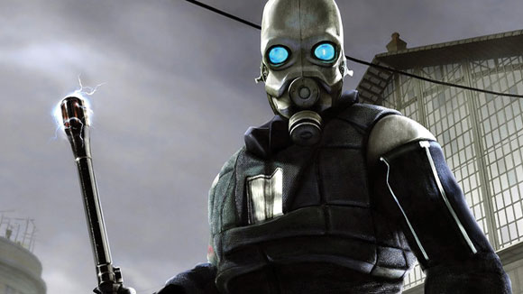
The Combine is a ruthless alien race that has come to Earth to bleed it of its natural resources. In Half-Life 2's levels, you see their machines literally 'eating' the unnamed Eastern European city it's set in. Black, angular, metallic structures stick out of buildings, grinding and whirring as they devour the environment around them.
This clash of spartan, functional Eastern Bloc architecture and abstract alien machinery makes the dystopian setting feel oppressive and uneasy. The Combine themselves all look different, as, according to the story, they're enslaved members of a variety of different alien species. Their designs are just as menacing as their monstrous technology.
Alien invaders are almost always based on Hollywood films, which makes them feel familiar, and not very interesting. Half-Life 2 art director Viktor Antonov instead dreamed up something totally unique, and it makes them feel genuinely intimidating.
Half-Life 2 designer view
Viktor Antonov, art director on Half-Life 2, says: "I started as a conceptual designer and just doing drawings, but the designs I received were not quite what I wanted. So I went to the team and literally sat behind the model makers and engineers and explained to them what I wanted from the art and design, and my ideas were finally realised in the final product. City 17 has many symbolic elements. The feeling is of an occupied city – in this case, The Combine. It also has allusions to communism, globalisation, and a hint of fascism."
17. Link's shield – The Legend of Zelda
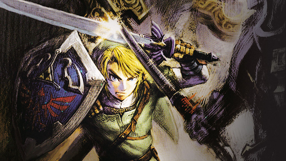
In each Zelda game, the Link you play as is a different character. But like in the Assassin's Creed series, it's the costume that connects them. The green tunic, cap, and shield have become not just video game icons, but modern pop culture ones too.
The design is always slightly different, but there are a few constants: the bold blue colouring, the triangular yellow 'Triforce', a story element that is threaded through each game, and the stylised silhouette of a bird is also apparant.
Link's outfit is arguably as recognisable as Sonic the Hedgehog, or Super Mario, and just as culturally significant in the world of video games. Even though the character has developed, and the textures have become more realistic, the shield is always recognisable, and has been largely the same since the first game was released in the late 1980s, much to gamers' delight.
The Legend of Zelda designer view
Shigeru Miyamoto, creator of The Legend of Zelda, says: "Studio Ghibli's My Neighbor Totoro impressed me with what they did with the style. That's something I like to look at, to see something within an existing media that is creative and different. That's what we try to do with the design of our games, to take something people have seen and try to do something new with it. It's when you're really able to do something revolutionary within a media that's existed for some time that I think you're able to startle people."
18. The ships – WipEout
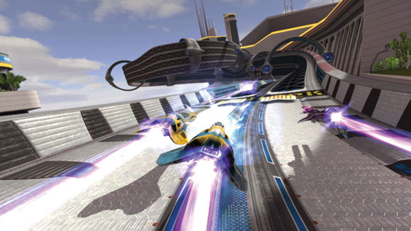
Developed by Psygnosis, in collaboration with The Designers Republic, WipEout was aimed at the trendy, club-going youth of the mid '90s. It had a cutting edge art style, that still stands up today, and a 'banging' soundtrack by acts including The Chemical Brothers. The visuals perfectly captured the cultural zeitgeist of that era.
Inspired by Nintendo racers like F-Zero and Mario Kart, the team wanted to make a fast-paced racing game with a distinct visual style. The result were the anti-grav ships that are still featured in the series today. As a testament to the quality of their design, they've barely changed since 1995, and still look notably futuristic.
After the success of WipEout, The Designers Republic enjoyed over 10 years of success, working with respected electronica record label Warp, and various other companies. They sadly closed their doors in 2009. More developers are hiring external artists to design certain elements of their games, be it visuals, or music. It's a smart way of bringing an original feel to a project that isn't used nearly enough.
WipEout designer view
Ian Anderson, founder of The Designers Republic, says: "With WipEout we were already given a target market, so we were playing the consumerist game. But the fun part was that we had a choice of deliberately going for them, or deliberately trying to alienate them."
19. The city – Mirror's Edge
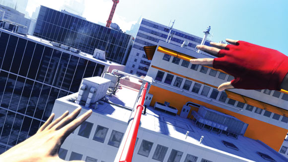
Dystopian cities are usually bleak, rain-soaked places, but Mirror's Edge is the exact opposite. The city, which is never named, is a gleaming urban paradise. Clean, bright, and safe. Or at least, that's what its brainwashed citizens think.
The game sees you playing as Faith, a courier and free-runner who's rebelling against the city's tyrannical rulers. The stark primary colours and hard lines of the city actually figure into the gameplay. As you dash across the rooftops, certain parts of the scenery are coloured and stand out from the cold whiteness of the city, letting you know you're able to use them to climb on. It's all about finding the perfect 'line' through the city's architecture.
While the textures are detailed and the city looks realistic, the vivid contrast of colours makes it feel more like a comic book. The designers at DICE took a common setting – a modern cityscape – and made it feel completely original through strong visual design.
Mirror's Edge designer view
Manuel Llines, producer on Mirror's Edge, says: "The art and gameplay came together a lot. We needed an environment that was easy to read, we needed a story that was believable. I think believability is the key word with this game. The city is contemporary: we had inspirations like Dubai and New York and Tokyo – all sorts of places. And yes it's a futuristic society but it's not Orwell, it's not 1984. It's a city where people are happy."
20. Sackboy – LittleBigPlanet
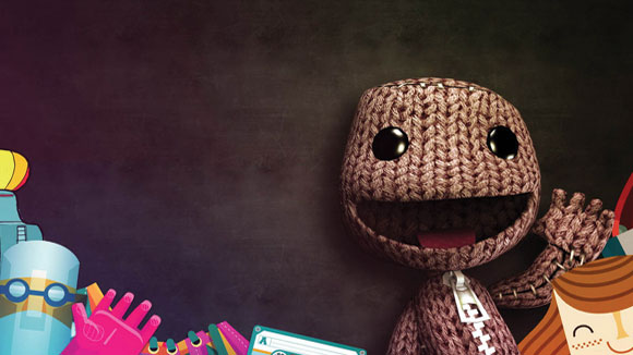
LBP is a game built around creativity. Using an imaginative and complex toolkit, you can make anything from games and movies, to interactive art exhibits. To reflect this idea of freedom and creation, developers Media Molecule created a mascot that was, essentially, a blank slate. Sackboy is a canvas for the player's imagination.
When you start the game he's completely featureless; a smiling ball of burlap material with a chunky zipper running down his middle. But then you can go in stick things on him, dress him up, change his material, and generally make your mark. It's a good example of character design directly complementing gameplay.
LittleBigPlanet designer view
Kareem Ettouney, designer at Media Molecule, says: "We came up with a crazy concept. Maybe the place where you go to create stuff in the game is actually in yourself. Let's put this zip on Sackboy, and when he opens the zip, folds in on himself and goes and creates inside himself. Because creativity and ideas are all inside you!"
Related articles:
