You might think the best infographics consist of plain graphs and diagrams, but to truly engage an audience, design is your secret weapon. These handy visual aids are all about making data, timelines and facts into something engaging and digestible, and it takes a fine balance of clever illustration, simple copy and sometimes even motion graphics such as kinetic typography, to create a standout design.
When it comes to creating infographics, you're not limited to a creative medium. While many designers will opt for graphic design software, handcrafted and illustrated infographics can have just as much visual impact. So, to inspire your next infographic project, here are some of the best eye-catching infographics.
01. Baby names
We're starting our list with this playful infographic from designer & data scientist Karim Douieb. Blending data analysis with slick kinetic typography, Douieb's website creates a shapeshifting graph, that shows how popular your name was throughout the decades.
Playfully using the letters of the given name, the dynamic visuals are a perfect example of simple, stripped back infographic design that's both informative and interactive. "This was an experiment combining typography and data using variable fonts. Each letter's height reflects the name's yearly popularity, turning trends into a micro-visual story. It's amazing how fonts can bring data to life!" Karim explains on Bluesky.
02. World's Most Popular Artist
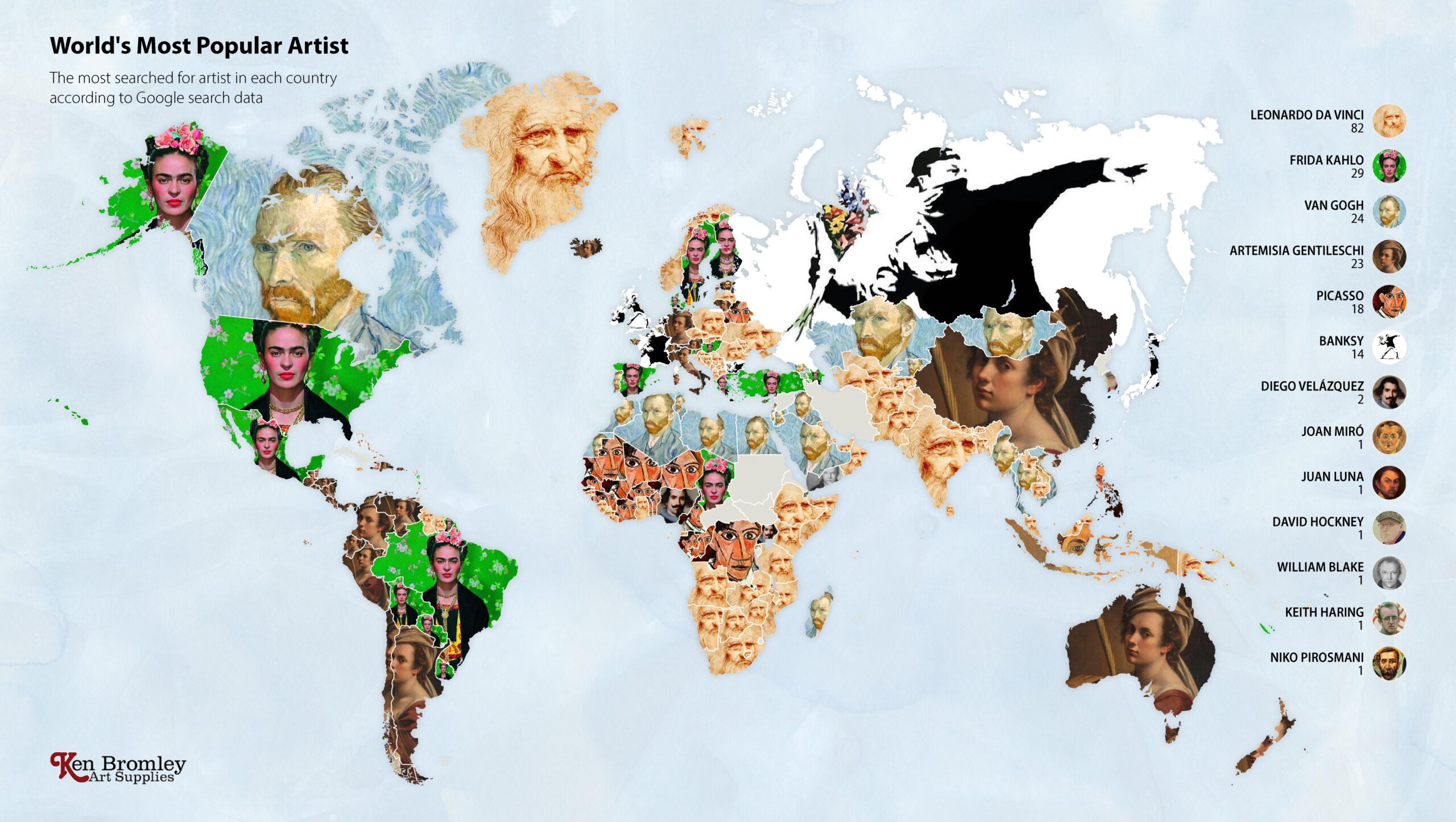
Who is your favourite artist? Frida Kahlo, Van Gogh, Banksy... the possibilities span countries and eras. But have you ever wondered if your passions lie with the same artist as other art fans in your country? This set of art-based data visualisations, created by Ken Bromley Art Supplies, are some of the most beautiful we've seen.
03. Species in Pieces
This stunning interactive site was created by Amsterdam-based designer Bryan James, who used CSS animation capabilities to create a platform to raise awareness of endangered species around the world. His “In Pieces” interactive catalogue of 30 animals is an innovative example of how animation can be used to not only help transform information but also act as a call to action for positive change.
04. How to build a human
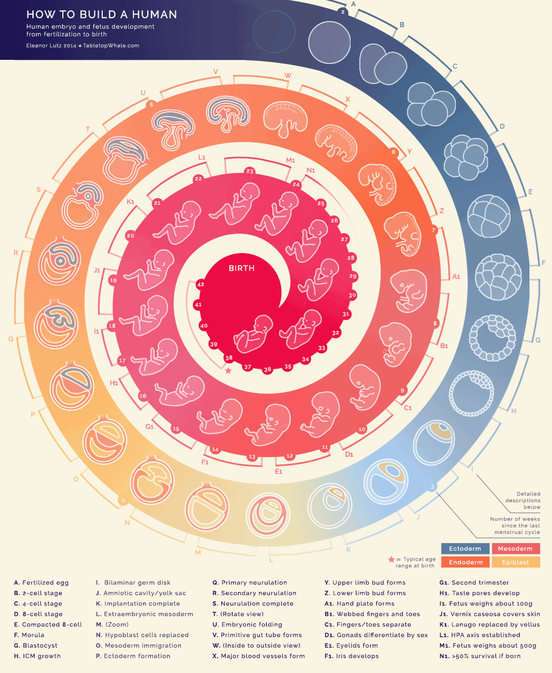
Within the static structure of a swirl, complete with markers for each month of pregnancy an embryo grows into a fully formed baby at birth in the centre. This animated infographic by Eleanor Lutz, is made up of 44 animations of nine frames each, totalling 396 sketches to produce this embryogenesis gif.
05. Font Psychology and Pop Culture

What effect does your font choice have on your audience, psychologically? That’s what this design, produced by Venngage, sets out to explore by reference to some of the most popular Netflix shows of recent years. From The Crown to 13 Reasons Why, what does each show’s typography say about their viewers, and what moods, genres and trends do they highlight?
06. History of Life

What better way to explore a world than by exploring our own world, and this is one of the best infographics to do so. Created by Juan Martinez, it defines each geological era of planet Earth, the changing shape of the land continents, and includes timelines, life milestones and mass extinction events.
07. A Stranger to Words

Dyslexic Artist Meng Chih Chiang created this data visualisation graph, which explores her own world of language. The fascinatingly complex infographic expresses the curve of her personal learning experience as she encounters language in her day-to-day life.
08. 50 years of Doctor Who
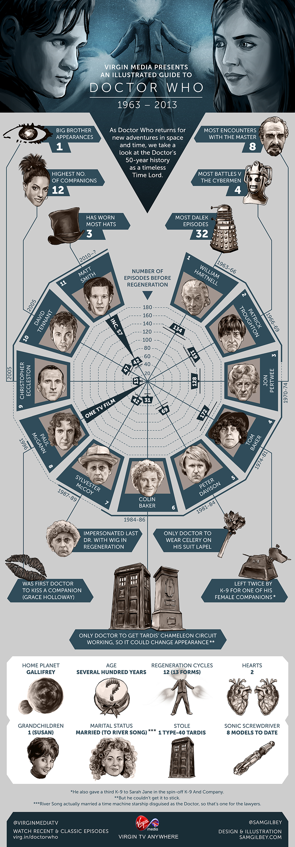
Illustrator Sam Gilbey has produced some of the best pop-culture infographics over the years. And we particularly loved this design, commissioned by Virgin to mark the 50th anniversary of Doctor Who back in 2013.
There have been a number of new Doctors since, of course, including ones sneakily retro-engineered by the writers into the show's existing canon. But for anyone new to Who, it gives a good overview of the first five decades of the show; and for die-hard fans, it's a lovely look back at an era when Doctor Who continuity was relatively straightforward.
09. Oddity Viz
The winner of an Information is Beautiful award, Valentina D'Efilippo's creative visualisation of the iconic Bowie track Space Oddity contrasts Dorothy's expansive genre-spanning creations by opting to go narrow and deep instead.
D'Efilippo worked with researcher Miriam Quick to gather data about the track, which she then visualised as a series of ten 12-inch discs, each of which deconstructs the track in a different way: according to melodies, harmonies, lyrics, structure, story and more.
10. Terms Designers Get Wrong
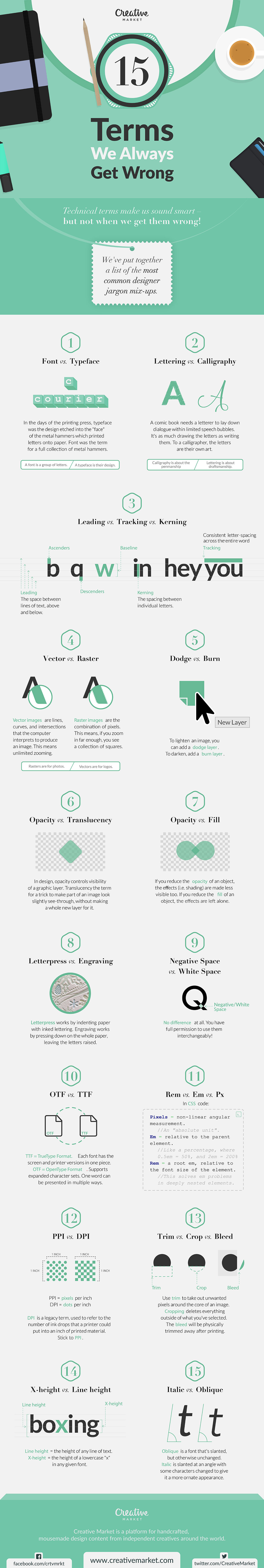
Jargon is a fact of life whatever profession you belong to, but the best infographics can help make the confusing clear. Which is why Creative Market produced this handy guide to the word and phrases that most commonly get mixed up. So whether you get unsure about opacity and transparency, vector and raster, or leading, tracking and kerning, this infographic has you covered.
11. Hip Hop infographic

Design studio Dorothy has carved some of the best infographics in poster form. Its designs often chart the many complex connections between entertainment genres and sub-genres, and are perfect for any superfan to display on their studio walls.
Stand-out examples include the 'blueprints' series, exploring the history of hip hop, showcased here; alternative and electronic music over the decades; the 'colour wheel' series, dedicated to the colour palettes of movies, books and music; and 'star charts', which map the relationships between seminal films, actors and directors.
12. The 10 Commandments of Typography

This infographic from Evan Brown at DesignMantic type nerd's dream. If you've ever found yourself aimlessly scrolling through lists of the best free fonts, this cheatsheet will help you refocus your search by providing some key rules.
13. An Analysis of The Beatles infographic
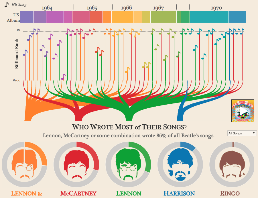
This interactive creation is one of the best infographics we've seen to analyse the Fab Four. It breaks down their career by year and by album and providing plenty of insight into who wrote what, which Beatle had the biggest vocabulary (hint: it wasn't Ringo), what most of their songs were about, and much more.
14. SWANH.NET

The best infographics go the extra mile, but this one goes the extra light year! Swiss illustrator Martin Panchaud has adapted the original 1977 Star Wars film, A New Hope, into a 123-metre-long animated wonder. Created in Illustrator CC, using 157 pictures across 22 separate files, it took him over a year to produce.
15. 30 Life Skills Every Functioning Adult Should Master

Do you consider yourself ‘grown up’ yet? If the answer’s yes, then maybe this infographic from Business Insider will make you think again. It runs through 30 of the most important traits every adult should have under their belt, from being able to mend your own clothes to speaking a second language. If like us, you haven’t mastered all of these yet, don’t let it stress you out, but use it as a handy motivational tool to improve your life.
16. 9 Productivity Mistakes you're Making in the First 10 Minutes of Your Day

The first 10 minutes of your day can make or break it. This clear and engaging infographic from Impact uses bold illustration to tell you how (and how not) to use those minutes to boost your productivity for the day ahead.
17. Should I Work for Free?
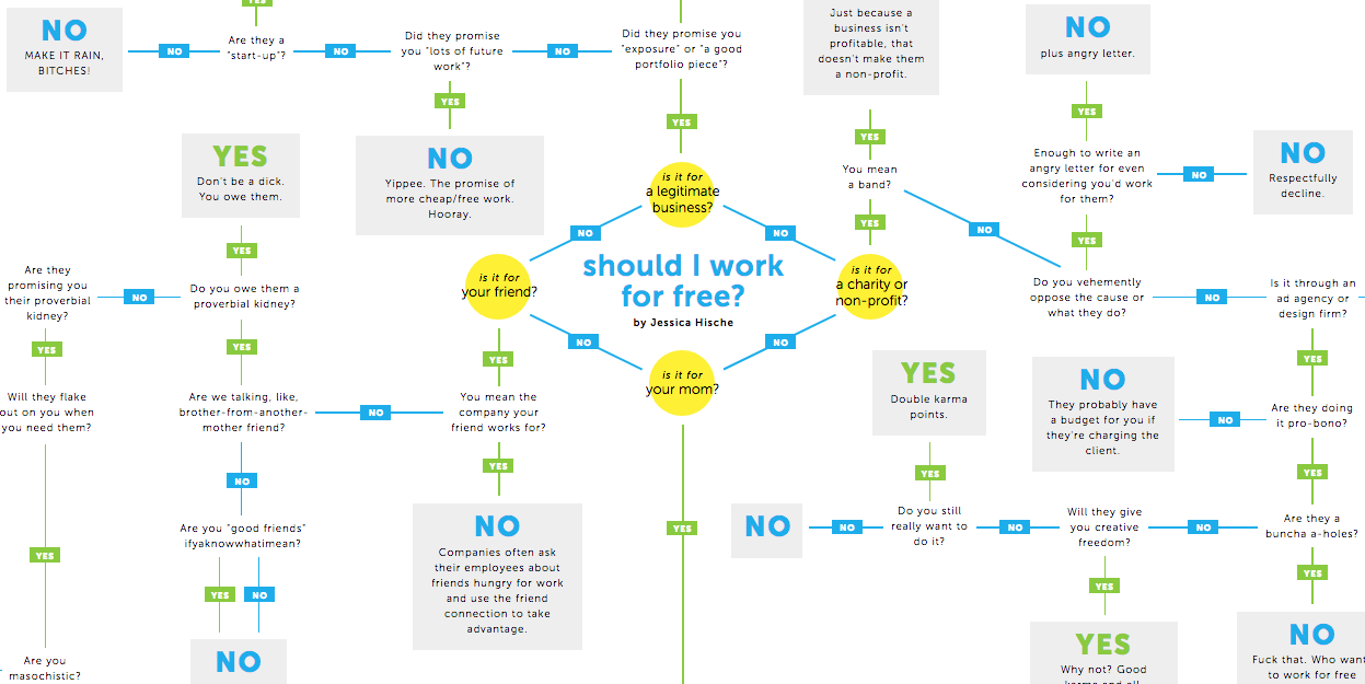
One of the best infographics to ever go viral, this tongue-in-cheek creation by Jessica Hische is every bit as relevant today as when it was created in 2011. It uses the classic flowchart method to address all the possible perspectives on this notoriously thorny and divisive issue, and is built using live text in HTML and CSS to enable translation into any language. If you'd prefer it in a more traditional format, however, it's also available as a letterpress print.
18. Gender Pay Gap by EU Country
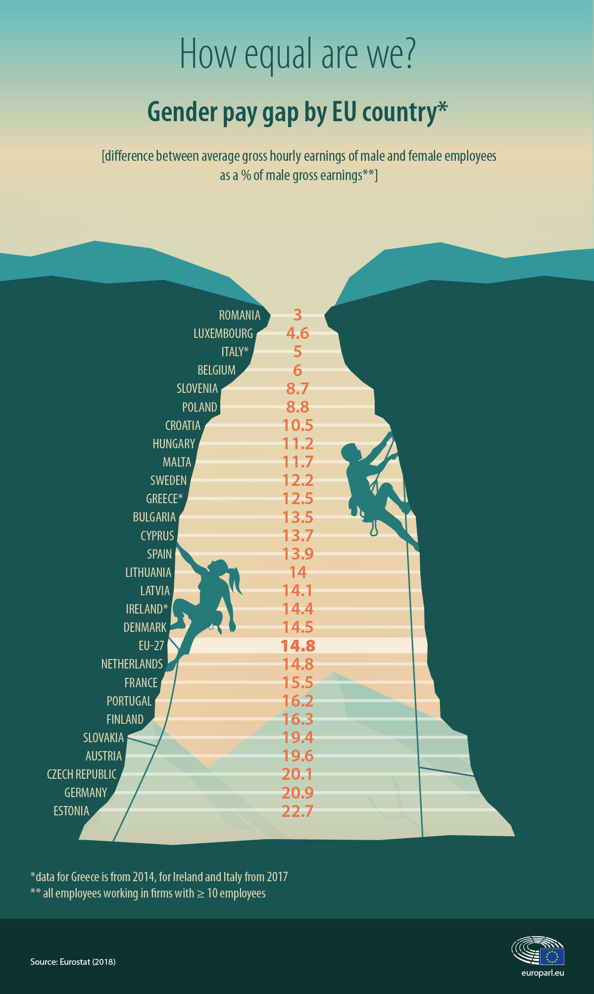
The best infographics can bring dry statistics to life, and bring out the main theme in one knockout visual punch. This great infographic from the European Parliament, focusing on the inequality between men and women in the labour market, uses simple but effective illustrative device to achieve just that. (That said, as the accompanying text makes clear, a narrower pay gap does not necessarily mean more equality; but that’s a whole other article...)
19. Desk Exercises for Designers
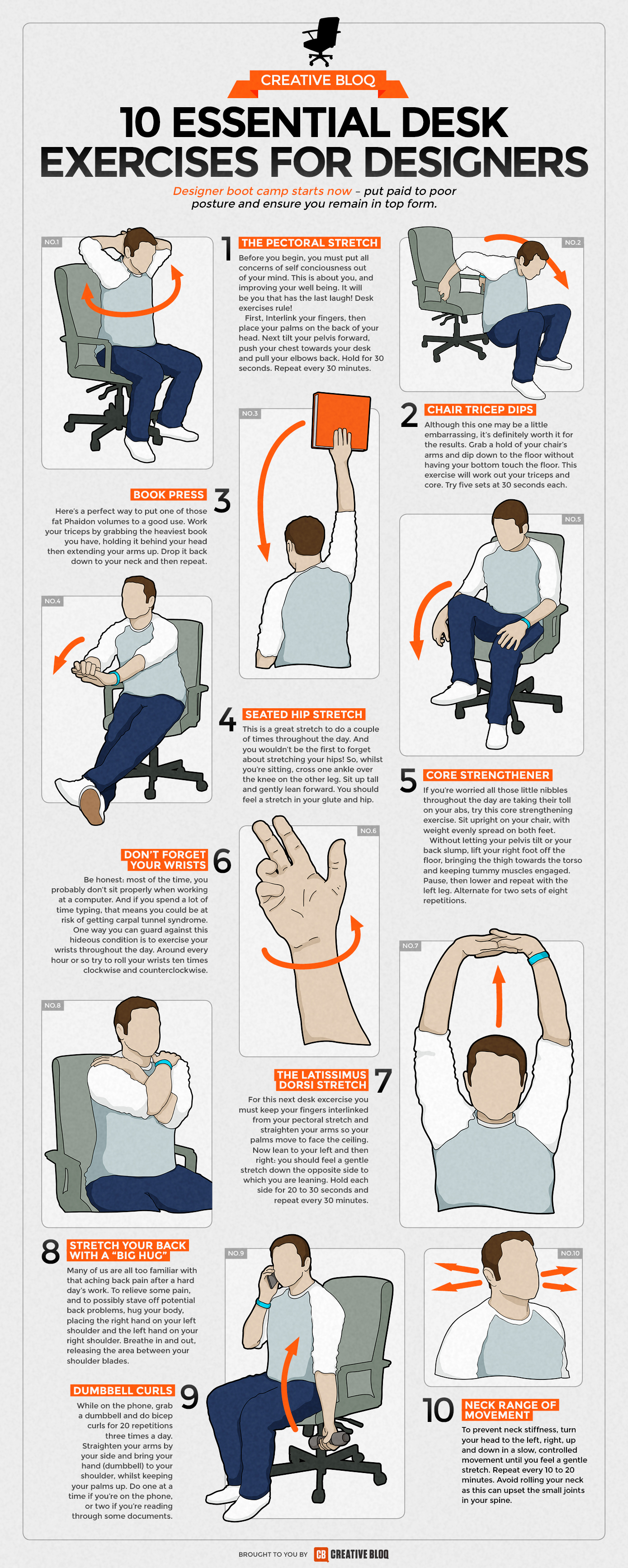
Are you reading this slumped at your desk? You're probably not doing yourself any favours, posture-wise. Sort yourself out with this guide to 10 exercises you can do right at your desk, compiled by us and illustrated by Simon Middleweek. See our post on the desk exercises infographic here.
20. Left vs Right
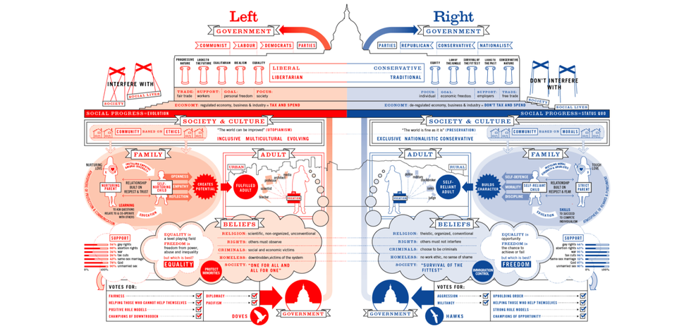
Information is Beautiful is a treasure trove of gorgeous infographics, and this one by David McCandless & Stefanie Posavec shows how the left and right are broadly defined around the world. We think it's a great way of distilling this complex ideology in just a few images.
21. A World of Debt

Whenever you hear about government debt, the figures are always so astronomical it’s difficult to understand what any of it means in real terms. Which makes this infographic from Visual Capitalist quite an eye opener. Visually comparing the amount of governmental debt owed country by country, you’ll probably be very surprised by the disparity in debt across the globe.
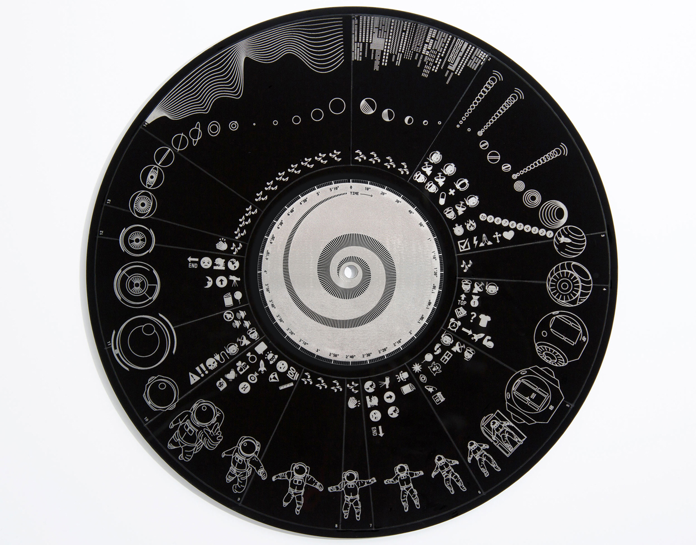
22. Apollo Missions

Winner of an 'Information is Beautiful award', which are given to the best infographics, in 2017, Paul Button's stunning visualisation of the Apollo missions charts every manned rocket flight by year, distance and path travelled, as well as which astronauts were on board. It thus explains incredibly complex processes such as calculating different orbits, flight paths and landing zones in a simple, visual way.
23. Photography Cheat Sheet: Manual Mode Camera Settings
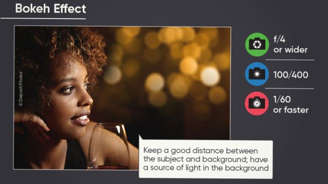
How many of us own expensive cameras, but don’t understand half of the buttons and functions they offer? If you're shooting using the automatic modes then you're probably going to end up with an uninspiring shot. So check out this infographic from Skylum, which explains the three most important things you need to know about manual camera settings: ISO, aperture and shutter speed.
24. Searching questions

Delayed Gratification magazine is full of interesting and beautifully laid out infographics. The one above shows what the world was searching online for during the height of the coronavirus pandemic from February to July 2020.
25. Chinese Social Media Landscape

This was illustrator Jessica Draws' first animated infographic. It was commissioned by China Blueprint Online to communicate the benefits of using Chinese social media in Australia, and it's both informative and super-fun.
26. The History of Art timeline infographic
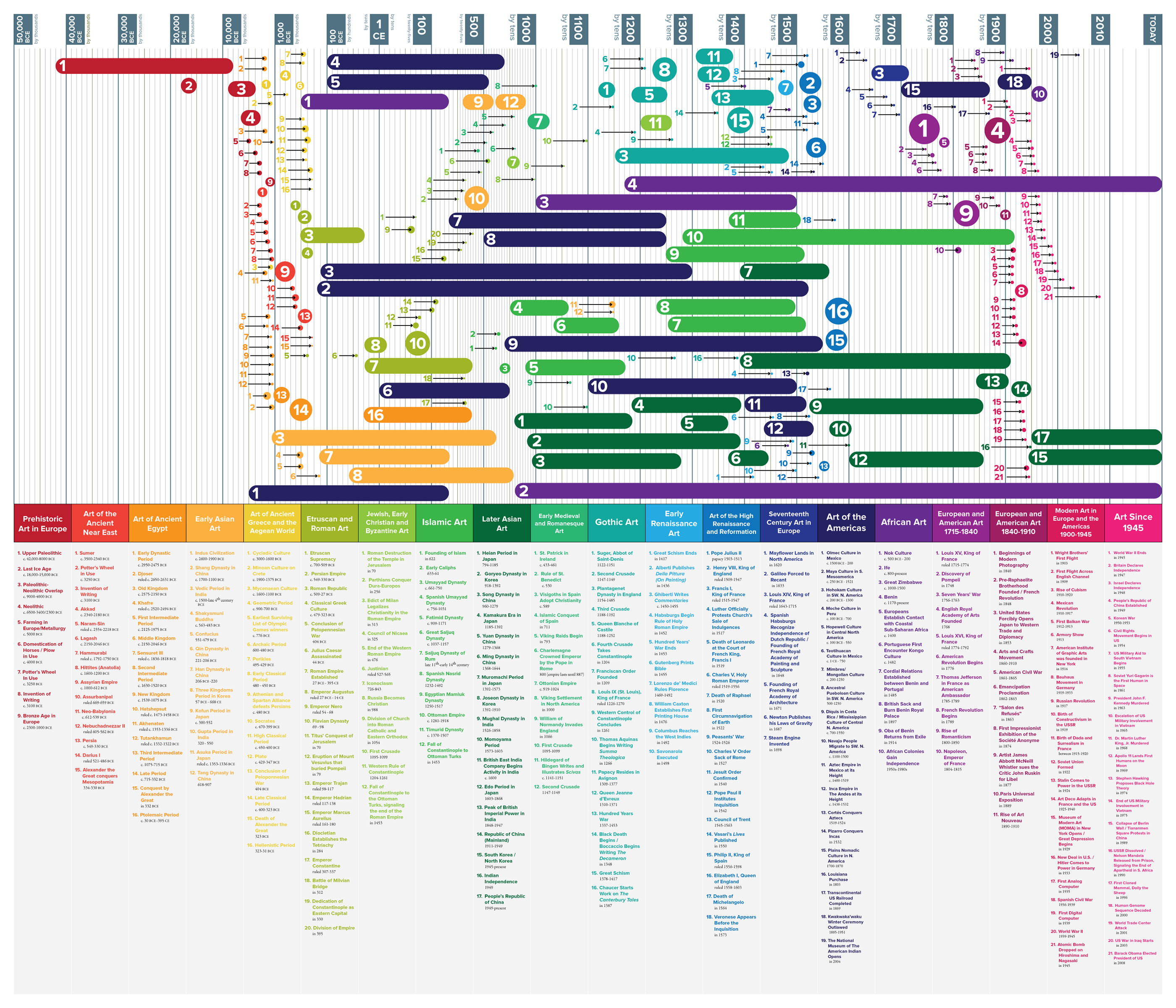
One of the best infographics showing a timeline, this design was created by Matthew Cobrin for an Art History class when he was an undergrad at The New England Institute of Art, Brookline, Massachusetts. We love its use of colour, bold lines, and fascinating subject matter.
27. All the World’s Metals and Minerals

It’s not traditionally something you would think about: what are the buildings we live in, the roads we drive on, and the products we consume actually made of? But in these times of enhanced environmental awareness, these are increasingly important questions, and they’re answered brilliantly in this eye-opening infographic from Visual Capitalist. Note, though, that you really need to scroll to the bottom to get the full impact.
28. Santiago Poster
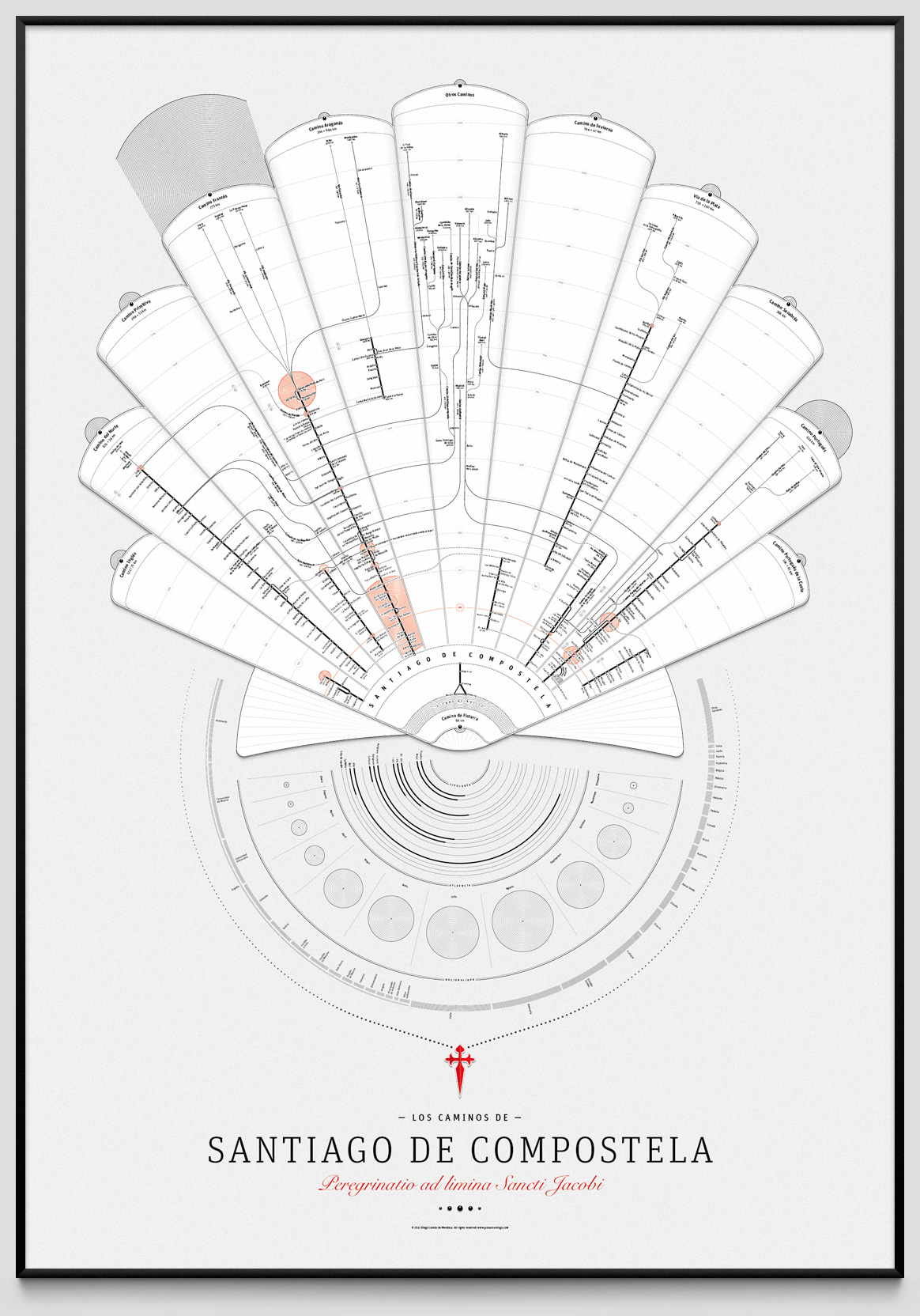
Santiago de Compostela is a city in Spain that's best known for being the culmination of the Camino de Santiago pilgrimage route. This infographic details the routes and identities of those who've journeyed to the alleged burial site of Biblical apostle St. James. It's available to buy as a poster.
29. How to use Colour and Typography in Marketing
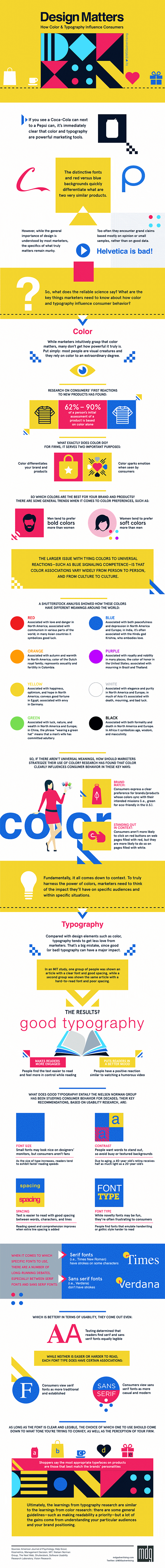
There’s a lot of talk about the cultural meaning of different colours and how this can be harnessed in marketing, but how much of it is actually true? This animated infographic by MDG Advertising sorts reality from myth, and provides a series of bite-size facts on the subjects of colour and typography in marketing.
30. How to Learn to Draw
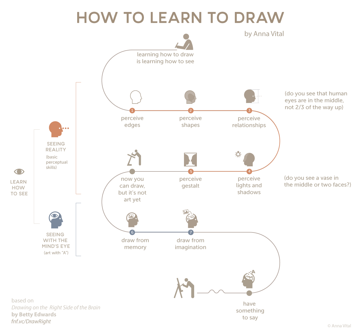
Anna Vital is the information designer behind Adioma, one of the best infographics tools around. And her infographic explaining how to learn to draw is a great example of the tool in action.

Thank you for reading 5 articles this month* Join now for unlimited access
Enjoy your first month for just £1 / $1 / €1
*Read 5 free articles per month without a subscription
Join now for unlimited access
Try first month for just £1 / $1 / €1