8 up-and-coming designers to watch from D&AD New Blood
We reveal our top picks from D&AD New Blood 2018.
Sign up to Creative Bloq's daily newsletter, which brings you the latest news and inspiration from the worlds of art, design and technology.
You are now subscribed
Your newsletter sign-up was successful
Want to add more newsletters?
Every year, D&AD New Blood Festival is inspiring and exhausting in almost equal measure. The vast Old Truman Brewery in London's Shoreditch plays host to top graduate talent from design courses from across the UK, creating a sensory overload of young creatives competing for the attention of the creative press, and agencies looking for that spark of potential in their next junior hire.
There's a lot to take in, and for the colleges themselves there's the difficult decision between giving a small, carefully curated selection of design portfolios room to breathe, and giving the whole course intake a shot at the limelight. Others put so much effort into an overarching 'concept' for the show, that the students themselves end up playing second fiddle and struggle even more to stand out.
Fortunately, we've spent a few hours at the show to do some of the hard work for you – read on for the eight talented grads that caught our eye in 2018...
Article continues below01. Christina Andrade

First up is Christina Dias Andrade, a Graphic Design graduate from Middlesex University who had two very different, but equally strong projects on display. The first, Bitter & Twisted, is an illustration-led branding scheme for a fictional brewery, inspired by the weird notion of 'beer cocktails'.
"I used old Victorian wood cuts found in books, and stitched together unlikely things to form the brand," explains Andrade. Ingredients are showcased within the quirky illustrations, which are applied across bottles, cans, packing boxes and more.

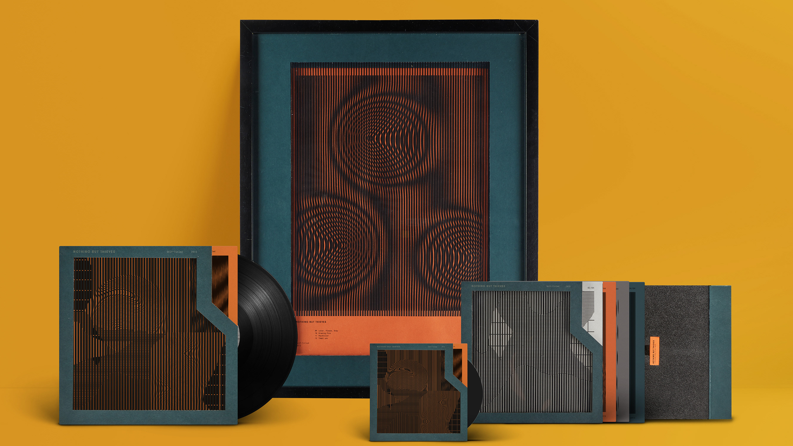
Andrade's second project is for self-titled album Nothing But Thieves, and incorporates a 10” vinyl cover, a 7” limited-edition box, a CD cover, and a promotional item. Inspired by a recurrent theme of the music of feeling lost, she used Kinegram animation techniques to create eye-catching illusions created by the listener's movement – whether walking past the promotional frame, or pulling the vinyl sleeve out of its box.
02. Elena Kidman

One of two Norwich University of the Arts graduates on this list, Elena Kidman studied Design for Publishing – and the brief for her final project was to design the layout for a new non-fiction book. She chose Sound, by Bella Bathurst – which gives a first-hand account of the deterioration of the author's hearing.
Sign up to Creative Bloq's daily newsletter, which brings you the latest news and inspiration from the worlds of art, design and technology.
Throughout the book, Bathurst makes specific references to the frequencies she is able to hear as her condition worsens. This inspired Kidman to translate the frequencies into graphic patterns, created by recording the shapes made in sand as sound is played at that frequency through a metal plate.

"I experimented with many different mediums, including watercolours, type distortions, photography and even page manipulations, such as tearing," she explains. "Then I re-read a chapter that goes into depth about the science behind hearing, and how we rely on other senses. I decided to manipulate how the reader responds to the content, to help them empathise with Bathurst."
These patterns are printed in translucent white ink to interact with and distort the text of the book – a graphical representation of the sounds that Bathurst can hear. The book concludes with Bathurst having an operation to restore her hearing, illustrated with the only full-colour spread in the book.
03. Frank Coxon

A Graphic Communication & Illustration graduate from Loughborough University, Frank Coxon created this striking book cover for entry in the Penguin Random House Student Design Awards. “The brief was to reflect the book’s status as one of the great modern political allegories of our time,” he explains.
Coxon drew on various Constructivist and Futurist influences to depict a “dark and crude impression” of the Communist regime that the novel satirises. “I set the animals on stages to give it a theatrical appearance, creating movement with repetitive motifs to demonstrate mechanical lifelessness,” he adds.
04. Hannah McInally

Duncan of Jordanstone College of Art and Design had a strong illustration showing this year, and Hannah McInally is the first of two inclusions on this list. She had three pieces on display, two of which are shown above.
On the left is her attempt to capture the essence of the Roald Dahl classic Matilda, and on the right is a "boozy dog" illustration for use on a craft beer label. "My work is playful and explorative, never taking itself too seriously," she explains.
McInally places "geometric constrictions" on her pieces, with a view to creating "accidental but engaging outcomes" – a process that often requires a certain degree of trial and error, and redrawing the composition, to reach the desired outcome.
05. Libby Bond

Our second Norwich University of the Arts graduate is Libby Bond, who used admirable graphic restraint to explore the topic of 'fake news', and misleading headlines in particular, in a series of bold typographic posters.
"People have been conditioned to trust the press, but the line between honest journalism and fake news is blurring," she says. "The Sun, The Star and The Daily Mail are renowned for their over-exaggerated headlines. Although these headlines can be humorous, they can also be dangerous, leaving people misinformed."
Bond scanned headlines from those three newspapers, and then rearranged key words and phrases into new, 'fake' headlines – preserving the original typefaces. The results, which included 'Trump hired to work in Manchester nightclub' and 'May to quit after becoming Page 3 girl', were then screen-printed.
06. Louis Murphy-Hancock

Sometimes at graduate shows, an interesting kernel of an idea shows through in a piece of work, more so than the wow factor of its presentation. This was definitely the case with University of Central Lancashire (UCLan) graduate Louis Murphy-Hancock, who had two projects in display.
The first was a rebrand of the Slapstick Comedy Festival, which at its heart has a simple but versatile graphic device: a bowler hat, reminiscent of slapstick icons such as Laurel and Hardy and Charlie Chaplin, transformed into an exclamation mark. The project also features various animated versions of the full logotype, with the characters jostling and interacting in a typically slapstick fashion.

The second was a series of stamps to commemorate the 200th anniversary of Frankenstein: eight component parts of the monster's face to assemble together, using photographs from different movie depictions over the decades – with the perforations neatly representing the stitches that hold the flesh together.
07. Lauren Morsley

Our second Duncan of Jordanstone graduate is Lauren Morsley, whose character-led project Music Practice includes a large silkscreen print, a digitally printed book, and a collection of ceramic figures made from earthenware clay.

Morsley used the characters to represent genres of music, exploring how colour can be used to express aspects, such as genre, rhythm and volume. "The characters from different genres are illustrated practicing within the book, and then come together to collaborate and create music within the large print," she explains.
08. Rebecca Watt

Edinburgh Napier graduate Rebecca Watt chose to explore Type 1 Diabetes in her final-year project. "My younger brother was diagnosed when he was four years old, and has now lived with it for 11 years," she explains. "I wanted to use the knowledge from his day-to-day life to communicate how Type 1 Diabetics have no option but to live with this autoimmune disease 24/7, 365 days a year."
Aware that her close personal experiences of the condition might lead her to make references that the general public wouldn't understand, Watt was careful to test her ideas on as wide a range of people as possible. "This also allowed me to see where any confusion was in the understanding, and helped me pinpoint what areas really needed focus," she adds.
At the core of the project was a collection of 'paper foods', covered with nutritional information – including grams of fat, sugar, protein and carbohydrate – to show the constant need to keep track of your body's intake as a Type 1 Diabetic.
Read more:

Nick has worked with world-class agencies including Wolff Olins, Taxi Studio and Vault49 on brand storytelling, tone of voice and verbal strategy for global brands such as Virgin, TikTok, and Bite Back 2030. Nick launched the Brand Impact Awards in 2013 while editor of Computer Arts, and remains chair of judges. He's written for Creative Bloq on design and branding matters since the site's launch.
