Clever typography posters explain dyslexia
Origami meets typography to explore the learning difference in an innovative way.

Sydney, Australia-based dyslexia correction organisation Sydlexia has combined typography and clever poster layouts to create a piece of design that clears up some of the confusion surrounding the learning difference.
Created in partnership with branding and communications specialists BBDO Dubai, the branding campaign aims to challenge the misconceptions associated with dyslexia. Rather than treating dyslexia as a disability, Sydlexia wants to move the conversation towards treating it as a learning difference. And with this innovative paper art it hopes to capture the attention of a diverse range of people.

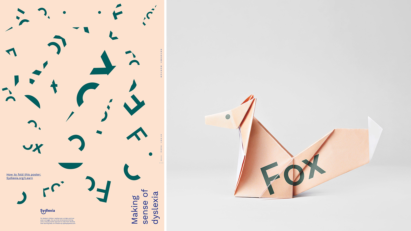
The campaign comes from the idea that people with dyslexia often report that they find written words to appear broken up and rearranged. BBDO runs with this angle by translating it into a visual design for posters based around fractured typography.
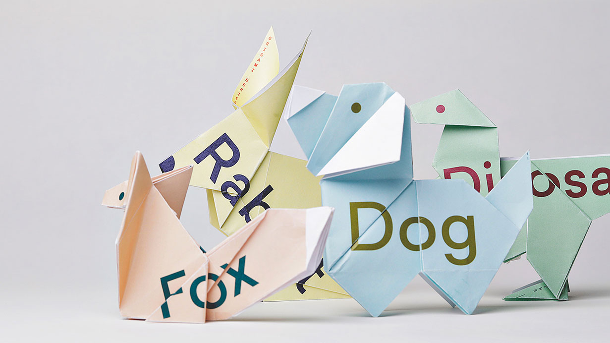
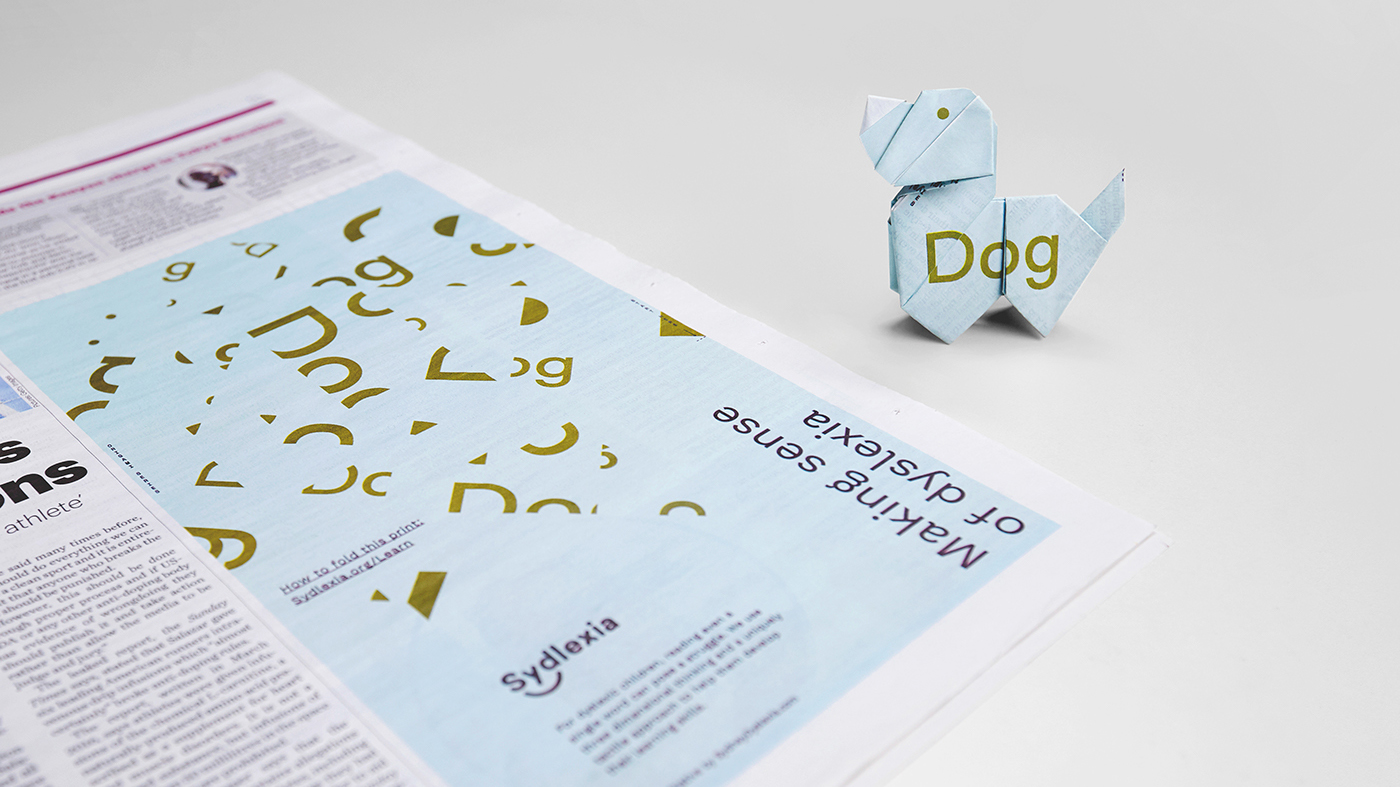
Article continues belowWords such as 'dog' or 'fox' are deliberately sliced up and jumbled to communicate how people with dyslexia see letters on the page. When looking at the posters, most people would struggle to piece together the words, but once they're folded together in a certain way into origami objects, the words become completely clear. Watch how the clever design takes shape in the video below.
The posters, which are being used as newspaper adverts and displayed on billboards, as well as online, double up as interactive learning tools. "Once folded correctly they help forge the connection of the word to the object it represents in the dyslexic mind," says BBDO Dubai.

With 1 in 10 people worldwide diagnosed with dyslexia, this campaign goes some way towards challenging preconceptions about the learning difference.
Topping off the campaign is an optimistic logo that ties together the name of Sydlexia and the scattered lettering present throughout the identity: linking together the d and s in Sydlexia is a smile icon that puts a positive face to dyslexia.
Sign up to Creative Bloq's daily newsletter, which brings you the latest news and inspiration from the worlds of art, design and technology.
Related articles:

Dom Carter is a freelance writer who specialises in art and design. Formerly a staff writer for Creative Bloq, his work has also appeared on Creative Boom and in the pages of ImagineFX, Computer Arts, 3D World, and .net. He has been a D&AD New Blood judge, and has a particular interest in picture books.
