Making of a modern classic: the Mobil logo
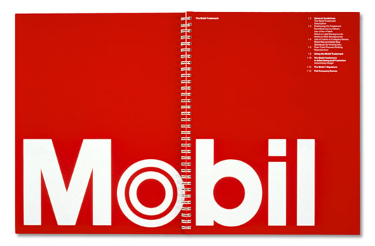
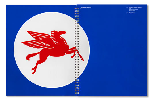
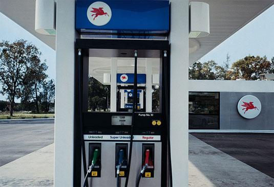
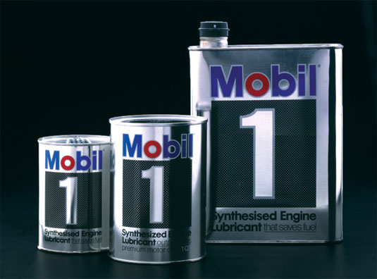
Design agency Chermayeff & Geismar & Haviv created the Mobil logo and developed its complete corporate identification programme. Check out how they developed this classic branding.
Logo designs often come and go, but some just seem timeless and it seems inconceivable that anyone would ever want to update them. The Mobil logo, created by Tom Geismar of New York design firm Chermayeff & Geismar & Haviv, is such a design.
Back in 1964, the agency was asked to develop a complete corporate identification programme for the fuel company, which had been in existence since 1911, with continuing consultation for 35 years. The agency worked with NBC, National Geographic and Harvard on the project.
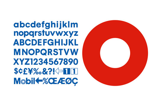
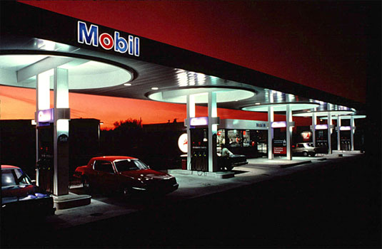
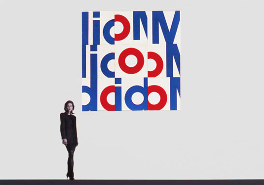
Once the new logo had been finalised, the agency began work on creating a specially designed alphabet (shown below) and a comprehensive design approach that integrated new graphics with architectural inspiration from Eliot Noyes.
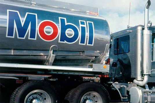
Article continues belowIncluding comprehensive branding designs for product packaging, vehicle markings, print material and posters, the branding has been placed on packaging, signs and more throughout the world. Instantly recognisable, the strong typography and patriotic use of colour evokes everything that Mobil wants to be.
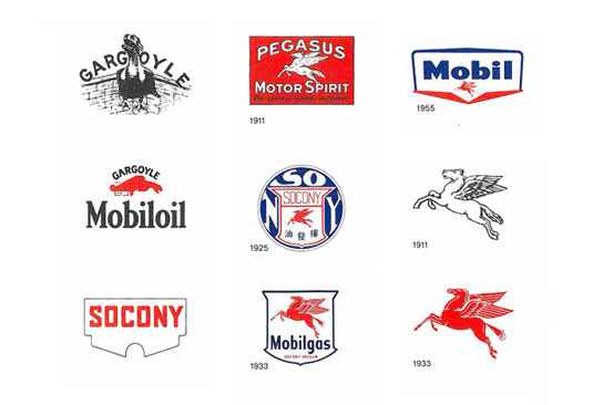
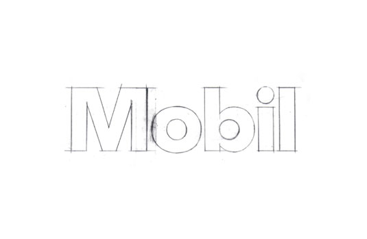

See more inspiring logo work over on Chermayeff & Geismar & Haviv.
Like this? Read these!
- The ultimate guide to logo design
- Our favourite web fonts - and they don't cost a penny
- Useful and inspiring flyer templates
What classic logo designs do you admire? Let us know in the comments box below!
Sign up to Creative Bloq's daily newsletter, which brings you the latest news and inspiration from the worlds of art, design and technology.

The Creative Bloq team is made up of a group of art and design enthusiasts, and has changed and evolved since Creative Bloq began back in 2012. The current website team consists of eight full-time members of staff: Editor Georgia Coggan, Deputy Editor Rosie Hilder, Ecommerce Editor Beren Neale, Senior News Editor Daniel Piper, Editor, Digital Art and 3D Ian Dean, Tech Reviews Editor Erlingur Einarsson, Ecommerce Writer Beth Nicholls and Staff Writer Natalie Fear, as well as a roster of freelancers from around the world. The ImagineFX magazine team also pitch in, ensuring that content from leading digital art publication ImagineFX is represented on Creative Bloq.
