Designers react to Wolff Olins' new Metropolitan Museum logo
We find out what designers have to say about the new logo for the New York Metropolitan Museum of Art.
Sign up to Creative Bloq's daily newsletter, which brings you the latest news and inspiration from the worlds of art, design and technology.
You are now subscribed
Your newsletter sign-up was successful
Want to add more newsletters?
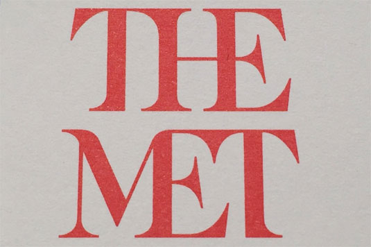
Wolff Olins, the agency behind the controversial logo for the 2012 London Olympics, has provoked another round of designer rage with its new logo design for New York's Metropolitan Museum of Art.
The redesign kicks out the museum's previous logo, a monogram based on a 16th century woodcut by a collaborator of Leonardo da Vinci's, and replaces it with a bold typographic treatment that merges flare serifs together and which has provoked nothing short of outrage.
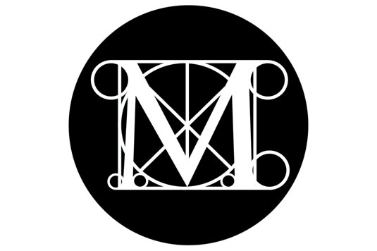
"The whole ensemble looks like a red double-decker bus that has stopped short, shoving the passengers into each other’s backs," says Justin Davidson in this Vulture article that's kicked off a Twitterstorm of designer fury, with respected designers including Miles Newlyn and Adrian Shaughnessy stepping up to voice their disapproval.
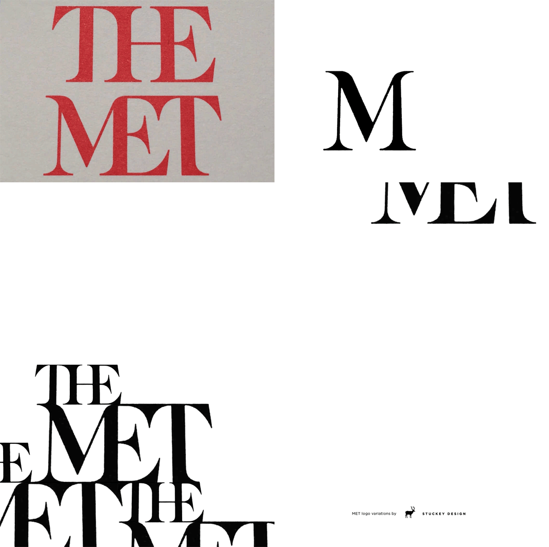
Article continues belowIt's not all incandescent designer rage, though. In a considered Facebook post, Wesley Stuckey notes that the shared stems and serifs of the letter forms are a basic design principle, but goes on to say: "The part that really irks me is the over emphasized 'THE' atop MET. This irritation includes the obscene amount of leading between the lines of type. If you are going to have a -100 kerning, you should balance that with -100 leading. Also, 'THE' should be at least half of the 'MET' in size relationship."
Bearing this in mind, he's quickly come up with his own treatment.
Other designers have been similarly thoughtful and pragmatic:
And at Wolff Olins, they're far from troubled by the reaction. "We think it’s great that people are talking about the work," a spokesperson told The Independent. "At Wolff Olins we always aim to create work that people feel strongly about."
Sign up to Creative Bloq's daily newsletter, which brings you the latest news and inspiration from the worlds of art, design and technology.
How do you feel about it? Let us know in the comments.
Liked this? Read these!
- How to become an art director
- Check out these amazing band logos through the years
- Get to grips with the golden ratio in this easy guide
- We reveal where to find logo design inspiration
- Can you guess the logo in this design quiz?
Jim McCauley is a writer, performer and cat-wrangler who started writing professionally way back in 1995 on PC Format magazine, and has been covering technology-related subjects ever since, whether it's hardware, software or videogames. A chance call in 2005 led to Jim taking charge of Computer Arts' website and developing an interest in the world of graphic design, and eventually led to a move over to the freshly-launched Creative Bloq in 2012. Jim now works as a freelance writer for sites including Creative Bloq, T3 and PetsRadar, specialising in design, technology, wellness and cats, while doing the occasional pantomime and street performance in Bath and designing posters for a local drama group on the side.
