New WBC logo hits the streets
To celebrate 50 years in operation, the World Boxing Council logo gets a new makeover.
Sign up to Creative Bloq's daily newsletter, which brings you the latest news and inspiration from the worlds of art, design and technology.
You are now subscribed
Your newsletter sign-up was successful
Want to add more newsletters?

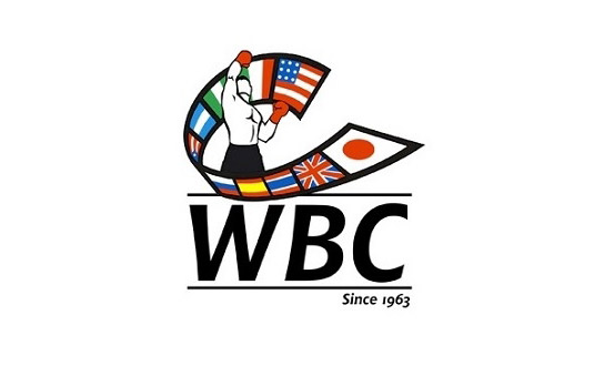
Yesterday, president of the World Boxing Council José Sulaimán unveiled the new logo for the WBC (above). The redesign comes as 2013 marks the organisation's 50th year in operation.
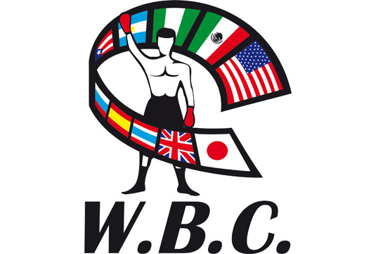
The new design is fairly similar to the one it precedes (below), featuring a male boxer amidst a belt of flags from various countries. But subtle changes altogether make it a much stronger design.

The new logo sees a new pose for the fighter in centre, which aims to express the joy of triumph and glory, as well as a new bold font. Sulaimán commented that the new look "is much more fresh, modern and able to convey feelings."
Article continues belowWhat do you think?
Like this? Read these!
- The ultimate guide to designing the best logos
- Illustrator tutorials: amazing ideas to try today!
- Download the best free fonts
What do you think of the new WBC logo? Let us know in the comments!
Sign up to Creative Bloq's daily newsletter, which brings you the latest news and inspiration from the worlds of art, design and technology.

The Creative Bloq team is made up of a group of art and design enthusiasts, and has changed and evolved since Creative Bloq began back in 2012. The current website team consists of eight full-time members of staff: Editor Georgia Coggan, Deputy Editor Rosie Hilder, Ecommerce Editor Beren Neale, Senior News Editor Daniel Piper, Editor, Digital Art and 3D Ian Dean, Tech Reviews Editor Erlingur Einarsson, Ecommerce Writer Beth Nicholls and Staff Writer Natalie Fear, as well as a roster of freelancers from around the world. The ImagineFX magazine team also pitch in, ensuring that content from leading digital art publication ImagineFX is represented on Creative Bloq.
