Does VH1's new logo fix its image problem?
The music and reality TV channel launches a new logo to explain its new brand identity better. But is it a success?
Sign up to Creative Bloq's daily newsletter, which brings you the latest news and inspiration from the worlds of art, design and technology.
You are now subscribed
Your newsletter sign-up was successful
Want to add more newsletters?
You may remember VH1, which originally stood for 'Video Hits 1', as a nostalgia-tinged, adult-oriented music video channel, an alternative to the up-to-the-minute pop and teen focus of MTV. If you haven't watched VH1 lately you may be surprised that, like MTV, it now features a mixture of music programming and trashy reality shows like 'Mob Wives' and 'Single Ladies'.

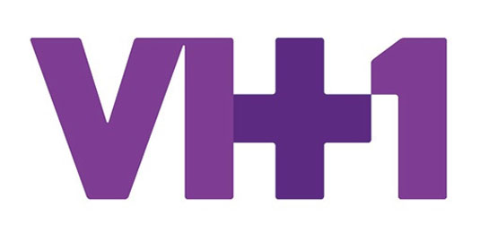
As a way of putting a positive spin on its apparent identity crisis, VH1's new logo design features a plus sign. This, the channel says in an explanatory video (below), signifies how VH1 has become "the ultimate mash up of music + pop culture + nostalgia".
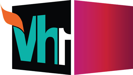
It's the first change to the channel's logo in 10 years, and greatly simplifies things, settling for a simpler, single-colour typeface that's a world away from the complex, mutli-coloured design of old (below).
Article continues below 
The new logo is now in use on VH1's website, and hovering your mouse over it brings the 'plus' to the forefront to ram the point home. Here's the promo spot to promote the channel's new identity and logo:
One issue may be that people will think the logo represents an entirely new channel called 'VH+1', which is separate from the main 'VH1' channel. That's exactly what two of us in the Creative Bloq office assumed on seeing the new logo - it will be interesting to see how many other people make the same mistake...
Now read:
- The 10 biggest logo redesigns of 2012
- The ultimate guide to logo design: 25 expert tips
- 5 top logo design resources
- Quiz! Can you name these 15 logos?
Is VH1's new logo a masterstroke of brand reinvention or a desperate sticking plaster over a muddled identity? Let us know your views in the comments below!
Sign up to Creative Bloq's daily newsletter, which brings you the latest news and inspiration from the worlds of art, design and technology.

The Creative Bloq team is made up of a group of art and design enthusiasts, and has changed and evolved since Creative Bloq began back in 2012. The current website team consists of eight full-time members of staff: Editor Georgia Coggan, Deputy Editor Rosie Hilder, Ecommerce Editor Beren Neale, Senior News Editor Daniel Piper, Editor, Digital Art and 3D Ian Dean, Tech Reviews Editor Erlingur Einarsson, Ecommerce Writer Beth Nicholls and Staff Writer Natalie Fear, as well as a roster of freelancers from around the world. The ImagineFX magazine team also pitch in, ensuring that content from leading digital art publication ImagineFX is represented on Creative Bloq.
