How iconic fantasy film posters were made
We relive the golden age of fantasy poster art, the 1980s.
Sign up to Creative Bloq's daily newsletter, which brings you the latest news and inspiration from the worlds of art, design and technology.
You are now subscribed
Your newsletter sign-up was successful
Want to add more newsletters?
There's a special kind of nostalgia that surrounds the fantasy and sci-fi films of the 1980s. Thanks to the impetus that Star Wars gave the film industry in the late-1970s, effects budgets grew and grew, but because CGI was a mere twinkle in John Lasseter's eye, the creatures and magic we witnessed were often handmade.
They looked tactile, and films like The Dark Crystal and Time Bandits felt lived in and quirky, more like real life than a cold computer screen.
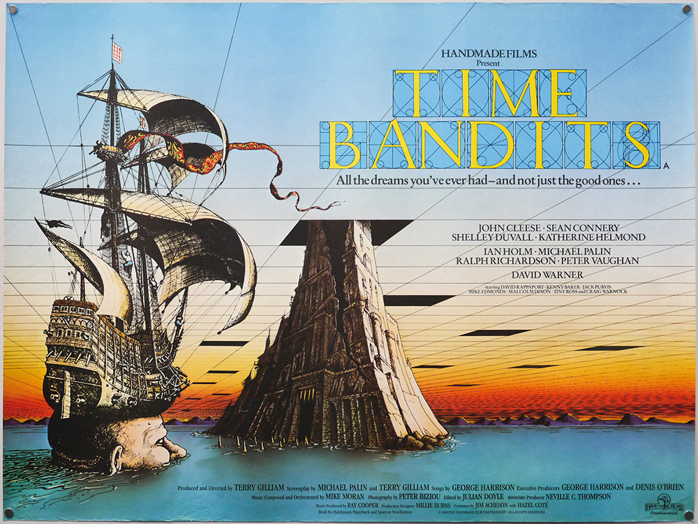
These were the days before Photoshop too, and the movie wallpapers and posters that enticed us into the cinemas were largely hand-painted. A whole crop of genius fantasy artists caught our imaginations with their pencils, ink and paint, with three-sheet or quad-sized posters going up around town whenever a new fantasy picture was on its way.
Article continues belowMore than that, our nostalgia is tweaked on a deeper, more psychological level. Fantasy films back then weren't just a distraction from boredom. Generation Y and hipster haircuts hadn't been invented.
Back then kids were worried. Reaganomics and Thatcherism were ravaging economies. People began to die of AIDS. Famines killed millions in Africa. And the Cold War promised mutually assured Armageddon.
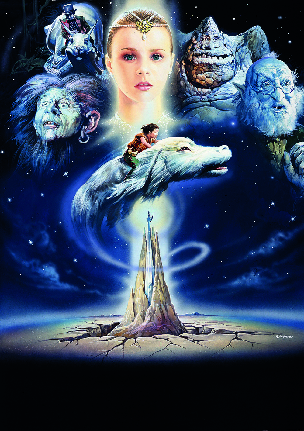
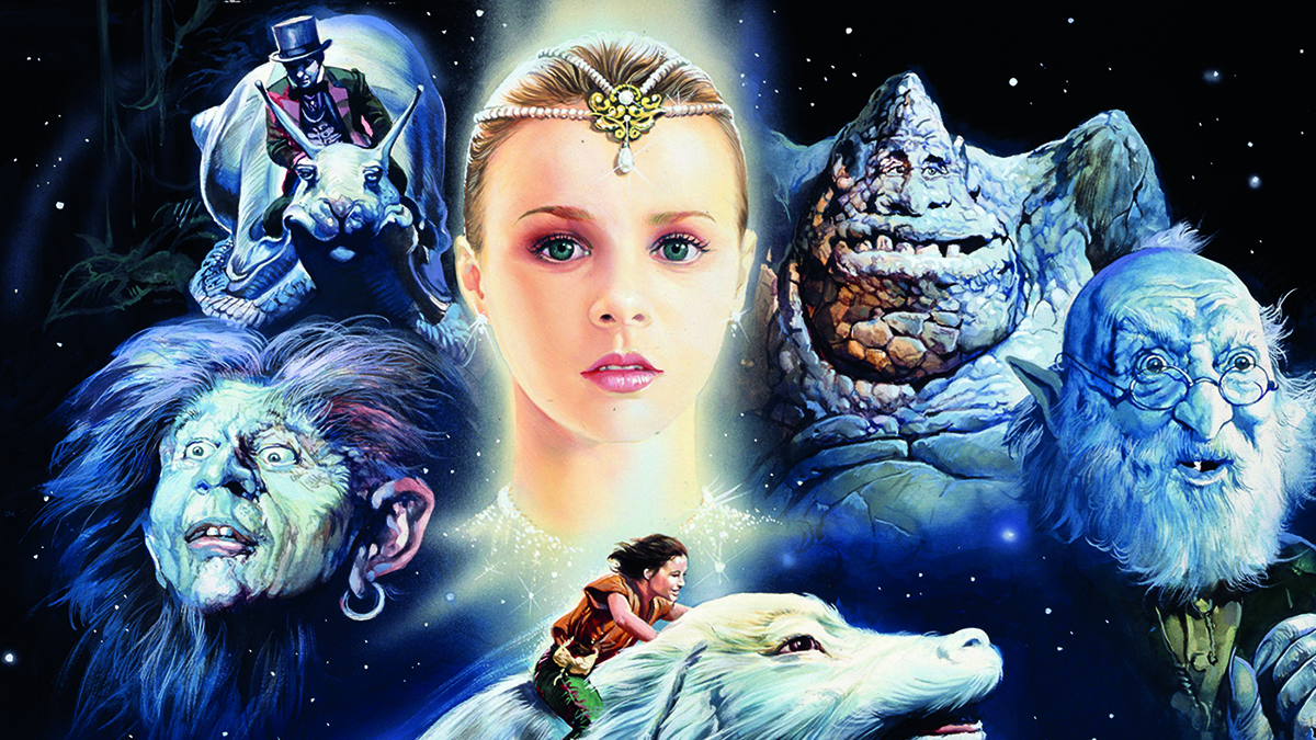
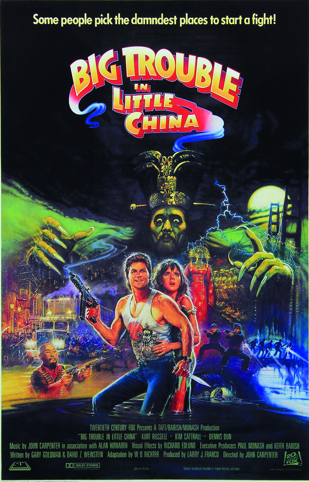
So we gazed at Brian Bysouth's posters for Willow and Big Trouble in Little China. We were beckoned by the peculiar-looking Falkor, the luckdragon, on Renato Casaro's poster for The NeverEnding Story.
Artists like John Alvin, Richard Amsel, Ted CoConis, Bob Peak and Drew Struzan gave us a gateway into imaginary realms.
Sign up to Creative Bloq's daily newsletter, which brings you the latest news and inspiration from the worlds of art, design and technology.
John Alvin was brilliant when it came to evoking a sense of mystery. John passed away in 2005, but his daughter Farah not only grew up alongside his work, but also appeared in it. You know the famous poster in which E.T.'s finger reaches out towards a human hand? She was a small child at the time, and that's her hand in the picture.
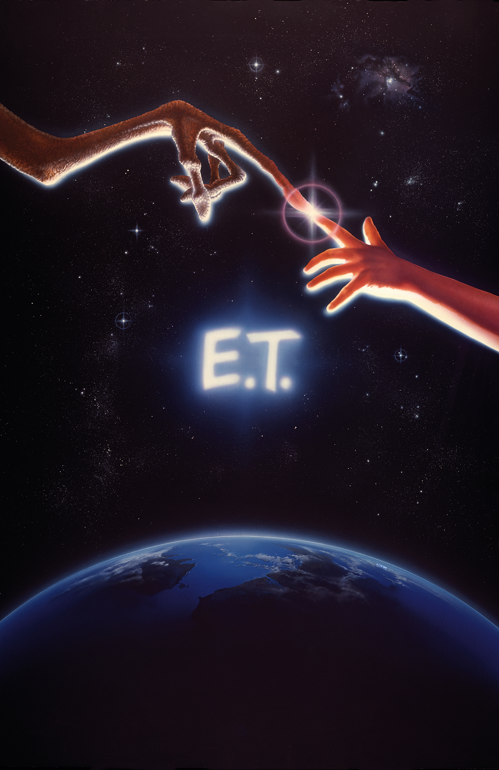
"Much of E.T. was kept top secret by the studio – not only the film itself, but what the characters and scenic elements looked like," she explains. "John was given a sketch of the alien's hand by a production designer to use for reference and then he took numerous Polaroids of my hand.
"He used these photos and the reference for the alien hand to create a composite sketch and then, ultimately, the painting we all know. The design concept, borrowed from Michelangelo, came from the studio. All of the aspects of light and colour were ultimately a product of his creativity."
Capture a film's heart and soul
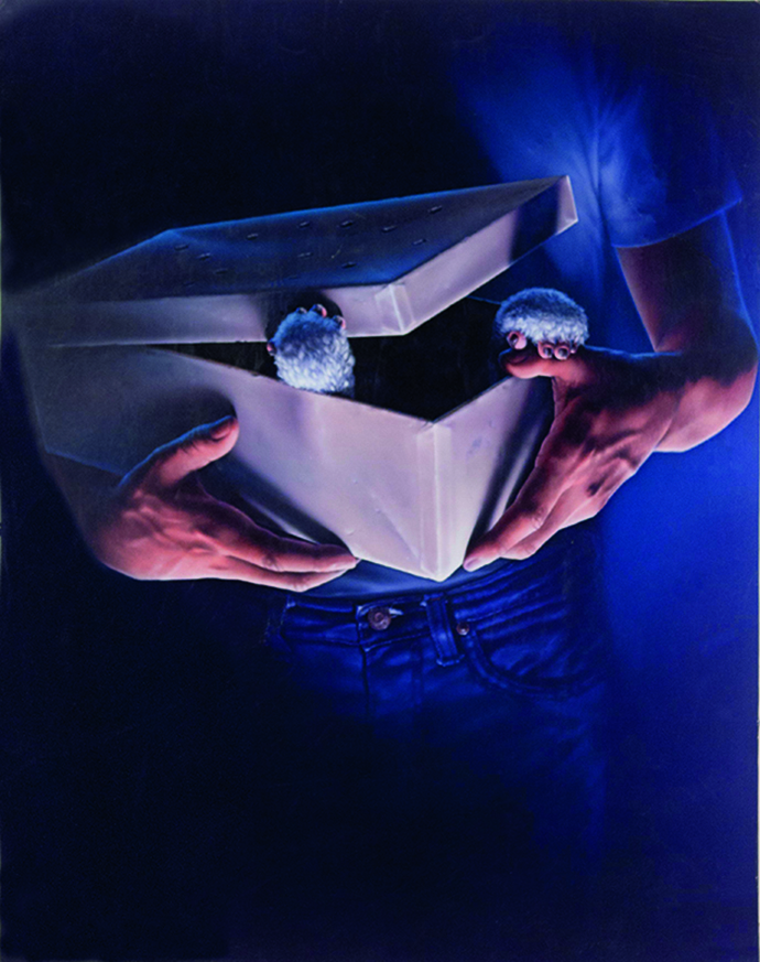
The Gremlins poster had to indicate that this cute creature had the potential to become horrible
John would often say that his job was "to create the promise of a great experience" and he worked on the concepts of the posters as much as their execution. The artist sought to identify the key elements of a film – its heart and soul – to convey in a single, emotive image.
With those little mogwai paws reaching out from under the shoebox lid, John's artwork for Gremlins is one of the most memorable of all time. "What was important about the Gremlins poster was to indicate that this cute, delightful creature had the potential to become horrible," explains Farah.
"But the film is sort of campy and scary, not gory, so I think he had to walk a very careful line and play up the mystery rather than the horror. You can't help but look at this poster and want to know what's in the box! That curiosity is, of course, the downfall of the characters in the film. So this poster reels you into the spirit and tone of the movie quite beautifully."
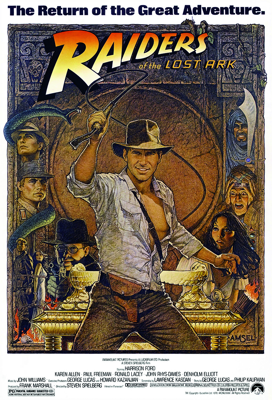
Generating intimacy with the observer is something a good painter can do if they have a unique style. Richard Amsel died of HIV in 1985, but his poster work for films such as Raiders of the Lost Ark, The Dark Crystal and Flash Gordon continues to resonate because the artist's hand is clear in the rendering of the images.
Adam McDaniel works in a film studio, and is an expert on Richard's art. "His use of pencils was extraordinary, as he'd draw in all sorts of frenzied directions, while maintaining control and getting the details just right," says Adam. "He was very gifted in capturing personalities, too; it wasn't enough to make something look photorealistic."
Intergalactic Kitsch
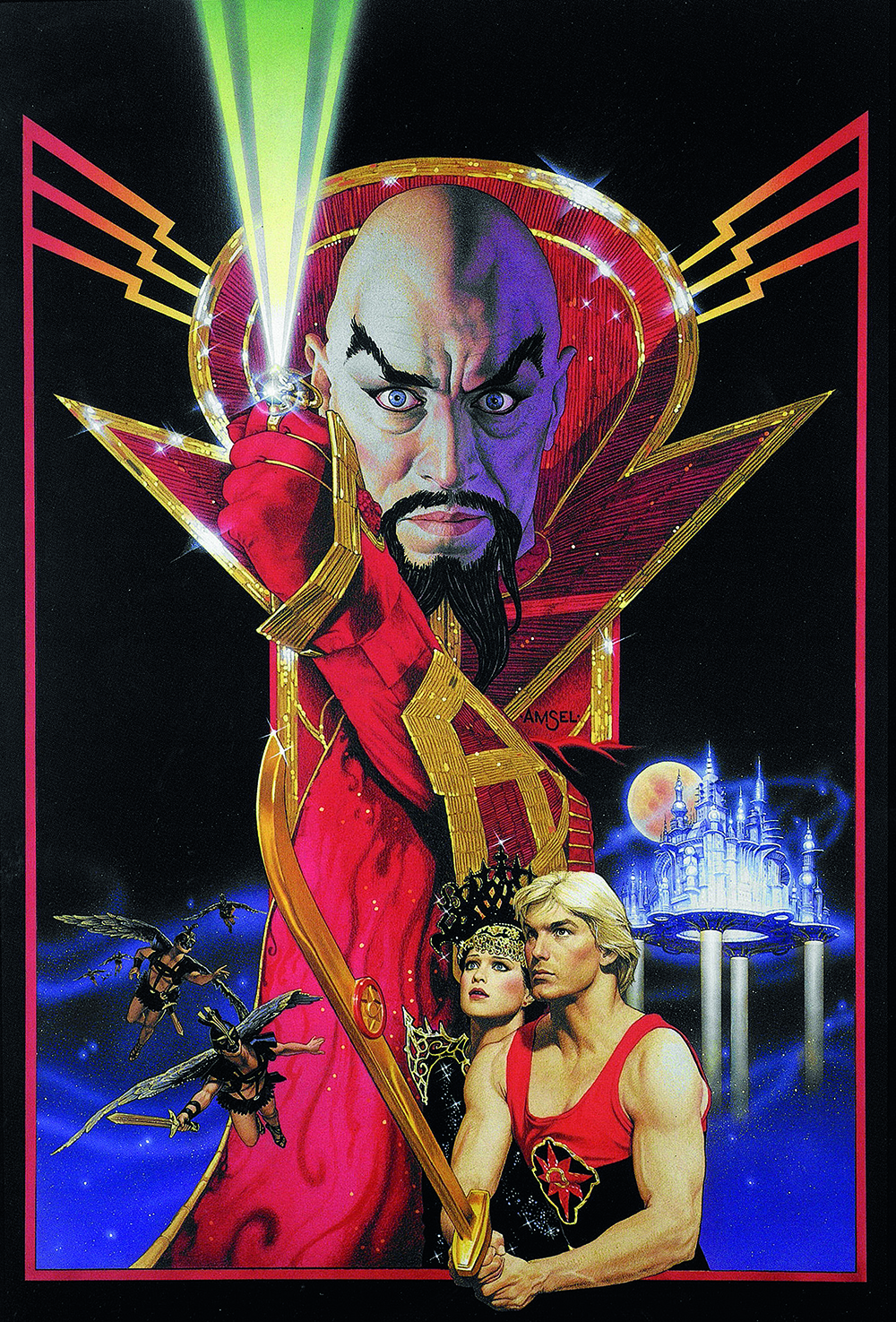
Richard's playful side came to the fore in his Flash Gordon poster. "The movie's called Flash Gordon, but it's Ming the Merciless who's front and centre, his penetrating gaze directed right at us, like a serpent ready to strike," says Adam.
"But the guy's got mascara on, wears a sequin dress, and has a sparkly ring of power. It's all wonderful, kitschy, 1930s sci-fi serials, as seen through the foggy vision of a 1970s glam rock concert. Richard wasn't out to make it look serious. He was in on the joke, and made the film look like the silly fun it was."
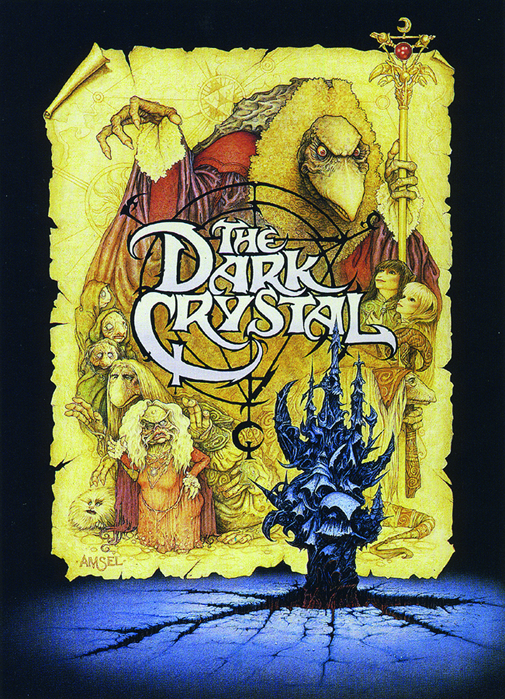
His poster for Jim Henson's The Dark Crystal is stunning, and was innovative at the time. He centred the work around logo art created for the film by Brian Froud, who also designed many of its creatures.
On one layer there's a piece of velum with a montage of strange characters. The castle housing the crystal and the broken landscape around it burst up from the bottom of the poster in front of the parchment. It speaks of mythology, legend, and a time long ago.
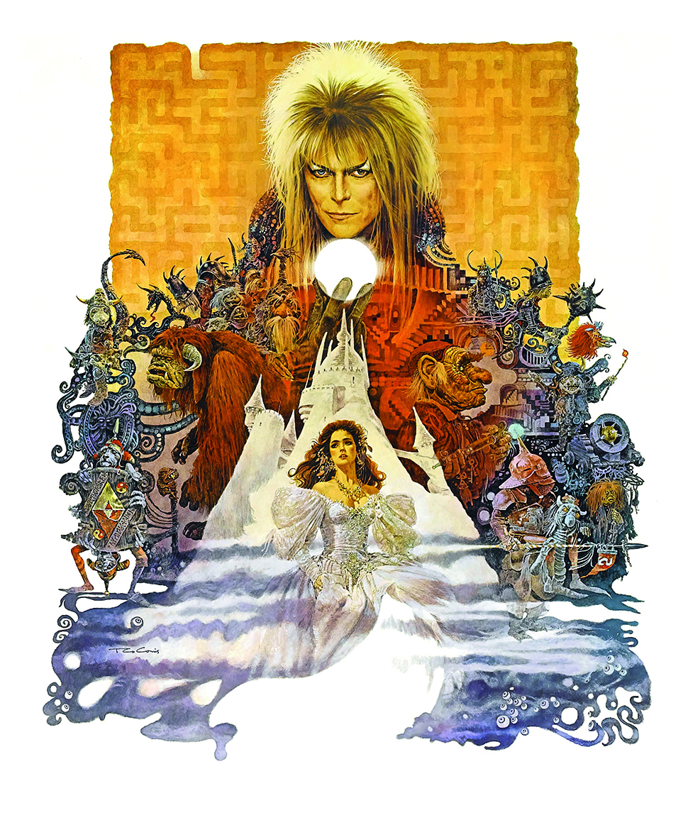
Jim Henson and Brian Froud also made Labyrinth together, and as with The Dark Crystal all the film's charm comes from its creatures and characters. This time, the artist Ted CoConis – who'd previously done posters for Fiddler on the Roof and Hair – was commissioned for the artwork.
Supplied with the idea of the Labyrinth and a logotype for the movie, the challenge for Ted was to bring the key characters together without it looking too complex. The film struggled at the box office, but its poster is iconic and today it has a cult following.
"Every single character is a work of art in itself: brilliantly conceived, masterfully constructed," says Ted. "In the end, Jim picked out a handful of key figures, and I was free to tie everything together with whichever ones worked best for the design.
"I was completely free to do whatever I thought would work best in terms of concept and design. The only client input – which I had to override – was their insistence that Sarah be portrayed in blue jeans. That was completely inappropriate for the look and feeling of the painting as well as the movie itself. She simply had to be wearing the gorgeous gown she wore in that fabulous ballroom scene."
Missing a touch of magic
Today, it's easy to see photos of the characters being montaged together, much like the posters for The Lord of the Rings films. But where would be the fun in that? Renato Casaro, who painted over 1,500 posters during his career, including those for The NeverEnding Story, believes that without the hand of an artist, today's posters are often devoid of that touch of magic.
"Hand-painted artwork died in the 90s," Renato laments. "To give you an idea of what we've lost, The Folkwang Museum in Essen, which is the most important poster gallery in Germany, organised a big retrospective including my movie posters.
"During the exhibition they invited graphic design students to transfer my artwork into Photoshop, and use elements of my artwork to create new posters. The results were unsatisfactory; they were unable to capture the special magic that you need in particular for movie posters."
How do we get some of that 80s magic back into movie poster art? Perhaps what some of these wonderful illustrators we've talked about here lends some inspiration. A sense of mystery and expectation, the return of a painterly feel, evidence of a painter's hand, and a fresh injection of character might just help us to escape the pressures of the 21st century, or at least feel a bit less like we're being marketed to. Artists, it's over to you!
Scroll through the gallery below for more fantasy poster inspiration:
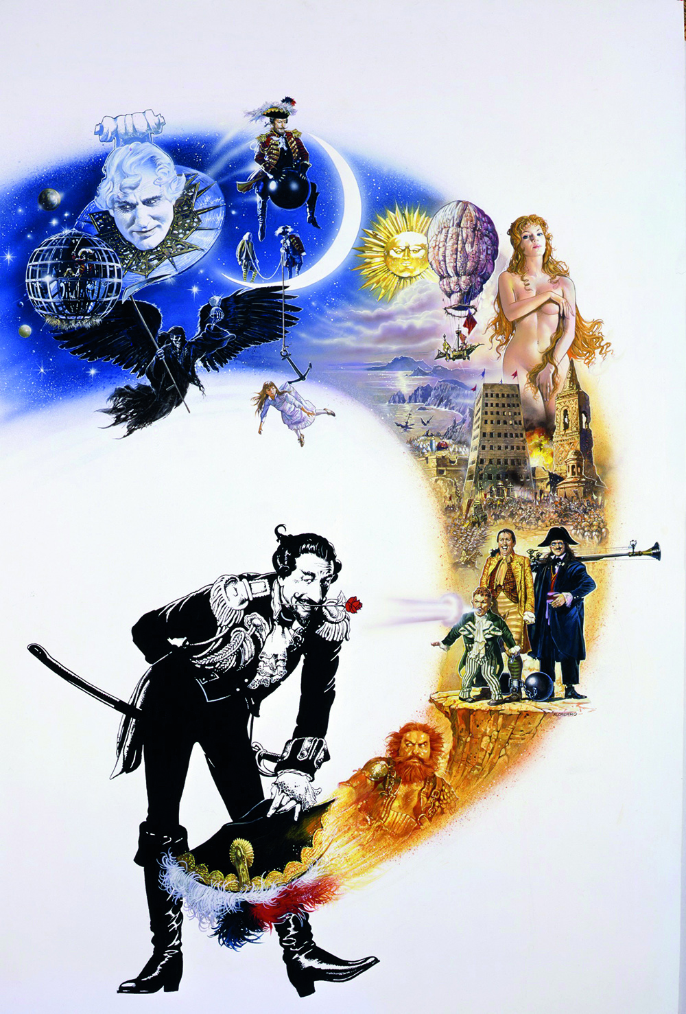
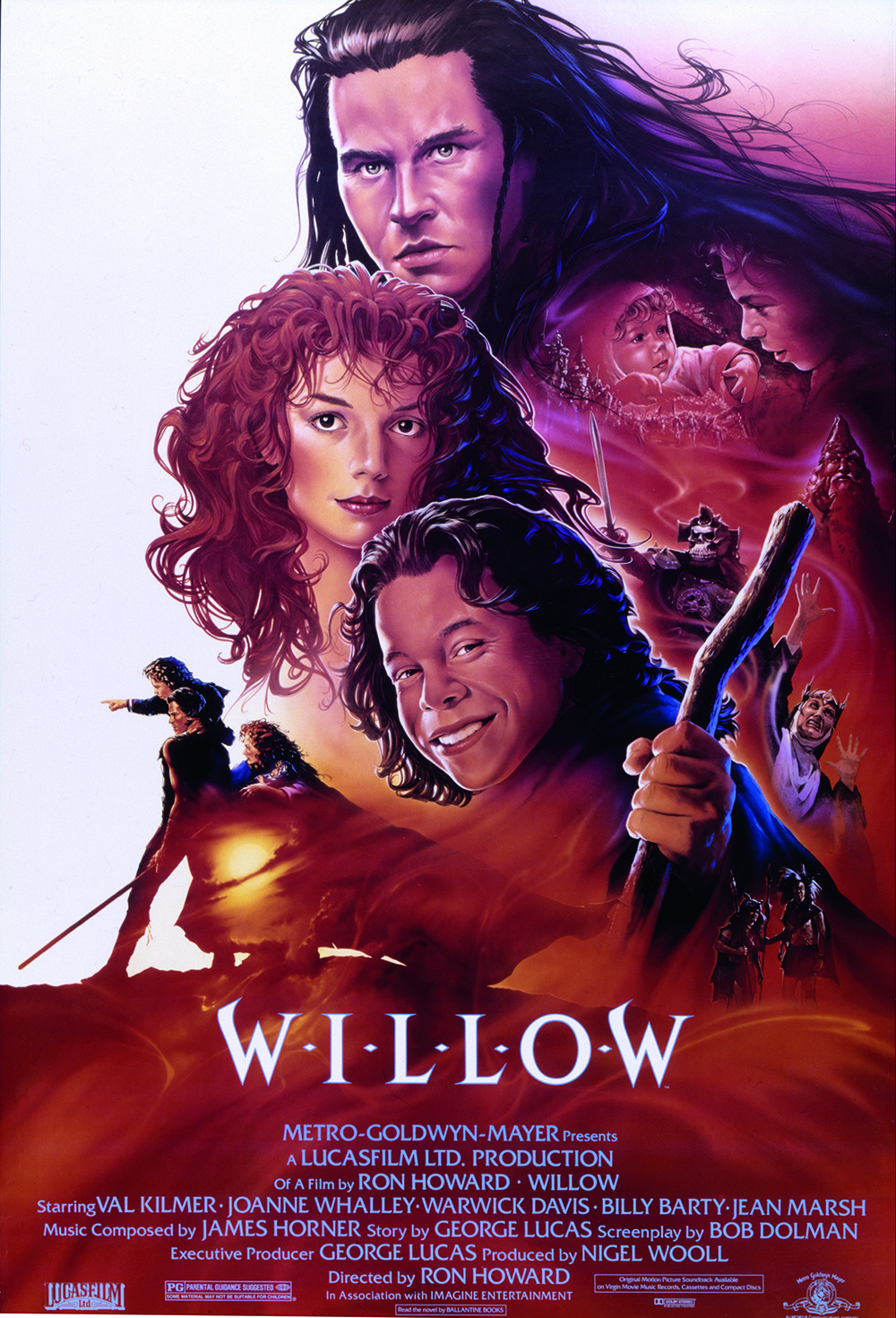
This article was originally published in ImagineFX magazine issue 132.
Related articles:

Garrick Webster is a freelance copywriter and branding specialist. He’s worked with major renewable energy companies such as Ecotricity and the Green Britain Group, and has helped develop award-winning branding and packaging for several distilleries in the UK, the US and Australia. He’s a former editor of Computer Arts magazine and has been writing about design, creativity and technology since 1995.
