How to add responsive video to your website
Responsive web design has changed the way we approach video. John Surdakowski explains how to add it responsively to your website.
Sign up to Creative Bloq's daily newsletter, which brings you the latest news and inspiration from the worlds of art, design and technology.
You are now subscribed
Your newsletter sign-up was successful
Want to add more newsletters?
The web design industry is evolving at a rapid pace. So, sometimes, we need to adjust our design and development techniques to account for new technologies.
Responsive web design (RWD) has become almost a necessity in our modern design process. While it's growing and maturing fast, it's still in its infancy.

Take video. You would expect that the embed codes we grab from YouTube or Vimeo would be responsive, just like our images. The code below is what YouTube provides for embedding videos into web pages; it's a pretty standard iframe.
Article continues below<iframe width="560" height="315" src=" HYPERLINK "http://www.youtube.
com/embed/Gk_fLeK7Uk4" http://www.youtube.com/embed/Gk_fLeK7Uk4"
frameborder="0" allowfullscreen></iframe>But, if we put this markup into our HTML, the video will maintain a fixed width of 560px by 315px, regardless of the browser or device screen size. If we're working with native HTML5 video or an image, a simple fix would be to add the following CSS:
Iframe {
width: 100%;
height:auto;
}
See the tutorial files for a working example. Here we're targeting the iframe with a width of 100% to span our container and a height of auto. If you try this for yourself, you'll notice that the video is full width, but the height doesn't follow the ratio. We can fix this with a simple, pure CSS solution.
First, we will need to wrap our embed code in an extra HTML element, as shown below. Add the following div container to your iframe.
<div class="video-container">
  <iframe width="560" height="315" src=" HYPERLINK "http://www.youtube.com/embed/Gk_fLeK7Uk4" http://www.youtube.com/embed/Gk_fLeK7Uk4" frameborder="0" allowfullscreen></iframe>
</div>
Next, we add the following to our CSS file:
Sign up to Creative Bloq's daily newsletter, which brings you the latest news and inspiration from the worlds of art, design and technology.
.video-container {
  position: relative;
  padding-bottom: 56.25%;
  padding-top: 30px;
  height: 0;
  overflow: hidden;
}
The video-container class that we wrapped around the iframe has some positioning and padding applied to it. Position relative will set the enclosed iframe, which is positioned absolutely, to the most relative parent container. We use padding-top to fine-tune the position our video where we need it to be, depending on the design.

The padding-bottom percentage is determined from the 16:9 aspect ratio. If you divide nine by 16, you get 56.25%. You'll notice we're using padding-bottom, height: 0 and overflow: hidden. These are mainly Internet Explorer fixes, which will help our solution work across all browsers.
Now, we'll target the iframe, object and embed with the following:
.video-container iframe,
.video-container object,
.video-container embed {
  position: absolute;
  top: 0;
  left: 0;
  width: 100%;
  height: 100%;
}
Since we have positioned the frame to absolute, we will set top and left to 0. This will set the video to the top left corner of our container. You can tweak these settings to match your design.
Let's test our example and see the results. Refer to the tutorial files for a working example.
We now have a fully fluid YouTube video embedded in our responsive design. This solution will also work with Vimeo (although it hasn't been tested on other vendors' platforms). This is extremely effective, easily implemented and is also cross-browser-friendly.
JavaScript solutions
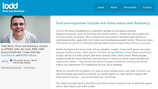
While our solution doesn't rely on JavaScript, there are other options that require the support of JavaScript. Todd Motto's FluidVids.js is written in vanilla JavaScript. To get started, download it and add the JavaScript to your website.

Adding a fallback
Sometimes, users may have JavaScript disabled, especially on some mobile devices. A simple fallback would be the following:
iframe {
max-width: 100%;
}
Another popular JavaScript solution is FitVids.js, which is described as "a lightweight, easy-to-use jQuery plug-in for fluid width video embeds". FitVids was created by CSS-Tricks founder Chris Coyier and Paravel.
This will work the same way as Todd Motto's FluidVids, relying on JavaScript. For example:
<script src="path/to/jquery.min.js"></script>
<script src="path/to/jquery.fitvids.js"></script>
<script>
$(document).ready(function(){
  // Target your .container, .wrapper, .post, etc.
  $("#thing-with-videos").fitVids();
});
</script>
The website says, "This will wrap each video in a div.fluid-width-video-wrapper and apply the necessary CSS. After the initial JavaScript call, it's all percentage-based CSS magic." FitVids currently supports YouTube, Vimeo, Blip.tv, Viddler and Kickstarter.

Add a custom video vendor
FitVids has an option to add a custom vendor. As detailed in the documentation, add the following to the JavaScript file:
$("#thing-with-videos").fitVids({ customSelector: "iframe[src^='http://mycoolvideosite.com'], iframe[src^='http://myviiids.com']"});Conclusion
Responsive web design is still growing and will continue to do so. As web designers and developers, we need to make sure our content is accessible across all platforms, operating systems, browsers and devices. Sometimes we need to go the extra mile to achieve this. Simple solutions, like the ones described in this article, whether in JavaScript or CSS, are very easy to implement and make a huge difference to our users. As technology progresses, new easier-to-implement solutions will arise, or even be baked into vendors' products. Until then, we need to find workarounds. Every project is different, so the solution you choose will depend on your goals.
Words: John Surdakowski
This article originally appeared in net magazine issue 247.

The Creative Bloq team is made up of a group of art and design enthusiasts, and has changed and evolved since Creative Bloq began back in 2012. The current website team consists of eight full-time members of staff: Editor Georgia Coggan, Deputy Editor Rosie Hilder, Ecommerce Editor Beren Neale, Senior News Editor Daniel Piper, Editor, Digital Art and 3D Ian Dean, Tech Reviews Editor Erlingur Einarsson, Ecommerce Writer Beth Nicholls and Staff Writer Natalie Fear, as well as a roster of freelancers from around the world. The ImagineFX magazine team also pitch in, ensuring that content from leading digital art publication ImagineFX is represented on Creative Bloq.
