Why you must create a compelling call to action
The call to action is still an important aspect of designing websites. Gene Crawford explains the current trends.
Sign up to Creative Bloq's daily newsletter, which brings you the latest news and inspiration from the worlds of art, design and technology.
You are now subscribed
Your newsletter sign-up was successful
Want to add more newsletters?
The call to action is a simple aspect of a website and still remains one of the most important pieces you can focus on when you're designing. It's a well-accepted concept that you have a brief moment between when a person loads your website/page and takes an action.
You want that person to act on your designed desired action so focusing the design around that specific action is paramount to the success of the page itself. You must make sure the one thing you want a person to do when they load your website is easily found and acted upon.
There are a few questions you can ask yourself when laying out and working through the details of the website to ensure your 'call to action' is working for you. Is it different enough from the rest of the page design to stand out? Do the colour and shape have enough visual contrast be easily seen? Is the copy used to denote the action properly describing what the person needs to do or get out of clicking on it? How many calls to action buttons or links do you have on the page? Are they consistent?
Article continues belowThese things all seem easy, but try running over these questions while visiting several websites throughout the rest of the day today and see what you uncover.
Perfect placement
There is a current trend for product homepage designs to be very long, requiring users to scroll a good deal. This is absolutely fine, but make sure the page's call to action is pretty prominently placed. It's also common practice to have multiple calls to action placed throughout the page so they are easily accessed as the user scrolls. In this long scrolling page scenario, consistency of both the visual design and copy used on the call to action is supremely important.
Here are five examples to check out...
01. InVision

On the design prototyping web app InVision's homepage the calls to action are all consistent in shape and colour.
Sign up to Creative Bloq's daily newsletter, which brings you the latest news and inspiration from the worlds of art, design and technology.
02. Geckoboard
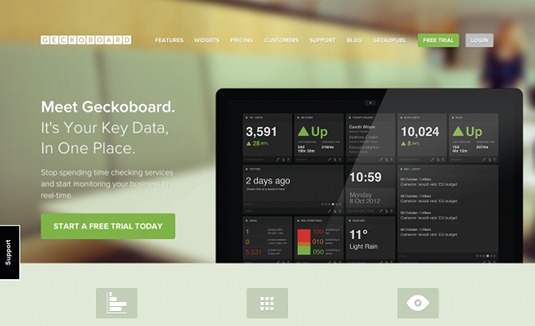
The data dashboard web app Geckoboard has a long scrolling homepage design. The copy on the calls to action is consistent, using the word 'free' and being all the same colour.
03. Mailchimp
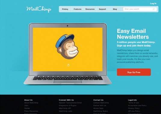
The email marketing web app Mailchimp's website only has a single call to action. It's bright red/ orange, complementing the other colours used on the page. The copy says 'Sign Up Free', reinforcing you can use it for nothing.
04. Emma
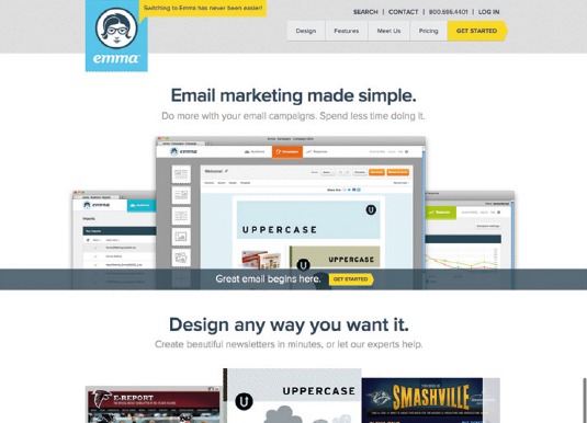
The homepage of email marketing web app Emma uses different messages across calls to action, but they're all consistent in tone, colour and shape.
05. Campaign Monitor
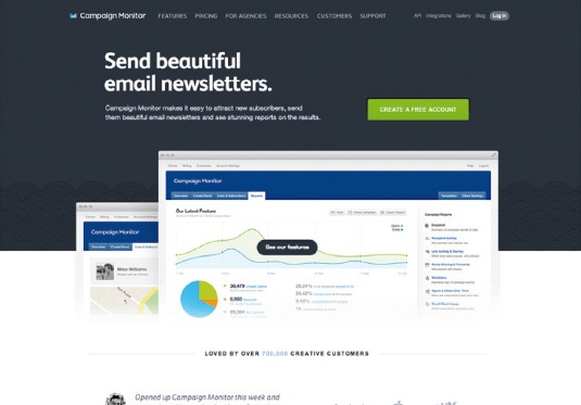
Campaign Monitor is an email marketing web app that has a single call to action button on its website that's complementary in colour to the rest of the page. It's also clearly, and almost centrally, positioned.
Words: Gene Crawford
Gene's mission is to work tirelessly at providing inspiration and insight for developers. His projects include www.unmatchedstyle.com and conferences such as www.convergese.com
This article originally appeared in net magazine issue 242.
Liked this? Read these!
- Brilliant examples of landing page design
- Create a perfect mood board with these pro tips
- Our favourite web fonts - and they don't cost a penny
Post something in the comments! How's that for a call to action?

The Creative Bloq team is made up of a group of art and design enthusiasts, and has changed and evolved since Creative Bloq began back in 2012. The current website team consists of eight full-time members of staff: Editor Georgia Coggan, Deputy Editor Rosie Hilder, Ecommerce Editor Beren Neale, Senior News Editor Daniel Piper, Editor, Digital Art and 3D Ian Dean, Tech Reviews Editor Erlingur Einarsson, Ecommerce Writer Beth Nicholls and Staff Writer Natalie Fear, as well as a roster of freelancers from around the world. The ImagineFX magazine team also pitch in, ensuring that content from leading digital art publication ImagineFX is represented on Creative Bloq.
