Adobe's colour palette cheat sheet could save you a whole lot of time
Colour theory can be a complex area of design. Understanding the relationships between different colours can help you use colour more effectively in your designs, but even then choosing the right palette can take a lot of time. Happily, Adobe has just shared a whole bunch of suggestions that can give us a head start and save us time when we're working against the clock.
The guys at Adobe Express have proposed a massive 101 colour combinations that can serve to create styles and moods to suit a range of design projects, from 'natural and earthy' to 'clean and modern', 'moody and gothic' and many more. And if you find one that almost works but isn't quite right, you can quickly edit it in Adobe Express.
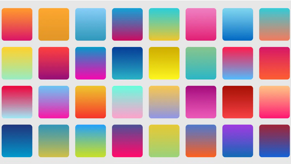
Adobe's used traditional colour theory to create five-colour palettes through a mix of analogous, complementary, monochromatic or triadic combinations. The resulting colour combinations can serve as a handy quick resource for designers looking for inspiration on what colours to use in their projects.
Illustrators might find inspiration for their art, while designers might just find the perfect colour palette for graphics, a UI design for an app or even inspiration for home décor. Here are a few examples of the combinations proposed.
Natural and earthy
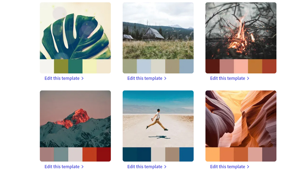
Natural, earthy tones have been big over the past few years, with warm desert colours and forest green seeking to communicate a reconnection with nature. These could be a hit in work for health and wellness brands.
Clean and modern
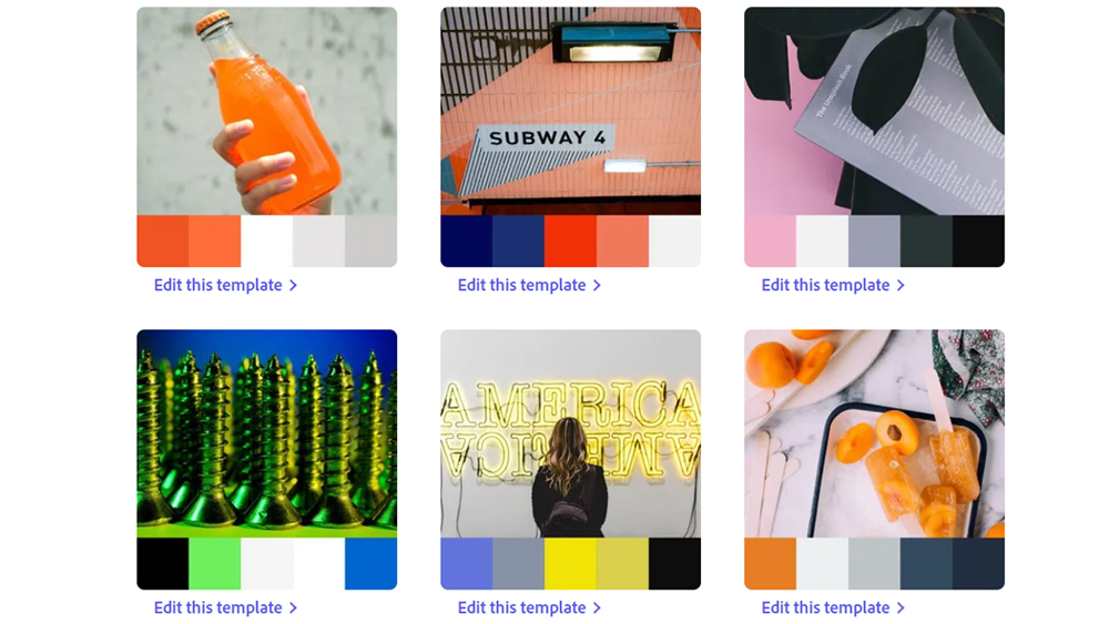
These suggestions mix muted hues for a light, clean feel with a pop of brighter colour for impact, for example, royal blue against more muted colours. Adobe suggests using these when the message needs to take centre stage.
Bright neons
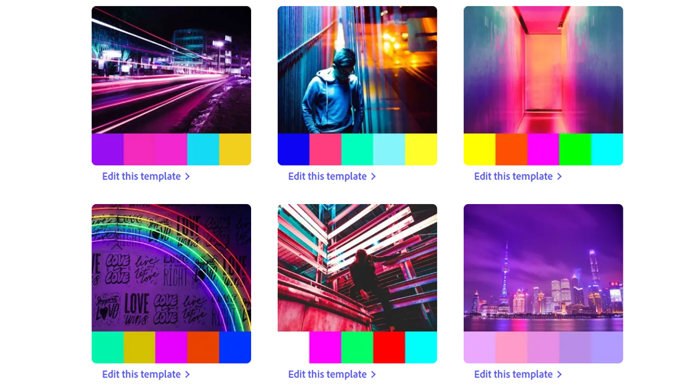
Not feeling subtle? These neon combinations with high-contrast primary and secondary colours are energetic and eye-catching. They can be garish in some situations but they can work well in posters and ads that need to make a big impact.
Sign up to Creative Bloq's daily newsletter, which brings you the latest news and inspiration from the worlds of art, design and technology.
90s throwback
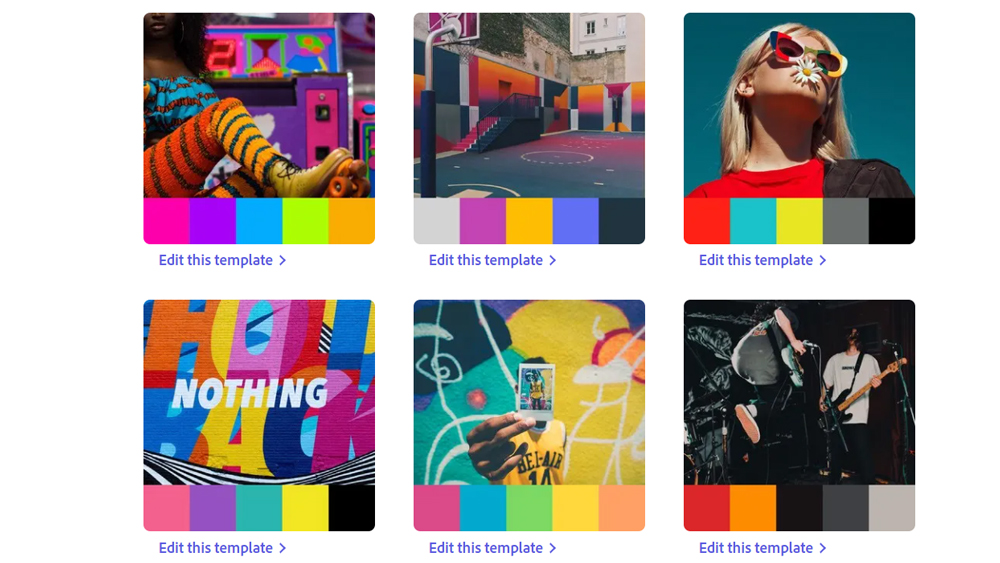
You've probably noticed that the 90s are back with a bang lately. If you want to take advantage of the nostalgia wave, Adobe has some suggestions. It's come up with fun jewel-toned palettes (think Fresh Prince of Bel Air and Beverly Hills 90210) and more neutral grungy palettes (Twin Peaks or early Friends) that could be complemented with distressed icons.
Moody and gothic
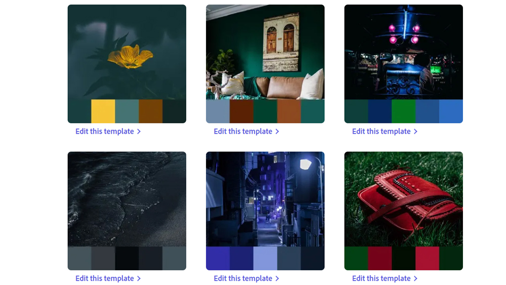
It's not all bright, uplifting colour combinations. Adobe Express also has suggestions for some dark, brooding palettes. Here we have hunter green, navy blues, dusty pinks and deep jewel tones combined with charcoal blacks. Perfect for adding some atmospheric gravitas to everything from posters to social media posts.
You can see all 101 colour combinations on the Adobe website. Designers will usually want to create their own bespoke colour palettes for each specific project, but Adobe's suggestions are broad enough to provide plenty of inspiration, and each palette can be tweaked to make it more unique.
See our pick of some of the best uses of colour in branding for more inspiration. And our piece on the golden rules of UI design deals with the use of colour specifically in interfaces.
Read more:

Joe is a regular freelance journalist and editor at Creative Bloq. He writes news, features and buying guides and keeps track of the best equipment and software for creatives, from video editing programs to monitors and accessories. A veteran news writer and photographer, he now works as a project manager at the London and Buenos Aires-based design, production and branding agency Hermana Creatives. There he manages a team of designers, photographers and video editors who specialise in producing visual content and design assets for the hospitality sector. He also dances Argentine tango.
