Adobe shares Pantone's summer trending colours
Stay up to date with the Colour Me Social gallery.
Sign up to Creative Bloq's daily newsletter, which brings you the latest news and inspiration from the worlds of art, design and technology.
You are now subscribed
Your newsletter sign-up was successful
Want to add more newsletters?
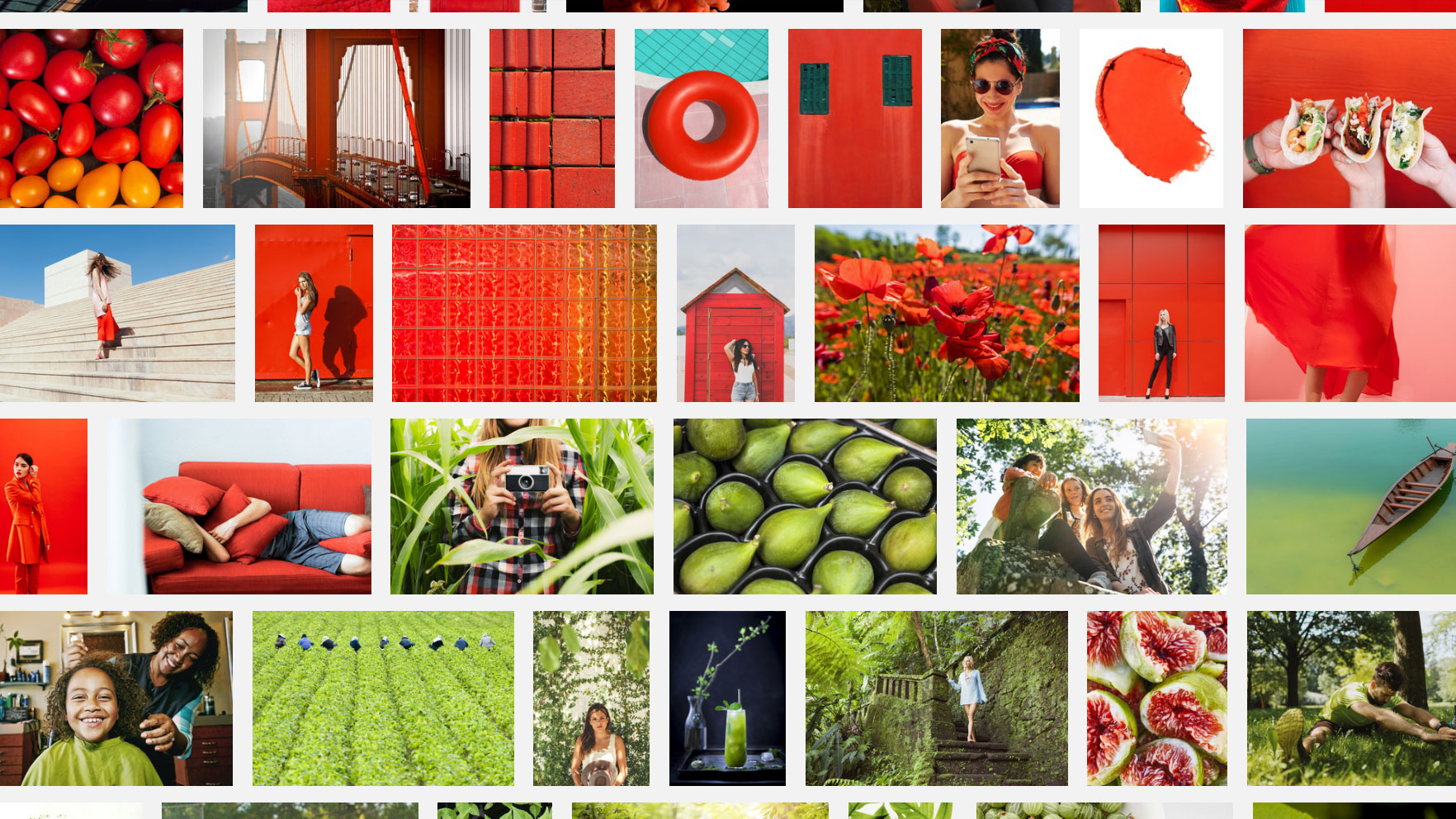
Adobe has teamed up with the Pantone Colour Institute to reveal which colours are trending this summer. Compiling its findings into the Pantone Colour Me Social gallery, Adobe suggests bold, saturated tones are big at the moment. And while this won't change colour theory, colour trends do affect the decisions of designers and brands.
The colours in question include Lime Green, Hawaiian Ocean, Flame Orange, Fuchsia Purple, Cherry Tomato, Blazing Yellow and Dazzling Blue. According to Laurie Pressman, the Institute's vice president, these tones mark a sea change in colour trends.
"Following years of essentialist and pared-down aesthetics, the thirst for vivid, rich colour is taking centre stage as people want to spark a new kind of joy and create playful paradises," she explains.
Article continues belowOne of the key drivers behind this change is social media. Pressman reasons that these online platforms give users the freedom to experiment with colours and intense experiences, which in turn leads to people gravitating towards richer hues.
Given that social media is a relentlessly noisy world, it makes sense that brighter, bolder images have been on the rise as users attempt to stand out from the crowd. With colour seen as a form of self-expression on social media, vibrant colours lead to more interaction.
You can explore these vibrant colours below; use the left and right arrows to click through the gallery.
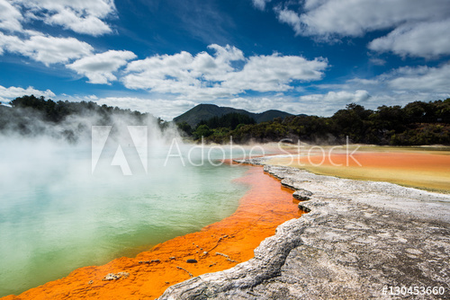
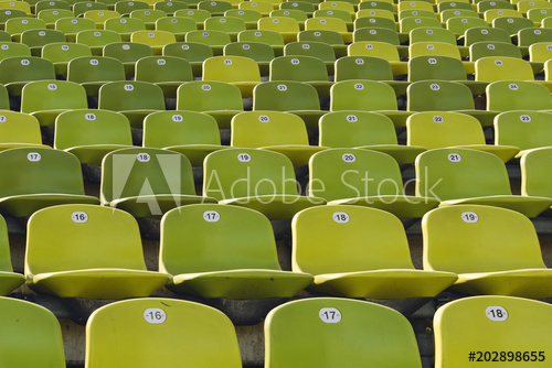

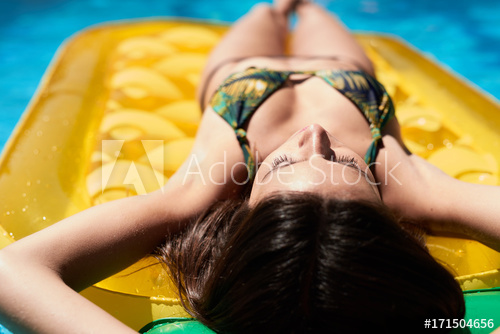
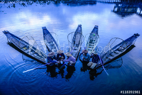
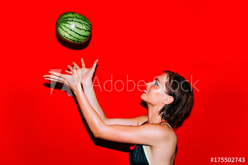
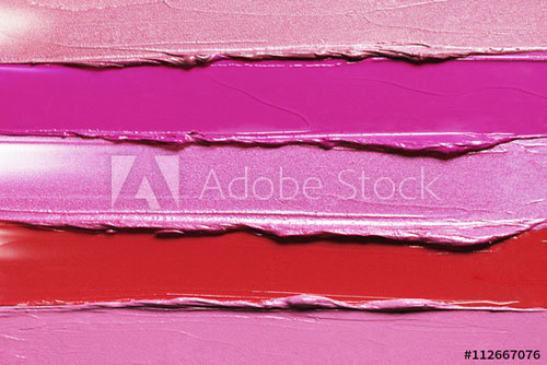
Despite this trend having its roots in social media, saturated colours have spilled over into the worlds of retail and fashion. This is an interesting inversion of traditional design, which usually saw fashion industries shaping the colour trends for everyone else to follow.
Sign up to Creative Bloq's daily newsletter, which brings you the latest news and inspiration from the worlds of art, design and technology.
"While all of the shades highlighted are being seen on the street and the catwalk," says Pressman, "we are seeing these colours show up in other areas as well, from travel to food. Some of the newest sources for colour inspiration are home furnishings, lifestyle and beauty."
Brands, museums and exhibitions can all take advantage from these trending colours to connect with audiences. Pressman goes on to add that even if saturated colours don't immediately appear suitable for your brand or company, "even a small accent or a bright shade in the background could do the trick."
And with the Institute predicting the current colour trend to continue right the way through until the summer of 2020, there's plenty of time to get on board with this eye-popping palette.
Related articles:

Dom Carter is a freelance writer who specialises in art and design. Formerly a staff writer for Creative Bloq, his work has also appeared on Creative Boom and in the pages of ImagineFX, Computer Arts, 3D World, and .net. He has been a D&AD New Blood judge, and has a particular interest in picture books.
