Baskin-Robbins has an ice-cool new logo
But it still pays homage to its roots.

You scream, I scream, we all scream for a good logo redesign, right? Baskin-Robbins is one of the most famous ice cream brands in the world with a range of over 1,000 flavours. And now 16 years after the last logo update, it's announced its fresh new look.
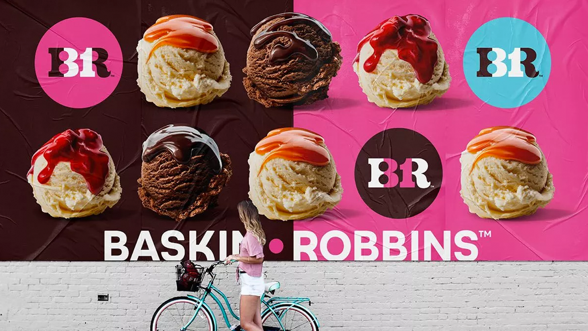
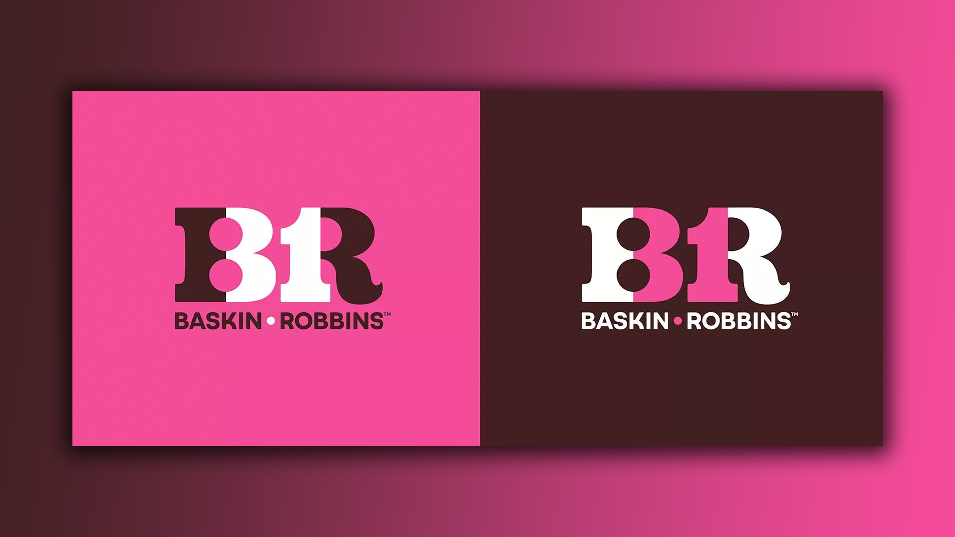
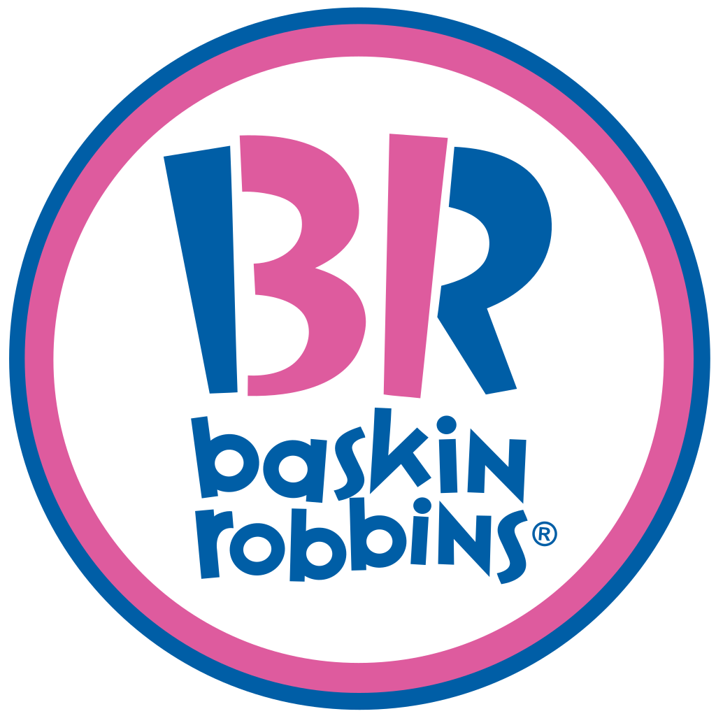
The previous Baskin-Robbins logos were instantly recognisable with their bright blue and pink colour palettes and bold, playful typeface. But now, the ice cream shop is rebranding with a smarter, more refined logo design that aims to "bring happiness to your everyday". Loving all this logo talk and fancy having a go at creating your own? Make sure you check out our guide on how to design a logo.

The rebrand covers all elements of Baskin-Robbins' visual identity from the logo to the packaging. While the new look is certainly a significant change, the logo still nods back to its roots with the famous '31' hidden in the design. When it first launched, Baskin-Robbins boasted that it had 31 ice cream flavours – one for each day of the month. The previous vibrant colour palette (see below) has been swapped out for pinks, browns, whites and light blues, making the brand look a little more sophisticated while also maintaining its playful look.
Article continues belowThe rebrand focuses on the new tagline, 'seize the yay', that aims to "turn fans of yesterday into brand loyalists of today and capture Gen Z’s heart with everyday moments of 'happy'," according to the agency behind the makeover, ChangeUp Inc(who had support from 22Squared). The new brand "personifies its [Baskin-Robbins'] mission to flavour every day with “happy” and staying “forever young" (whatever that means).

I really like the makeover because it's a very smart rebrand with its more tonal palettes and minimalistic visual identity, but its bold, curvy font and colour palette still manages to encapsulate that element of fun. The brown, pink and white logo, in particular, reminds me of Neapolitan ice cream, which may not have been intentional, but I hope it was.
I don't know about you but all this Baskin-Robbins talk has got me craving some ice cream. While I scurry off to the freezer to treat myself, why not check out our roundup of the best logos of all time? Or if you'd like to have a go at creating one yourself, then make sure you download Illustrator.
Read More:
Sign up to Creative Bloq's daily newsletter, which brings you the latest news and inspiration from the worlds of art, design and technology.

Amelia previously worked as Creative Bloq’s Staff Writer. After completing a degree in Popular Music and a Master’s in Song Writing, Amelia began designing posters, logos, album covers and websites for musicians. She covered a range of topics on Creative Bloq, including posters, optical illusions, logos (she's a particular fan of logo Easter eggs), gaming and illustration. In her free time, she relishes in the likes of art (especially the Pre-Raphaelites), photography and literature. Amelia prides herself on her unorthodox creative methods, her Animal Crossing island and her extensive music library.
