BT reveals new logo design
The telecommunications company has registered a new logo which follows the trend for flat designs.

Sign up to Creative Bloq's daily newsletter, which brings you the latest news and inspiration from the worlds of art, design and technology.
You are now subscribed
Your newsletter sign-up was successful
Want to add more newsletters?
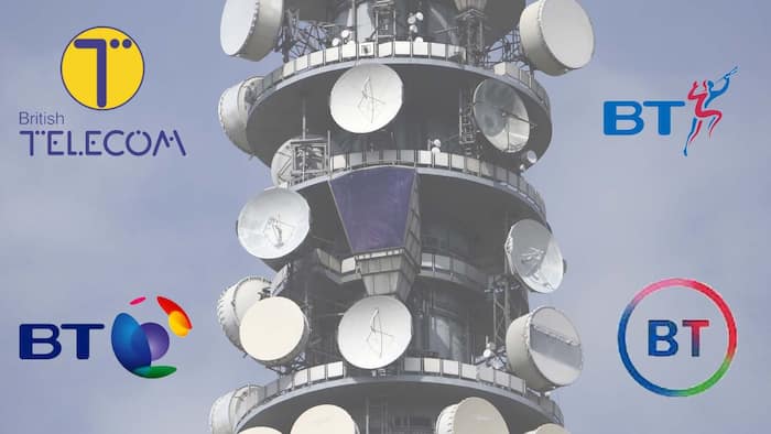
The BT Group looks set to launch a rebrand for the first time in 13 years, which will see the telecommunications company drop their recognisable Connected World branding in favour of a flat logo design. Following the likes of Instagram and Mastercard, the new branding, due to launch next year, is said to take a minimalist approach.
The new logo (which can be seen in the image below) is yet to be formally signed off, but if it gets pushed through it will be the fourth design since the company was privatised. Made up of a simple multicoloured ring with a new BT wordmark in the middle, this is the first logo that incorporates the lettering and the graphics into one design, whereas previously the two parts just sat next to each other.

It remains to be seen how the logo will fit in with the overall rebrand, but the contrasting yet somehow blended together colours will take a little time to get used to.
[via the Financial Times]
Sign up to Creative Bloq's daily newsletter, which brings you the latest news and inspiration from the worlds of art, design and technology.

Dom Carter is a freelance writer who specialises in art and design. Formerly a staff writer for Creative Bloq, his work has also appeared on Creative Boom and in the pages of ImagineFX, Computer Arts, 3D World, and .net. He has been a D&AD New Blood judge, and has a particular interest in picture books.
