Campbell’s soup updates iconic can after 50 years
It's always controversial when a heritage brand decides to update its look, and in this case it's one that's also an icon of the art world. Campbell's soup has made the first major update to the design of its flagship cans for the first time since Andy Warhol put them on the wall of a gallery in the early 1960s. Predictably, the internet is divided.
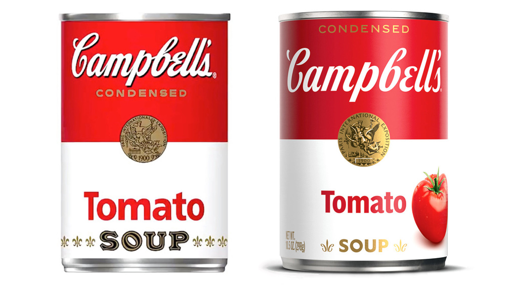
The company's redesigned its cans before, but its three classic flavours (tomato, cream of mushroom and chicken noodle, if you're wondering) had escaped all but minor tweaks until now – perhaps because they were so recognisable thanks to Warhol's screenprints. More than five decades on, the familiar red-and-white colour palette is still present, but the Campbell’s logo has been updated with a “modernized logo scripture” (see our guide to find the best free script fonts for your own designs).

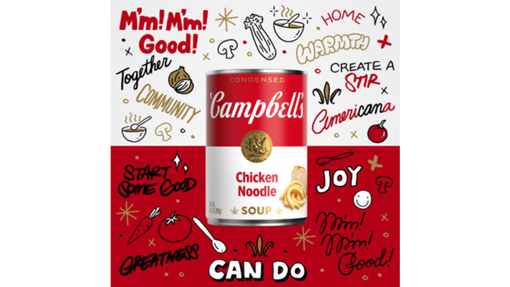
Campbell's has eliminated the shadow on its script logo and slightly changed the font, which was originally based on founder Joseph A. Campbell’s signature. The word “soup” is in a new font too, and keen-eyed fans may also notice some "hidden" features, including a more pronounced C in the fleurs-de-lis and the retention of a slanted O in the word “soup” – both tributes to the lettering from the company's original labels back in 1898. The company says that "the refreshed label still evokes the same sense of comfort, goodness and Americana."
Article continues belowThe response so far has been mixed. Some have praised the redesign for introducing a fresh look while respecting the brand's heritage, while others reckon the nostalgia value of the old can was Campbell's biggest strength. One user commented on Twitter: "My first thought is it looks like a can of beer. Campbell's! Out of respect, couldn't you have waited until all the BabyBoomers were gone?" Another tweeted: "Decades building an iconic brand then dumping the most recognized label in soups. Not smart."
New label, same M'm! M'm! Good!® taste you know and love.❤️Look for our new design on shelves & online!#NewLook #Campbells #MmMmGood pic.twitter.com/h1tb6FRJrJJuly 27, 2021
Not wanting to lose its status in the art world, Campbell’s is accompanying the redesign with a foray into nonfungible token (NFT) art. It's brought in artist and illustrator Sophia Chang to create 100 NFT-authenticated artworks, which are available to purchase at NTWRK NFT. There's also a one-off animated version.

Given Warhol's obsession with consumer culture, we think he'd probably approve. Warhol even dabbled in digital art himself. In May, Christie's auctioned NFT-authenticated restorations of Campbell's soup cans that he sketched in a paint programme on a Commodore Amiga 1000 in the 1980s.
A post shared by Christie's (@christiesinc)
A photo posted by on
Think you could do better than Campbell's? Whether you want to create your own packaging designs or digital artwork, check out the latest prices for Adobe Creative Cloud below. For packaging inspiration, see our list of standout packaging designs.
Sign up to Creative Bloq's daily newsletter, which brings you the latest news and inspiration from the worlds of art, design and technology.
Read more:

Joe is a regular freelance journalist and editor at Creative Bloq. He writes news, features and buying guides and keeps track of the best equipment and software for creatives, from video editing programs to monitors and accessories. A veteran news writer and photographer, he now works as a project manager at the London and Buenos Aires-based design, production and branding agency Hermana Creatives. There he manages a team of designers, photographers and video editors who specialise in producing visual content and design assets for the hospitality sector. He also dances Argentine tango.
