A clever use of negative space in logos can create memorable designs that add an extra level of meaning to a brand identity. Just think of the much-acclaimed FedEx logo with its hidden arrow - one of our picks of the best logos of all time.
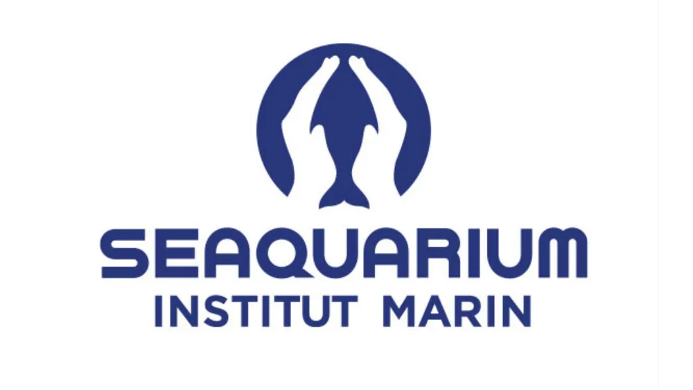
The logo for Seaquarium Institut Marin in the south of France also makes big use of negative space. The design shows two hands cupped together inside a blue circle, but the space between them forms the shape of a dolphin. Together, the two elements effectively communicate the aquarium and research institute's marine preservation and conservation work.
This logo of a French aquarium showing they take care of sea animals from r/DesignPorn
Over on Reddit, people aren't so sure about the choice of typography, but the negative space in the logo design is getting a rare positive consensus ( for the most part). "This is o-fish-ially a great logo. Not that I think they’re fishing for compliments. But let minnow what you guys think," one person wrote.
Although, some don't seem to be quite sure of the aquarium's good intentions. "For me, the hands are getting ready to remove the skin of the fish... sorry." And as for the typography, the consensus is that it could be improved. "The font could work better if the ends of the letters are rounded instead of squared off. The logo itself feels too organic and doesn't work with the sharp edges in the font," one person suggests.
See our tips and examples of negative space for ideas for your own work. If you need to upgrade your own graphic design tools, see our pick of the best graphic design software or check out the best prices for Creative Cloud below.

