Animated logos and kinetic typography can engage and delight viewers, but they can also add meaning to a design. A new logo design for a dog accessories brand is a fun and playful example, and it shows just how effective kerning can be in type-based projects.
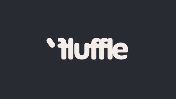
With a reversed initial 'f' and an apostrophe to create a waggling tail, the Fluffle logo shifts form to create the impression of different breeds of dogs. And it was all inspired by the concept of a hug. Aww.

Oddity Studio says its branding and logo design for Fluffle was inspired by the idea of a "tight hug with your furry friend". For the logotype, it used Extraset's ES Peak Rounded but applies extra-tight kerning to convey that idea of a hug.
"When we pushed the boundaries and tightened the hug even more, we got intro the territory of glyphs moving up and down from the axis and form shapes reminiscent of different fog breeds," the studio says.

Meanwhile, it used textured papers, emboss and colour accents in the packaging design to reflect the quality of the handmade leather accessories. Coloured papers match the brand identity colour scheme, which uses a primary brown joined by accents in lilac, rust and pale pink. "We were looking to create tactile, sensually reach unboxing experience, caring about details, as the dog owner does about their pups," Oddity explains.

The logo design is cute and fluffy like many rival brands, perfecting complementing the brand name. But the clever, playful use of typography makes it feel more original and stylish and less derivative, which is echoed in the elegance of the packaging designs.
For more recent logo and type designs, see the new Danaher logo with its clever secret meaning and the Breast Cancer Alphabet. We also have a roundup of the best new logos.

