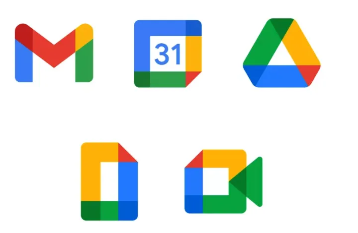
It's been over two years since Google released a slew of new logos and icons for its various Workspace apps, but it seems the initially cold reception is showing no signs of thawing. Even today, Twitter users are continuing to bemoan the confusing nature of these bafflingly indistinguishable designs.
The icons for Gmail, Google Photos, Google Maps and many more were transformed in 2020 into much more minimalist versions, all featuring the same four colours: blue, green, red and yellow. One of the key qualities of the best logos of all time is how unmistakeable they are, and as anyone who repeatedly opens Calendar instead of Mail will attest, the same doesn't apply to these.
pic.twitter.com/vqNnyRWtJ1January 11, 2023
Meme account No Context USA recently shared its take on the issue, with the caption 'When designers prioritise aesthetics over usability' – and judging by the many, many comments, the overly similar logos are as confusing as ever.
"This is very real, honestly I once spent like three whole minutes searching for the Maps app because its so indistinguishable from everything else," one user comments, while another adds, "Takes me a good 5 minutes to press the right one and it’s still the wrong one."
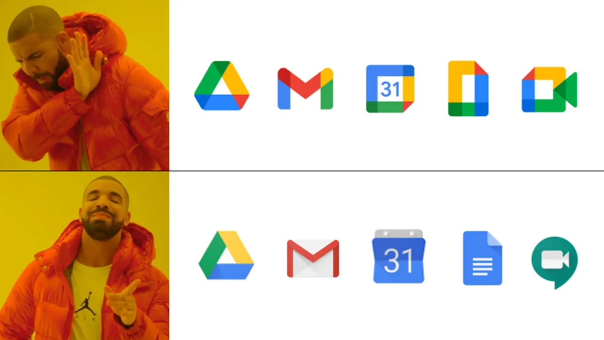
Google said in 2020 that the new logo is designed to reflect "a more connected, helpful, and flexible experience," and the fact that Google's Workspace apps are "part of the same family". Judging by the continued response from users, it seems the company achieved this a little too effectively. Still, at least Google can take some solace from the fact that it isn't the only brand to confuse users with its overly consistent logos – the same dubious honour also goes to Adobe.
Read more:

