Google Maps changed its colours (but you probably didn’t notice)
And now you’re stuck with it.

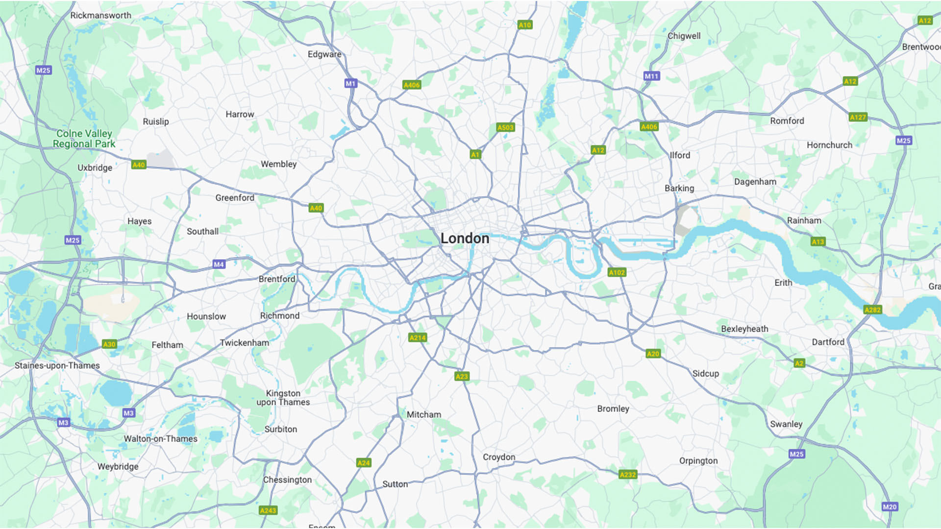
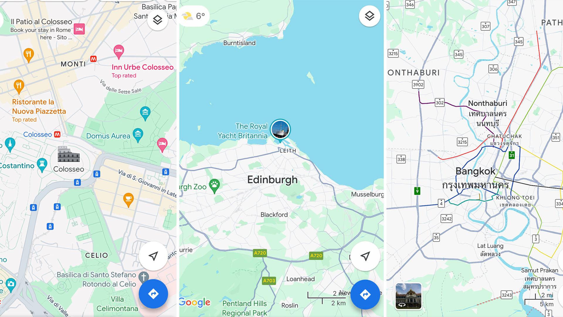
The internet is once again upset, and this time it's about maps. Google Maps in fact, as the app has recently updated its colour scheme to a lighter and brighter hue, much to the dismay of passionate users who are threatening to migrate to the directional hellscape of Apple Maps.
If you can cast your mind back to the old colour scheme, it's a subtle but confusing difference, replacing the perfectly functional colourway with a new, less visible alternative. (To avoid a similar colour-related scandal, check out our jargon-free guide to colour theory).

So let's dissect the drama – what's new in the world of Google Maps? Roads have become a dreary grey (in place of a crisp, clinical white). The directions bar and forest areas are now a darker green and bodies of water have been replaced with a significantly lighter blue. Now you know, you won't be able to unsee it – you're welcome.
I'm always down for a little change and as long as I can still get to my desired location I'm not too disturbed by the change, but that's not the collective opinion of the internet (obviously). One X user called the update "horrible" and "barely readable," while another scathingly said it was "cartographically disappointing."
The new colour scheme used by @googlemaps is just horrible, barely readable within the sea of greyness. I wish there was a way to bring back the old colours.November 21, 2023
new google maps UI is cartographically disappointing! major local roads and limited-access highways (freeways) are basically indistinguishable. pic.twitter.com/qvVX0HqebQNovember 21, 2023
The new colour scheme used by @googlemaps is just horrible, barely readable within the sea of greyness. I wish there was a way to bring back the old colours.November 21, 2023
By now I think most of us are well versed in internet outrage. I don't see Google taking any steps towards responding to the haters and most likely they'll get used to it in a few weeks, but hey, it's always fun to see what gets the internet riled up.
For more news that recently ruffled some feathers, check out the latest GTA 6 rumour that's got fans a little concerned, or take a look at Marvel's Madame Web trailer that got a passionate roasting online.
Sign up to Creative Bloq's daily newsletter, which brings you the latest news and inspiration from the worlds of art, design and technology.

Natalie Fear is Creative Bloq's staff writer. With an eye for trending topics and a passion for internet culture, she brings you the latest in art and design news. Natalie also runs Creative Bloq’s 5 Questions series, spotlighting diverse talent across the creative industries. Outside of work, she loves all things literature and music (although she’s partial to a spot of TikTok brain rot).

