We love little Easter eggs in logo designs, and this new branding project for a UK department store delivers just that. And it's a logo secret that references the brand's legacy while resolving a couple of issues with the previous design in a classy way.
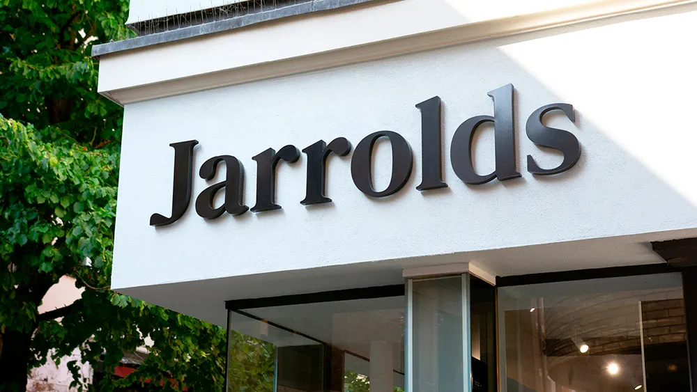
Jarrolds is an independent family-owned department store in Norwich with a history that goes way back over 200 years. Its new logo provides it with a modern look but also feels like it could have been with the brand for years. And with a little secret in that 'J', it could even be one of the best new logos.


Jarrolds' previous logo featured a lion pawing at a J. The design was inspired by a pair of heraldic lions that were installed outside Norwich City Council's headquarters nearby back in 1938. The store adopted the town's lion in its own symbol, but there were a couple of issues. The lion conjoined with the J looks a bit strange, almost as if together they might form an H. And Jarrold's couldn't really call the lion its own - the shape was based on the town's sculptures.
In its rebranding of the store, design agency The Click opted to keep the lion since it had become so associated with the brand, but decided to create both a mark and logotype that can be used together or separately, and which both reference each other. they redrew it so that it properly belongs to Jarrolds, and incorporated the 'J' for Jarrolds into the design in the form of the lion's legs. The same shape now forms the J in the logotype, which is custom-drawn at the same scale and ratio as the front standing foot of the lion, creating harmony across the two elements.

"By completely redrawing the lion from scratch, we were able to craft a new, more iconic and fit-for-purpose brand mark that performs more effectively at varying scale across all channels and applications," The Click says. Best of all, this now means the lion is (finally) truly ownable by Jarrolds – becoming unique to them and, ultimately, more memorable."

They also resolved another issue with the branding – whether the store should be called Jarrold or Jarrolds with an 'S'. Both names have been used at different times over the years, but they settled for the plural form since the store has passed through eight generations of Jarrolds, and it's also how most customers refer to the store.
The Click also modernised Jarrolds' brand colours – purple to refer to luxury and Verdigris Blue in reference those bronze lion statues – and introduced two brand typefaces: the traditional-looking Lapture and the more neutral DM Sans.


To reference Jarrolds' history in publishing (it printed and published the first edition of Anna Sewell’s Black Beauty in 1878), the agency has also designed a series of imagery inspired by printing. It says it decided to use a combination of vertical and horizontal axes for headline type alignment as a further reference to sideways ‘J’ that appears in the form of the lion’s right raised leg in the logomark.
Put that all together and it makes for a classy rebranding that respects and builds upon the long legacy of an enduring local business, creating a stronger, more arresting contemporary identity in the process.
See our pick of some of the best logo secrets and the best logos of all time for more inspiration.

