The Kia logo fiasco just won't go away
Is the worst logo of the year the worst of all time?
Sign up to Creative Bloq's daily newsletter, which brings you the latest news and inspiration from the worlds of art, design and technology.
You are now subscribed
Your newsletter sign-up was successful
Want to add more newsletters?
Poor Kia. Usually when a logo is declared a disaster, it's a subjective thing – down to personal taste and aesthetics. But for once, we have hard facts and statistics to prove that a brand's logo just isn't working – and the numbers just keep coming.
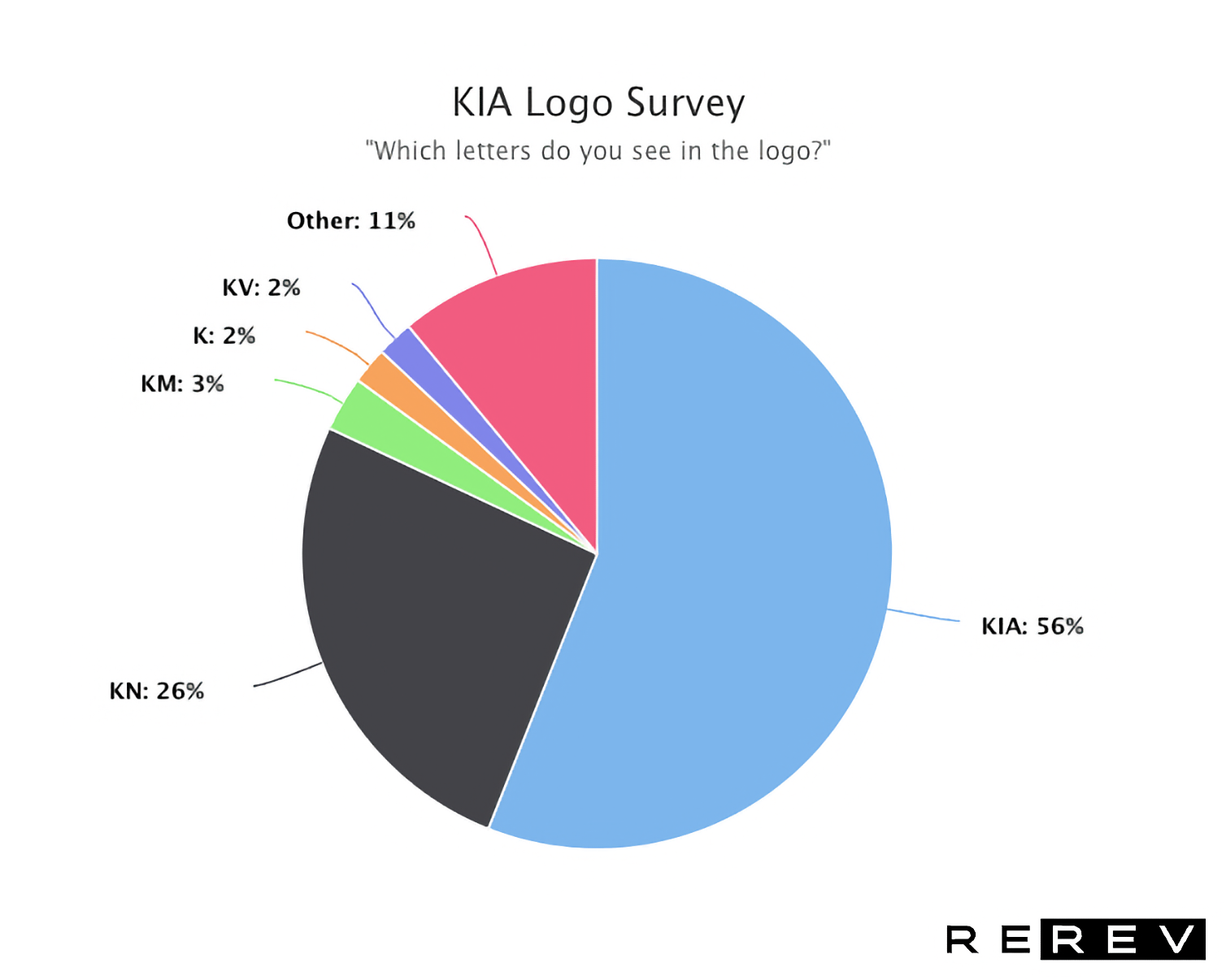
Last month, we brought you the news that over 30,000 people are searching 'KN cars' on Google every month, proving that the (admittedly sleek) new sawtooth design is somewhat illegible. And now, a survey has revealed that nearly 50% of people still don't recognise the new badge. One of the best logos of all time, this ain't.

Car maintenance expert Rerev recently conducted a survey asking its members what letters they see in the new logo. And while 56% saw Kia, 44% saw something else entirely, with 26% seeing 'KN', and others going for 'KM', 'KV', and the rather mysterious 'Other'.
Article continues below 
As we recently said, an illegible logo is possibly the ultimate design crime. In the brand's defence, we rather liked the logo when it first appeared, describing it as "a sleeker, racier number that still loses the crossbar off the 'A' but carries everything off in a much more stylised way, ditching those half-hearted serifs and instead arranging the logo in the form of a sawtooth wave." But that was before we heard about those 30k 'KN' Google searches, and long before this damning survey came to light.
Still, at least Kia can take some solace from the fact that it's by no means the only car brand to experience an advertising fail in 2022. Audi fans recently got road rage over the brand's updated 'rings' logo, while the less said about Volkswagen Italy's Instagram bio, the better. Let's just hope next time around, Kia's design team opt for something a little clearer – they could start by taking a look at our guide on how to design a logo.
Read more:
- Please tell me this isn't the new DC Studios logo
- Is this really the most offensive logo?
- The Coca-Cola logo: a history from 1886 to today
Sign up to Creative Bloq's daily newsletter, which brings you the latest news and inspiration from the worlds of art, design and technology.

Daniel John is Design Editor at Creative Bloq. He reports on the worlds of design, branding and lifestyle tech, and has covered several industry events including Milan Design Week, OFFF Barcelona and Adobe Max in Los Angeles. He has interviewed leaders and designers at brands including Apple, Microsoft and Adobe. Daniel's debut book of short stories and poems was published in 2018, and his comedy newsletter is a Substack Bestseller.
