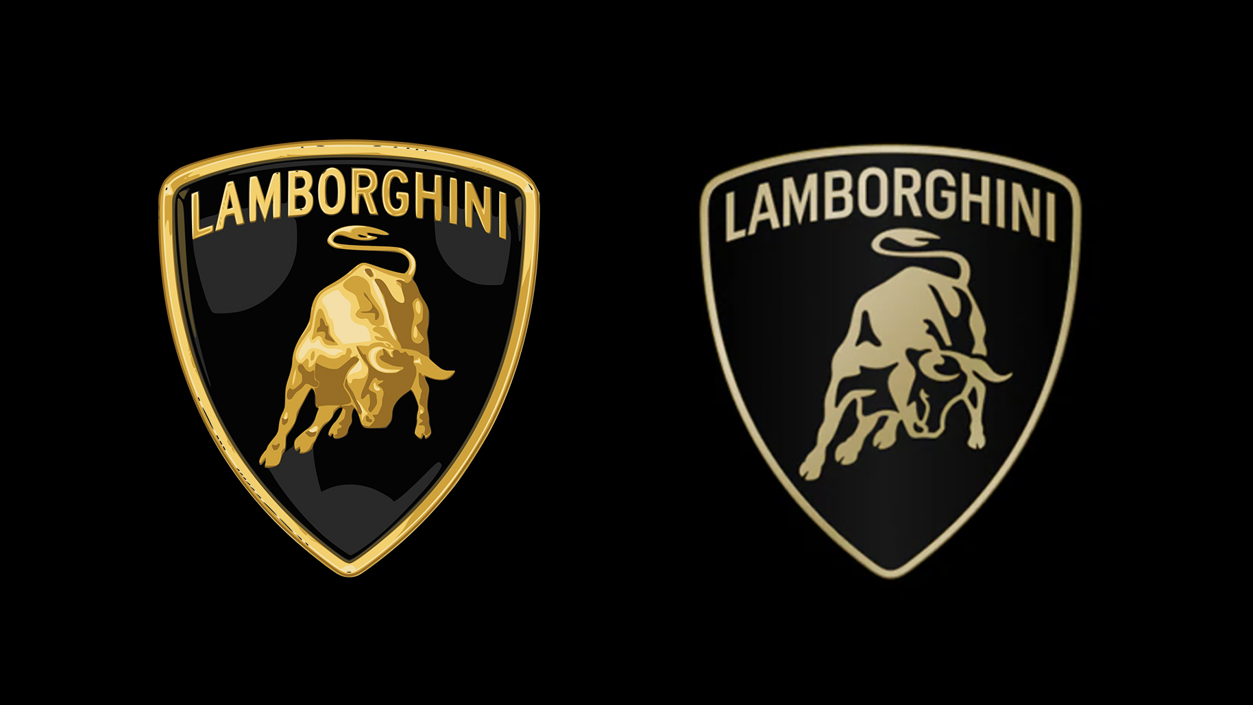
Lamborghini reveals "brave" new logo
(But it looks pretty familiar to us.)

It seems like pretty much every car brand has revealed a new logo over the last four years, from BMW to Rolls-Royce. One of the last remaining holdouts was Lamborghini, but the sports car brand has finally revealed a "new corporate look", including a tweaked logo design.
The brand describes the new logo as a visual expression of its “brave”, “unexpected” and “authentic” values. It features a bull sitting below the words 'Lamborghini' inside a badge shape. But, since the previous design featured a very similar bull sitting below the words 'Lamborghini' inside a badge shape, not everybody is finding it easy to tell the difference.
A post shared by Lamborghini (@lamborghini)
A photo posted by on
"The new logo, unveiled today and used on all the company’s official channels, is redefined by a broader Lamborghini typeface than its predecessor and by colours that are minimal yet bold," the brand announces via its website. "Therefore, black and white are reconfirmed as the primary hues, symbolizing the clear identity of the brand, while yellow, along with the introduction of the gold colour, is used as the accent colour."
Article continues below"This revamped version of the logo becomes an integral part of the company’s distinctive identity and will also be applied on future cars. In addition, the iconic bull in the centre of the logo has undergone a major transformation. For the first time, it will exist individually on the company’s digital touchpoints, separated from the classic shield to lend it even greater prominence."
But plenty of fans have noted the the design is very similar to the previous one. "Proper "corporate needs you to tell the difference between these 2 pictures" energy" one Reddit user comments, while another adds, "looks nearly identical to the old one".
Which, arguably, is a good thing. The best logos are timeless, and car brands are among the most recognisable designs in the world (although it's pretty hilarious when people try to draw them from memory). Just like BMW and Aston Martin, Lamborghini has opted to slightly simplify its existing design, wisely embracing its design heritage (which is quite the trend right now). Because as we know, when a car brand deviates too far from its established design, things can go wrong – just ask Kia.
Sign up to Creative Bloq's daily newsletter, which brings you the latest news and inspiration from the worlds of art, design and technology.

Daniel John is Design Editor at Creative Bloq. He reports on the worlds of design, branding and lifestyle tech, and has covered several industry events including Milan Design Week, OFFF Barcelona and Adobe Max in Los Angeles. He has interviewed leaders and designers at brands including Apple, Microsoft and Adobe. Daniel's debut book of short stories and poems was published in 2018, and his comedy newsletter is a Substack Bestseller.
