
There are some designs we encounter every day, and perhaps chief among them is car logos. On the road, in the street, on the TV - car logos are everywhere. So they're pretty easy to remember, right? As proven by one of our favourite studies of recent years, drawing them from memory is a little harder than you might think.
Vanmonster asked 100 members of the British public to draw famous car logos from memory, and the results range from spookily accurate to hilariously um, inaccurate. For some of the most memorable logos ever, check out our best logos of all time.
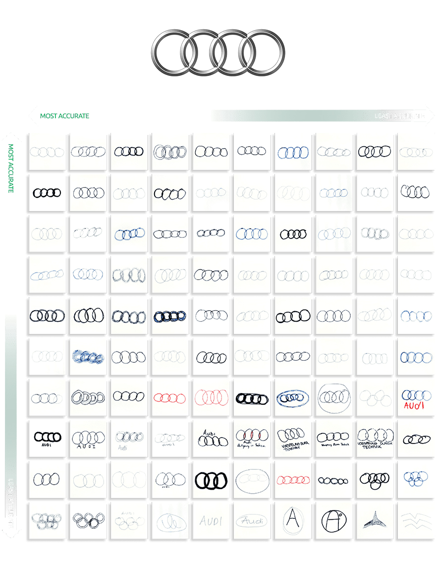
Take Audi, for example. Surely those four intersecting rings (below) are impossible to forget? Audi's and the Olympics' rings are similar, we'll give you that. As for those towards the bottom-right (Vanmonster lists the drawings from 'most accurate' to 'least accurate'), a few seem to have mixed up Audi and the Avengers.
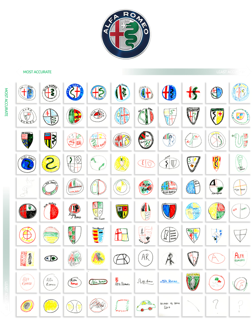
The Alfa Romeo logo is probably the most complex on the list. Unsurprising, then, that most got this one wrong. 74 per cent of entrants forgot to include the red cross, 63 per cent forgot the green snake and 75 per cent didn't include the shield.
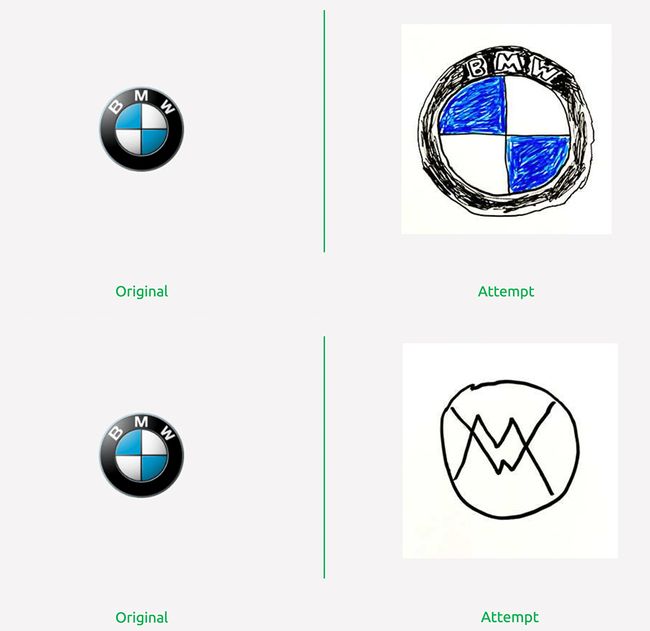
As well as showing all 100 entries for each logo, Vanmonster includes a handy gallery showing us the original logo alongside the most and least accurate attempt. Below are the best and worst attempts at BMW's logo (which underwent its biggest design change in over 100 years in 2020).
You can find the rest of the entries on Vanmonster's website, with logos including Renault, Toyota, Ferrari and many more. One thing's for sure, just like when 150 Americans tried to draw various (non-vehicular) logos from memory, this car logo test proves that the simplest are the most memorable. It's easier to recall rings than flag-snake-shield combinations. Fancy designing a logo of your own? Check out our guide on how to download Photoshop.
Read more:

