What's going on with the macOs Ventura UI design?
Apple is renowned for its outstanding design prowess, from product design to branding. But even Apple can struggle to get things right sometimes, as some of the developers using the beta version of macOs Ventura are now pointing out.
Several developers have listed litanies of schoolboy UI errors and bugs, mainly in the System Settings app and the Share menu of the upcoming operating system. This is the beta version so there's still time for Apple to fix things before the full release of the macOs Ventura, which is expected in October or early November, but some argue that these errors are not just bugs but design decisions. Perhaps even Apple could learn from our UX design course.
Ok thread of weird stuff found in redesigned macOS Ventura System Settings app.First one: what happens if you simply hold “Up” button pic.twitter.com/Xuez5U5ufeAugust 10, 2022
macOS Ventura is expected to be released later this year, replacing the current macOS Monterey. It looks like the update could offer a range of improvements, not least possibly an end to the dreaded CAPTCHA (take a tour of every MacOS since 1984 if you're feeling nostalgic).
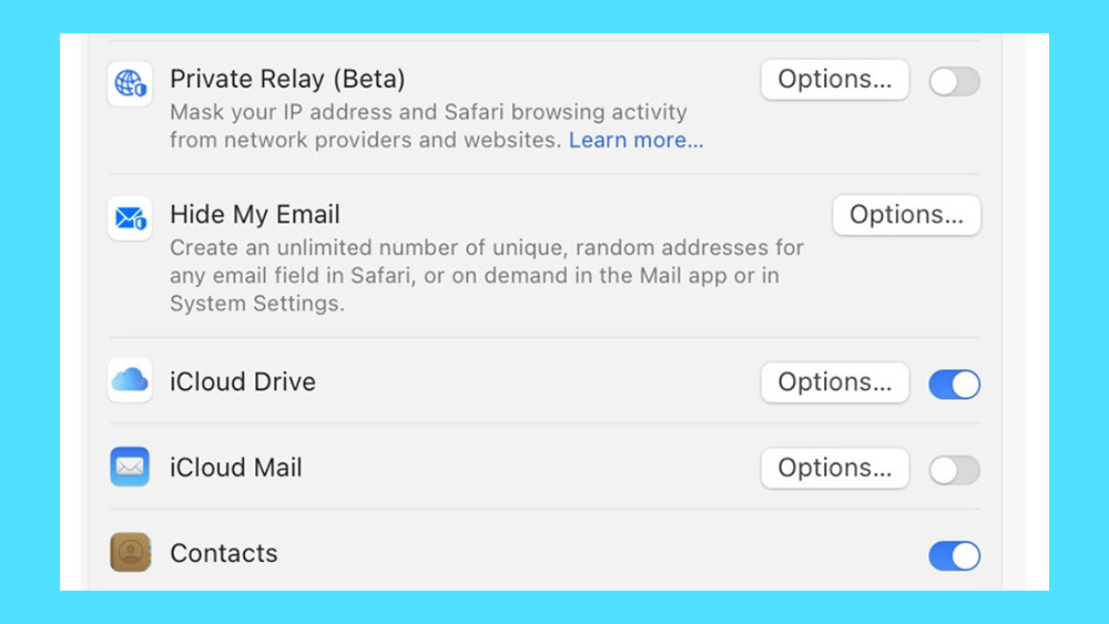
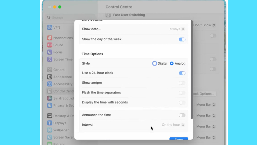
Article continues belowBut developers have been picking apart the operating system's UI. Most recently, the developer and UI researcher Niki Tonsky has shared a whole series of screengrabs on Twitter demonstrating UI nightmares in developer beta four and five versions of the System Settings app, which replaces the current System Preferences and looks more like the Settings app on the iPhone and iPad, with settings located in a sidebar.
Tonsky calls out some inconsistent use of basic UI elements such as buttons, dropdown and chevrons, misaligned content, cut-off boxes and texts, badly sized windows and much more. He's basically demolished the app's UI with a list of basic errors, oversights and bad decisions.


The new app is built using Apple's cross-platform user interface layer SwiftUI, and the list of errors has prompted some to suggest that this is where the problem lies. “If Apple can’t make professional-looking settings panels with Swift UI, how can anyone be expected to?” Jason Broccardo commented on Twitter, sharing Tonsky's original thread.
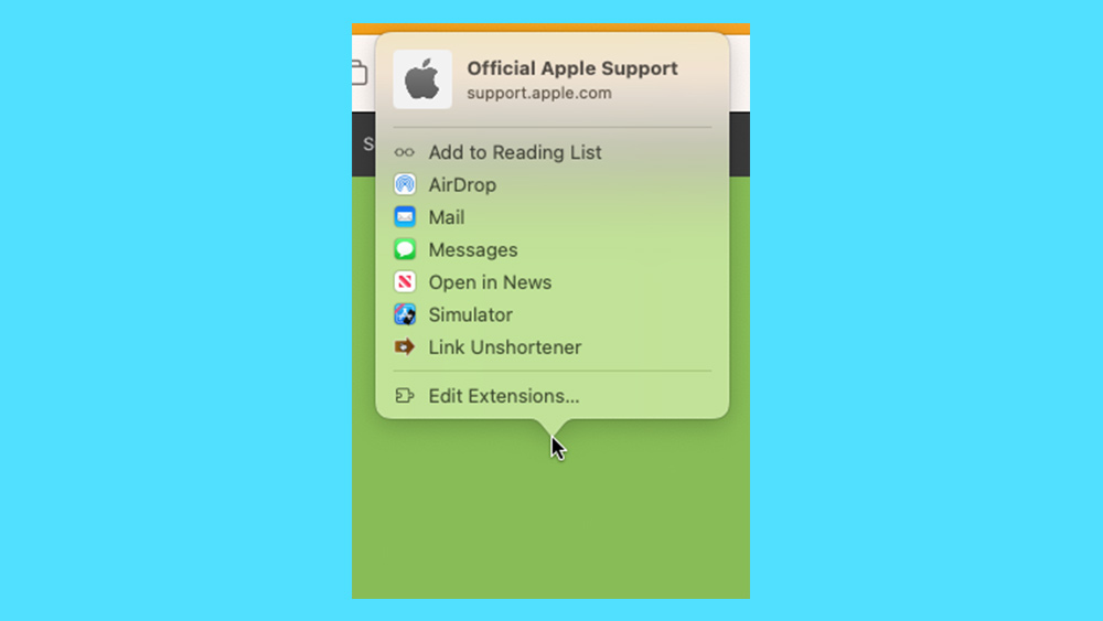
And it's not only the System Settings app. On lapcatsoftware.com, software engineer Jeff Johnson has listed a catalogue of UI issues with the macOS Ventura Share menu, which he notes is no longer really a menu but a menu item. The faults that Johnson identifies include additional clicks required, disappearing contextual menus and strange placements, anchoring and navigation. "In short, the new user interface is totally insane," he concludes.
Sign up to Creative Bloq's daily newsletter, which brings you the latest news and inspiration from the worlds of art, design and technology.

Only time will tell whether Apple has these issues on its radar and fixes them in time for the release of macOS Ventura. For tips for your own UI design, see our guide to the things you need to consider when designing a UI. Also see our pick of the best UI prototyping tools.
Read more:

Joe is a regular freelance journalist and editor at Creative Bloq. He writes news, features and buying guides and keeps track of the best equipment and software for creatives, from video editing programs to monitors and accessories. A veteran news writer and photographer, he now works as a project manager at the London and Buenos Aires-based design, production and branding agency Hermana Creatives. There he manages a team of designers, photographers and video editors who specialise in producing visual content and design assets for the hospitality sector. He also dances Argentine tango.
