9 things you need to consider when designing a UI

Sign up to Creative Bloq's daily newsletter, which brings you the latest news and inspiration from the worlds of art, design and technology.
You are now subscribed
Your newsletter sign-up was successful
Want to add more newsletters?
Designing a UI involves a combination of several skills. Great UI design feels completely natural for the user, but it doesn't happen by accident. It's the result of a lot of research and testing, with consideration given to a number of vital elements. We spoke to some of the experts on our UX Design Foundations course to get some pointers.
When designing a UI, you need to balance several things. On the one hand, there's the user experience. It should go without saying that the user interface needs to serve its purpose for the user it's designed for. But that's not the only concern. A highly usable interface is no good if it's ugly because simply won't want to use it, no matter how usable it is. And there are plenty of usable products that lose customers' interest because they start to look out of date.
UI doesn't only serve as the visual manifestation of UX, it also makes a contribution to the UX itself. Designing a UI design involves aesthetics, and part of that inevitably also involves brand identity. Below, a range of industry experts, including Pilar Serna and Daphne Lin from Spotify, Luke Cooley from Google and the ethical design and UX specialist Trina Falbe, talk through the key things to consider for great UI design.
Article continues belowAll of the experts quoted are contributors to our essential online UX design course, UX Design Foundations. The course offers a convenient, flexible way to learn all of the fundamentals of UX design. Complete our 2-minute survey for a chance to win a place on the course.
9 things to consider when designing a UI
01. Prioritise UX in your UI
So we started out by saying that UX isn't everything; but it is the reason for everything. We could debate the difference between UI vs UX for days but, we can hopefully agree that UI should at least mainly be in the service of user experience – and that visual design should really follow functionality.
UI design refers to the visual components of a user experience, and it can help make the user's journey as intuitive as possible. We can think of UX as the foundation, structure and frame of the house, and UI as the wallpaper, the furniture, and all those elements that make the environment more pleasant to navigate. This includes buttons, iconography, colours and all aesthetics on the user interface. But to get those right, we need to consider who will be using the interface, and why.
As Pilar Serna, senior design manager at Spotify, says: "When designing, make sure that you don't only have the UI part, but also that the user experience is embedded in it. And also like try to optimise for that consistency. If you use a certain UI element, [ensure] it actually makes sense and has a reason to be there."
Sign up to Creative Bloq's daily newsletter, which brings you the latest news and inspiration from the worlds of art, design and technology.
The entrepreneur, educator and Parsons School of Design professor Rinat Sherzer recommends using a design thinking methodology. This process starts with discovering the world that you're going to create for, then understanding the insides and ideally coming up with many ideas that could be a possible solution before choosing one to prototype and test (see our guide to the best UI prototyping tools for that).
"It's a really smart framework to go through when you create a new product because it really encapsulates both the right side of the brain, the really imaginative and creative side of the brain, as well as the left side of the brain, which is more analytical," he says.
The first skill here is empathy but also objectivity. You need to be able to understand other people's problems and needs without simulating yourself; to be able to "see through their eyes without making it about yourself".
02. Use text hierarchy when designing a UI
Turning to elements of the UI design itself, the hierarchy of text is one of the most key visual elements to consider. This goes for designing a UI in any format. From an early age, through reading newspaper headlines and straplines, book chapter titles, and really any media that involves text, people learn how to use the weight given to text to guide their reading.
At the most basic level, you need to make sure that the important information is the biggest and that this is what engages the reader first. The body copy provides the detail, and resources like edges and splashes can be used to highlight other important details.
"It's about making sure you're getting the right information across to everybody," says Jo Gulliver, group art director, events, at Future. "You have to think about the format of the page that you are getting this information across on, but the principles are always the same: snappy, punchy headlines to draw someone in, explain more information in the strap and then go into great detail in the body-copy using portraits, imprints to put out information."
03. Use the right icons

Getting icons right is an interesting challenge when designing a UI. Icons in UI need to simply communicate an idea or action or activity. An icon can be simplified and abstracted, but it can't be so abstract that people struggle to understand what it is – it needs to be intuitive. Of course, an icon can also become something more: even a symbol that people connect with as their way into an experience, like a logo. At the same time, while an icon may be foreign to users at first, with use, they become familiar with it
"It's so powerful that an icon can take the place of a huge block of content," Fiona Yang says. "It can make something so easily recognisable and just simplify an entire page. Choosing the right icon is very, very important and you might have a library of thousands of icons, but choosing the wrong one could mean somebody doesn't know to go to that specific part of the page to get help or, you know, or to do something that they need to do."
John Bricker, Principal and Creative Director at Gensler notes that many UI designers will build up whole libraries of icons to study and draw from. Choosing the right icons often means trying to fit into a system or a even broader societal visual language and about adopting conventions that are familiar for people much more than is maybe about trying to differentiate trends. But icons do change and evolve. For example, symbols for restrooms must now account for more blurred representations of gender in a way that feels right.
David Owen Morgan, senior product designer at Spotify, says: "There's a picture language, and it can be a lot stronger than a text language. You know the cliche about a picture's worth a thousand words. This is true and so much of our recognition of objects and tasks is because we've seen something before that's familiar."
04. Choose colours wisely
As well as text and iconography, colour can also perform a very important role in guiding users through a UI. Daphne Lin, senior product designer at Spotify, says: "Contrast is something that you should use very thoughtfully and sparingly. It will draw a lot of attention to itself if you design an item with high contrast. And that's why I typically reserve high contrast for my action buttons on an interface."
On principle taken from interior design is to choose three colours but make sure that the base colour (something neutral) is 60% to 80% of the page. The two other colours can be used to draw attention to things that matter. Rules and guidelines exist here to avoid confusing people with too much complexity. So for example, if you have a call to action button and a secondary call to action, you're not going to make them the same colour. You'll want to use your secondary colour while ensuring that this doesn't make the button look like it's disabled.
Colour can be an issue for accessibility, however. So while colour is important, it can be best to leave it to the later phase of design. Yuchen Zhang advocates for designing in greyscale first. "Many people are relying on colours in differentiating the meaning of let's say two different buttons or a link from a regular text," she says. "As a designer who has red and green colourblind, one thing I've found that's really, really helpful in my work is, I generally work in as much detail as possible for the final version of wireframes for my app design or web design."
Designing a UI initially in black and white and grey allows you to use the contrast of tonality to create a visual hierarchy for navigation. "I think sometimes when we give ourselves a limited amount of tools, we actually create a more accessible design," Zhang says.
05. Aim for universal design
That brings us to the concept of universal design. It's important to remember that you may be designing a UI for users from different backgrounds and of different ages. Culture, race is important in user experience design, and often that means adjusting your research strategy.
Designing for different ages means considering visual acuity among other factors (what's a comfortable font size and level of contrast for a 25 year old isn't the same for a 70 year old). It's also easy to be culturally biased in UI design. Jacquelyn Iyamah, founder of Black UX Collective, notes that iconography can be alienating, for example gender icons for people who don't identify with a single gender or are gender neutral. Meanwhile, voice-activated UI can struggle to deal with different accents.
Universal design is a set of practices and values to ensure that designers are thinking of all the different types of people who could be engaging with a product, be that voice, text size, colours, imagery or other elements. "You can't simply be engaging with folks who are considered the default in society," Iyamah says. "You have to speak to other people and understand what challenges that they're facing in order to create products that are truly universal."
She says UI designers need to get into the mindset of intersectional identities. "So if you are designing a mental health product for communities of colour to be matched with therapists of colour, maybe folks who English isn't their first language need to be able to select that in the form to be matched with a therapist that would really speak to their needs. All of these things really need to be implemented into the wireframing, and the mockups, and that visual design process."
Luke Cooley, a UX researcher on Google's Cloud AI team, encourages students to explore anthropology, sociology and economics from macro to micro to inform their work. "There's no shortcut," he says. "It takes constant investment in your users, but also understanding how people behave in different countries, their perceptions, their attitudes. And not all of that is directly tied to UX research and design. You're not always going to find that in design books or research books."
06. Create feedback and data gathering opportunities in your UI

Hopefully, you’ll be testing your UI before it goes live (see our tips for UX research and testing), but you can also build in opportunities for further feedback when designing a UI. This can be as simple as pop up with a message along the lines of 'how would you rate your experience today?', with a rating from one to 10. Another options are exit triggers – for example, the UI detects that your mouse is heading to the search bar to exit a site and it will surface a message at this moment.
The are also scroll triggers, which appear after scrolling has indicated that the user has some interest in the page, and cart abandonment triggers. There are also many opportunities to gather data. "Having interface elements on the page, or at least any actions on a page that are clickable are areas where you can collect data," Lin says. "Anything that a user does, you can collect information about. The hearts at Spotify is an event that we capture. Understanding when people click on the heart and why they click on it, those are all data points that we then can capture and create better products."
07. Build branding into you UI design
This is something to consider if the brand you're designing for already exists outside of the UI you’re creating, which it often will. You can create the most beautiful and most usable UI in the world, but if it doesn’t look and feel like part of the established brand, your company, or your client, is losing an opportunity to reinforce their identity and users may even be confused. And branding isn't only the visual logo, colours and fonts, it's also present in the tone of the UI.
"Brand is not necessarily just the visuals," the author AJ Camara says. "It's really like the whole feeling that you get when you deal with the company. When you're designing a website or an app or a product, a lot of times you are unconsciously creating something that is like an expansion of that brand. In doing so, you have to keep in mind with that brand stands for, how that brand wants to be represented, and the way that that brand wants to communicate with its users."
This means capturing the brand's personality when you're designing a UI, whether it's quiet and dainty, minimal or loud and boisterous. Gulliver says: "It could be a really memorable strapline, your use of colour, your use of font, font size. You're considering all of these design elements as stand-alone things but you've also got to consider how they interact."
08. Make your UI's notifications meaningful

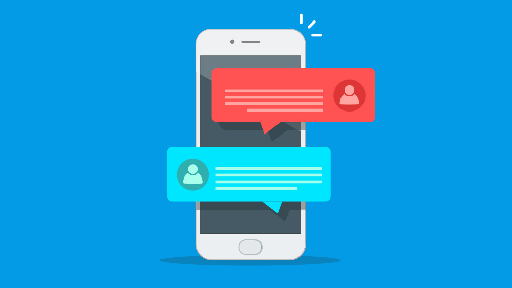
Apple's Human Interface Guidelines are a good place to start when considering notifications. They have a set of standards that state that a notification must be meaningful, informative, and not repetitive. That basically means a notification that doesn't hold actual meaning or meaningful information for the user shouldn't be sent. And a notification shouldn't be sent more than once, which is also something that a lot of UI designers forget (or ignore).
Trine Falbe suggests that instead of only focusing on the type of notification, the use case, and the timing, it's also helpful to think about the user value of the notification. "That's a column in that framework that people tend to not include," she says, "but if you force yourself or remind yourself to think about the user value for each of the notifications that you actually want your system to send, that helps you to create only meaningful notifications."
09. Don't forget that sound can be part of UI design
UI is often thought of as visual and perhaps tactile, but sound can also play a role. Sound design is an interesting space for design and user experience design. We're used to thinking about screens and experiences that require the user to interact with buttons and fields. But not all products and services need a screen.
"Look at the Alexas or the Google hub," says Vee Rogacheva, senior product designer at Future. "Either there's a very small screen or no screen at all. You need to interact with sound. And it's not only the interaction of you asking the device to do something. It's what the device tells you."
Another possible use of sound when you design a UI is to provide feedback, for example on whether the user is using the device correctly or has made a mistake. Vibration can also be used for this. "All of these are elements of the experience that are consciously designed to motivate, encourage and ultimately solve a problem or even two," Rogacheva says.
Learn more about how to design a UI

These are just some of the vital elements to consider when designing a UI. To learn more about both UX and UI, don't miss our UX Design Foundations course.
Meet the expert contributors to find out more about the people you can learn from in the remote study program. And for more details, see six reasons why you should sign up for the course.
Read more:

Joe is a regular freelance journalist and editor at Creative Bloq. He writes news, features and buying guides and keeps track of the best equipment and software for creatives, from video editing programs to monitors and accessories. A veteran news writer and photographer, he now works as a project manager at the London and Buenos Aires-based design, production and branding agency Hermana Creatives. There he manages a team of designers, photographers and video editors who specialise in producing visual content and design assets for the hospitality sector. He also dances Argentine tango.
