This year will no doubt go down in history as one of the worst for many, with plans and goals ruined for people across the globe. And it seems that's not the only thing 2020 has had a hand in ruining. Many rebrands are following the same trend these days, turning to a flat or minimalist aesthetic for logo overhauls. But a recent Twitter thread saw the design community asking if logos are in danger of becoming devoid of personality, lamenting the loss of uniqueness and quirkiness, and sharing examples of the perceived problem.
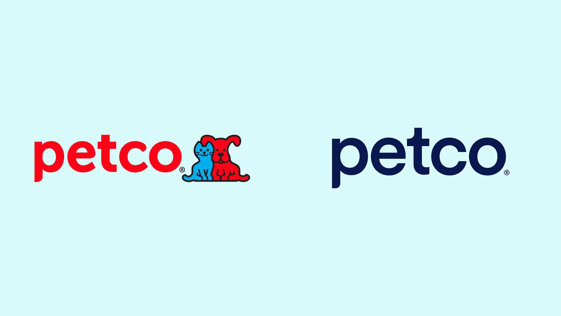
The conversation was sparked by the recent Petco redesign, which various designers see as intensely boring, and a million miles away from decent logo design inspiration. In this instance, Petco's smiling cat and dog have been unceremoniously removed, and the typeface has been transformed – losing the friendly curves it once had.
Mitch Goldstein, a designer and design professor, drew attention to the Petco rebrand with a series of tweets (below). He called into question the thinking that goes into this sort of redesign, which essentially removes any individuality from the brand.
I'm not snarking the people who created this logo: they had a job to do & wanted to make the client — who wanted a contemporary logo — happy.I'm snarking on the Graphic Design Profession™ who sold clients the idea that this is what contemporary graphic design looks like.December 10, 2020
More honestly — maybe I & my colleagues in academia are to blame the most. What are we teaching that leads to this? Original thought? Insightful research? Interdisciplinary empathy? Or are we teaching "reflect on what people think is cool & then do versions of that kind of?"December 10, 2020
Designer Liz Shinn agreed, remarking "remove anything that makes it unique or memorable = "modern". And we have to agree as well. Though it's a nice enough font, it doesn't say anything about the company. Could there have been a way to keep in an element of the 'pets' part of the business?
One designer thought so, and offered another way the rebrand could have been approached:
Guys I did ithttps://t.co/S7gpqEoUkmDecember 10, 2020
The plot thickened as one of the original designers for this project weighed in, providing some much needed context for the decision to remove the cat and dog (below). But even that design relies on the logo being viewed as a video, with the dog providing movement, personality and energy.
Since this already launched I can share what my original logo design entailed. I kept the logotype as was. https://t.co/XKpSdrWEEV pic.twitter.com/HDBejVjwb2December 10, 2020
Twitter users added other examples of companies making similar moves, proving how far reaching the trend has become.
Need the end to set me free. pic.twitter.com/hljn9ShXPQDecember 10, 2020
There is nothing more for me pic.twitter.com/lyUA0gQoKtDecember 11, 2020
With some voices asking why this trend is so far reaching, those in-the-know provided some useful explanation regarding cost and read speed, among others.
And you guessed right with printing as well. Less colors=smaller cost. It's literally penny pinching.December 10, 2020
This issue reaches into all areas of the industry, with trends enveloping design output and resulting in a lack of diversity in branding. For example, we recently looked at how the app design trend towards abstract, rainbow-coloured shapes may be giving you a headache. And the same thing is happening across car logos, where many car brands, such as Nissan, are all making the leap into flat design.
Do you like the stripped-back aesthetic or do you long for days when brands showed their personality and uniqueness through their iconography? Let us know on Twitter, Facebook or Instagram.
Read more:
- Has branding become boring?
- Logo design: All you need to know
- 10 unmissable logo design trends for 2021

