New infographic helps you colour match your branding
Easy guide to which colours are perceived as cheap or elegant.
Sign up to Creative Bloq's daily newsletter, which brings you the latest news and inspiration from the worlds of art, design and technology.
You are now subscribed
Your newsletter sign-up was successful
Want to add more newsletters?
As we know, using colour in branding effectively is key to a campaign's success. But how can designers be sure which colours are suitable for which projects?
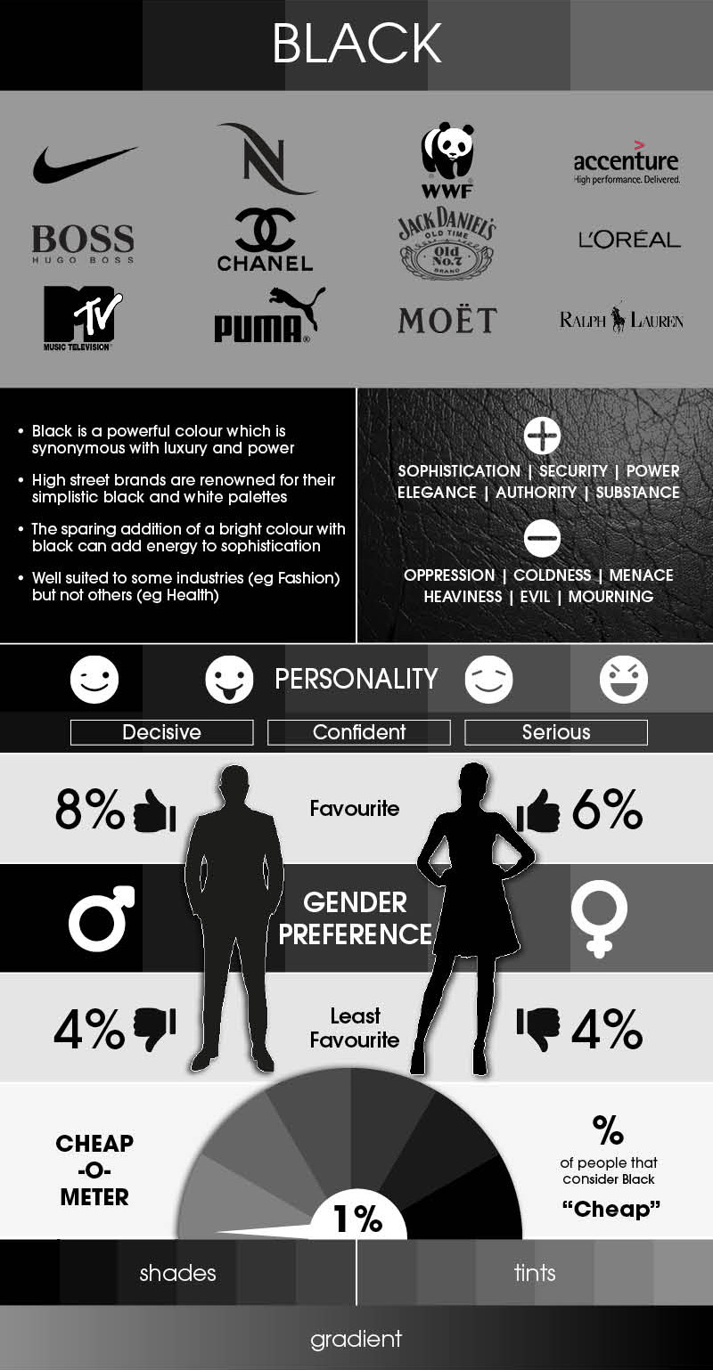
A new infographic by Iconic Fox aims to demystify the science of colour by breaking down the rainbow into the common associations, gender preferences and existing uses of each colour.
The Colour in Branding Infographic is an easy reference guide to make sure that you make the right colour choices in your designs. It aims to help designers avoid making any faux pas – by splashing 'cheap' colours over a luxury brand's business cards, for example.
Article continues below 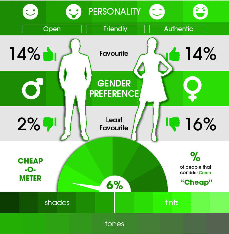
Iconic Fox brand creator Stephen Houraghan said that the quality content on Creative Bloq actually helped influence the infographic. "We didn’t find a really detailed, comprehensive infographic though, so once we gathered all of our info, we decided to design a comprehensive infographic."
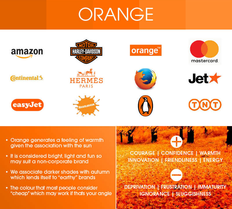
To see the full infographic, head over to the Iconic Fox site.
Related articles:
- The world’s favourite colour revealed
- How to pick the perfect colour palette every time
- 25 logo design tips from the experts
Sign up to Creative Bloq's daily newsletter, which brings you the latest news and inspiration from the worlds of art, design and technology.

Ella is Creative Bloq’s former production editor, and now works as managing editor for CB’s sister site, Woman&Home. In both roles, she helped the team to ensure content is expertly written, authoritative, timely and compelling.
While on Creative Bloq, she wrote a number of news and feature articles, specialising in graphic design and photography, attending design industry events and interviewing leading studios. She has 14 years of of editorial experience, graduating from Kingston University with a First Class Honours degree in Journalism in 2008.
Ella has written and edited magazines and websites including TechRadar.com, Digital Camera magazine, BikeRadar.com, Mollie Makes and more. She worked on professional photography website www.canon-europe.com/pro for six years, having worked her way up from production editor, to deputy editor, to editor. As such, she's a stickler for fact-checking, has too many opinions about grammar and is easily excited by a beautiful photo.
