We reported back in April on the reaction to the new LG logo, which we thought was being criticised unfairly. Now that the rebrand has started to appear in the wild, we think we were right to give it a vote of confidence.
LG had a rather boring, stale image that failed to reflect the fact that it produces some really innovative products. The new logo might seem like merely a slimmed-down version of its previous design, but animation gives it a personality that the brand had lacked. It's younger, brighter, and most importantly, much more noticeable (see our pick of the best new logos and the best animated logos for more inspiration).

LG is one of those tech brands that has never really stood out despite being generally reliable and even producing wild 'world first' products like the first 'wireless' TV and a portable monitor in a briefcase. It was a brand that was just fine but seemed to fade into the background. The new LG logo, now live alongside a new campaign, aims to change that.
Wolff Olins turns out to be the agency responsible for a rebrand that aims to “bring a smile back to the world of technology". The logo's repertoire of eight movements might have sounded limited when the character was first revealed, but its nodding, spinning and winking take on new meaning when implemented in the campaign, making the logo feel almost like a companion to a product
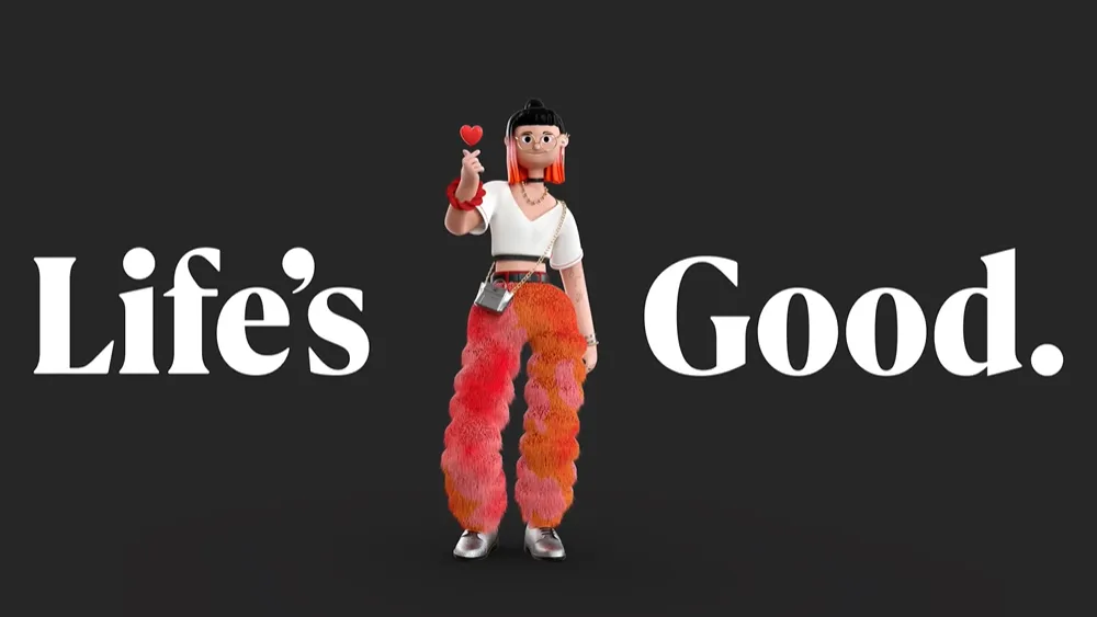
LG aims to become an “iconic brand” – think Apple and Samsung – known as a “smart life solutions company” rather than a home appliance brand. Part of that move involves appealing to a younger market. The new logo alone feels more youthful, but a new campaign goes further and introduces the characters Joy and Ryder, developed with South Korean illustrator Jungmin Ryu and animated by Animade.
Giving a tech company mascots risks taking it into breakfast cereal or sports franchise territory, but I think the unusual move pays off. It remains to be seen how long they'll stick around or how much people will take to them, but it's pleasing to see the attention given to making the clothing and accessories reference LG and Korean culture, and they make an impact in 3D billboards - see the video below from Times Square.
The campaign sticks with LG's established Life’s Good slogan. But this is also given a more youthful boost of energy in a bespoke type drawn by F37, and it appears alongside quirky visuals.
There's been much criticism of the dominating trend to flatten logos (see the many car logo rebrands), but I think this is a case where going flatter has made it bolder. LG is no longer the tech brand that you don't really notice.

