New logo for the New York Jets takes flight
The American football team reveals a modern redesign.

Sign up to Creative Bloq's daily newsletter, which brings you the latest news and inspiration from the worlds of art, design and technology.
You are now subscribed
Your newsletter sign-up was successful
Want to add more newsletters?
It's a big day for fans of the New York Jets as the American football team has launched its new logo, along with a redesigned uniform for players. Notable due to the fact that this is only the seventh logo refresh in the team's 60 year history, the new design puts the focus on New York and uses a football shape to tie the whole package together.
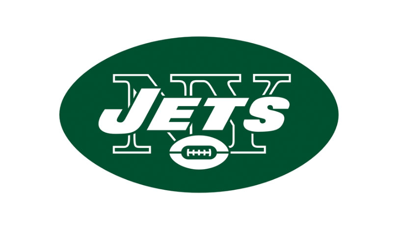
Picking up where the previous logo design (below) left off, this update harks back to designs from the '60s and '70s that also used a football shape as their foundation. The new version also straightens out difficult type elements found in the 1998-2018 logo, and ditches a strange use of negative space found floating around the word 'Jets'.

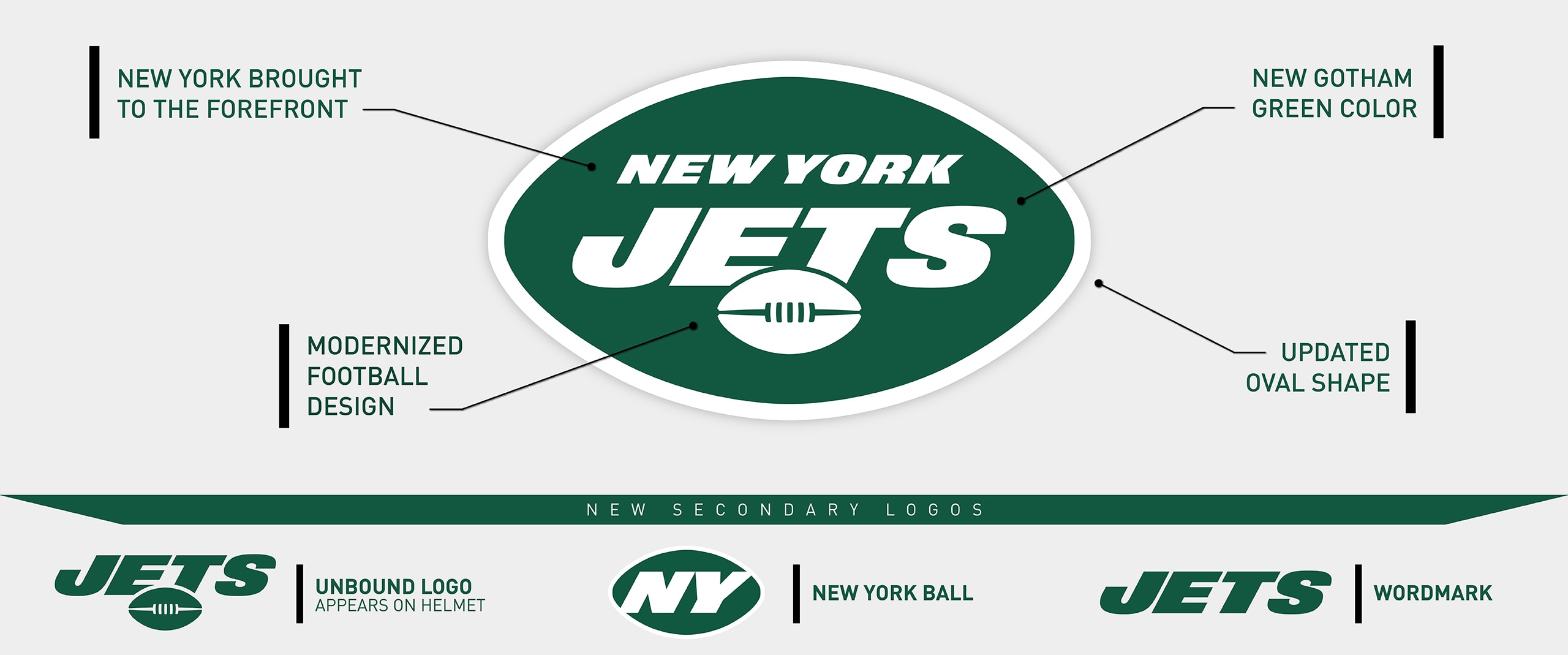
The team's custom typeset, which was designed by Hoefler & Co. in 2002, is still present, but colour has been changed to a straightforward but pleasing Gotham Green. It's a neater design, especially when it comes to the spruced up football graphic at the heart of the logo, which features more elegant stitching.
Article continues belowSpeaking of Gotham Green, over on the New York Jets' site, you can already see the colour working in action on a range of merchandise. There is also a glimpse at new secondary logos. These take elements from the main design, such as the team name and ball shape, and rework them to fit into different settings such as the player's helmets.

The new logo is the latest in a slew of changes for the New York Jets. Prior to this update the team was enjoying a revamped kit, and behind the scenes they were working with a new coach and players. For a team that has been somewhat of a punchline in the National Football League, it's hoped that the redesign and reshuffle will signal the start of a new era for the Jets.
Related articles:
- 8 iconic American logos that changed branding forever
- Wolves rebrand puts club ahead of the pack
- Redesigned Leeds United badge has outraged fans
Sign up to Creative Bloq's daily newsletter, which brings you the latest news and inspiration from the worlds of art, design and technology.

Dom Carter is a freelance writer who specialises in art and design. Formerly a staff writer for Creative Bloq, his work has also appeared on Creative Boom and in the pages of ImagineFX, Computer Arts, 3D World, and .net. He has been a D&AD New Blood judge, and has a particular interest in picture books.
