The new Papa Johns logo makes absolutely no sense
What a difference an apostrophe makes.
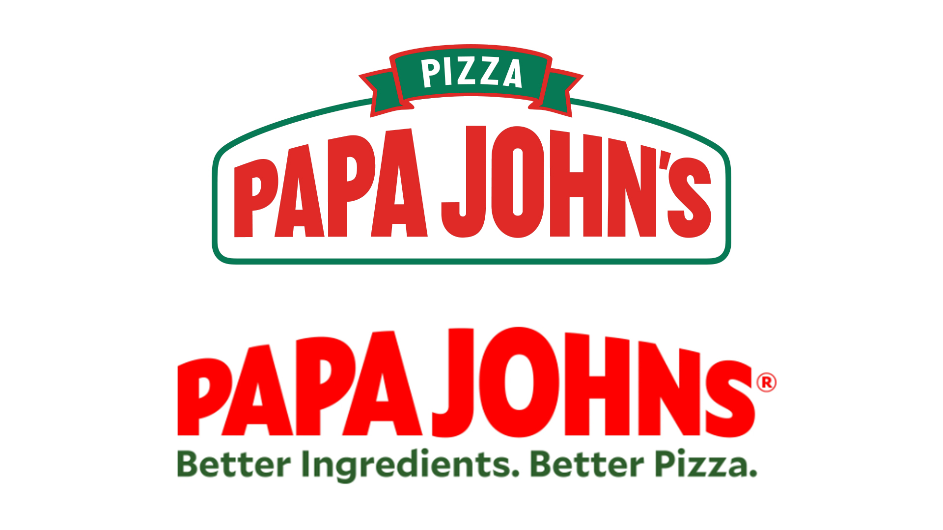
What a difference an apostrophe makes. Pizza chain Papa Johns has just revealed a brand new logo, doing away with decorative features in favour of a more minimal design. But it's perhaps the smallest change that makes the biggest difference – not just to the design, but to the entire meaning of the name.
With new colours, typography and illustration, the company has been given an entirely new brand identity. But it's the missing apostrophe that people are noticing, and with it the implication that Papa Johns no longer belongs to, er, Papa John himself. (Looking for design inspiration? Check out the best logos of all time.)

The new logo features bulging text in an updated sans-serif font, which Papa Johns says is "inspired by the way Papa Johns' fresh, never-frozen dough moves and stretches when team members craft pizza." It's a more minimal affair, with the border removed and lack of shadow granting it access to the flat design party, where it joins the likes of BMW, Burger King and, well, pretty much every new logo of the last few years.
A new colour palette, meanwhile, includes Tangy tomato (red), Fresh basil (green) and Fluffy dough (off-white). But while the press release itself doesn't reference the absent apostrophe, it's the only thing pizza fans are talking about.

It seems the possessive has been pulled as part of an attempt by the brand to distance itself from founder John Schnatter. According to Courier Journal, Schnatter recently stepped down after it was reported that he’d used a racial slur on a conference call.
But rather than scrub the name entirely, the brand decided to do away with one all-important piece of punctuation. And we can't help but feel that the new name isn't entirely grammatically sound (as evidenced by our word processor's tenacious attempts to reinsert said apostrophe). What does the new name mean? Is it now plural? Are there now multiple Papa Johns? Have we entered the Papa Johns multiverse? Or is Papa's surname now Johns? It's the greatest mystery of 2021, folks.
excuse me.papa john's is changing its logo.it now reads "papa johns," without the apostrophe.the pizza no longer belongs to the bad john, but perhaps now to... all johns? or are they now selling fathers named john instead of their wet pizza?this is disorienting. pic.twitter.com/jd7NxqqvhyNovember 16, 2021
Indeed, while the new logo is hardly the worst we've seen in 2021 (Step forward, Calendly), it's the grammatical chaos of the new name that undoes the entire enterprise for us. About to embark on your own rebranding project? Be sure to take a look at our guide to logo design.
Daily design news, reviews, how-tos and more, as picked by the editors.
Read more:

Thank you for reading 5 articles this month* Join now for unlimited access
Enjoy your first month for just £1 / $1 / €1
*Read 5 free articles per month without a subscription

Join now for unlimited access
Try first month for just £1 / $1 / €1

Daniel John is Design Editor at Creative Bloq. He reports on the worlds of design, branding and lifestyle tech, and has covered several industry events including Milan Design Week, OFFF Barcelona and Adobe Max in Los Angeles. He has interviewed leaders and designers at brands including Apple, Microsoft and Adobe. Daniel's debut book of short stories and poems was published in 2018, and his comedy newsletter is a Substack Bestseller.
