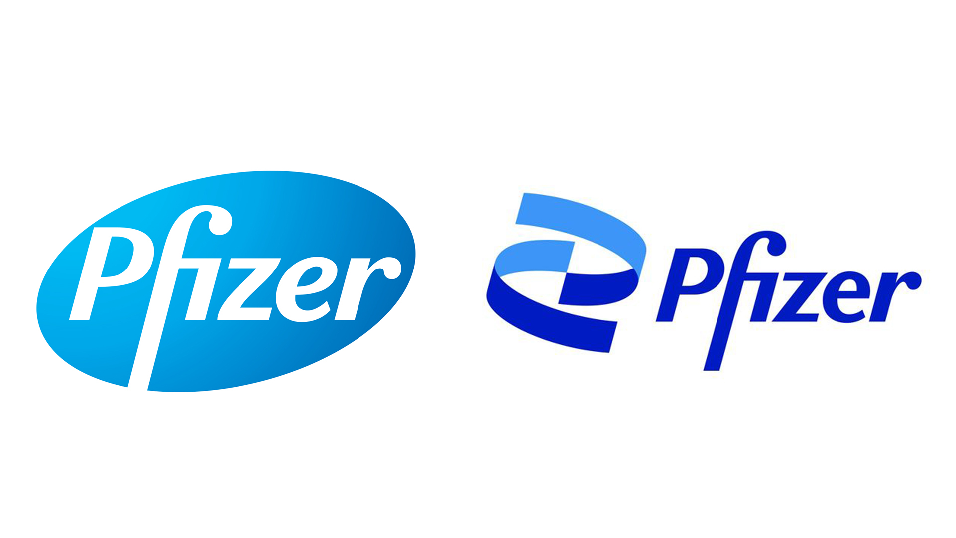
Pfizer tries to inject some life into its logo (but does it succeed?)
It's not immune to criticism.
You may have heard of pharmaceutical company Pfizer over the last few months, what with it having jointly created a somewhat notable vaccine. Keen to emphasise its "extraordinary focus on science", the company has revealed full rebrand, doing away with its pill-shaped logo.
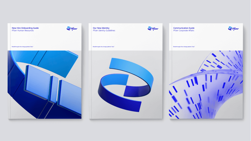
The new logo features a double helix spiral, and marks the first major redesign for Pfizer in 70 years. The replacement of the pill with DNA is said to signify a shift from commerce to science, and while hardly one of the best logos of all time, it's an appropriately clean, clinical new look – if a little dull.
In order to realize the breakthroughs of the future, we’ve revolutionized how we work today. We're unlocking the pill to reveal Pfizer’s DNA: the power of science. pic.twitter.com/NO0TWt6OVhJanuary 5, 2021
Pfizer says the two-tone blue helix is more representative than the previous pill design of the company's slogan: Breakthroughs that change patients' lives. "Pfizer is no longer in the business of just treating diseases," says Pfizer's CEO Albert Bourla. "We're curing and preventing them."

Along with the updated logo, the rebrand includes a new typeface, Noto Sans. Designed by Google "to internationalise the internet", the font family is, according to Pfizer, "sleek and practical, minimal and inviting – and asserts itself only when asked to" (presumably that means it also comes in bold). Check out our best free fonts for more typographical inspiration.
Pfizer has also stripped its eight-colour palette down to a simplified, two-tone blue colour scheme. "In an industry awash with blue," Pfizer says, "we're doubling down". Fair enough.

The result of 18 months of work by Brooklyn-based design agency Team, Pfizer's new identity comes at a good time for the company. According to Fierce Pharma, a recent survey revealed that Pfizer's reputation improved by 48 per cent among Americans after reports of its coronavirus vaccine's 95 per cent effectiveness rate.
While a new logo is unlikely to boost its image quite as much as the vaccine for a world-stopping virus, we'd say the transition from pill to DNA successfully suggests a shift from commerce to science. That said, being one of the few pharmaceutical companies people know by name right now, we can't help but wish Pfizer had gone for something a little more distinctive and contemporary.
Sign up to Creative Bloq's daily newsletter, which brings you the latest news and inspiration from the worlds of art, design and technology.
Encoded within a successful emblem is a company’s DNA – its history, its future. @Pfizer’s new corporate brand identity is a digital-first expression of our commitment to the transformative power of science. It’s a dynamic reflection of our purpose. pic.twitter.com/vNqCgWus4wJanuary 5, 2021
But while it isn't the most exciting rebrand we'll see in 2021, Pfizer's new look gets the job done. One thing's for sure – it's a lot less baffling than the first rebrand we saw this year, courtesy of the CIA.
Read more:

Daniel John is Design Editor at Creative Bloq. He reports on the worlds of design, branding and lifestyle tech, and has covered several industry events including Milan Design Week, OFFF Barcelona and Adobe Max in Los Angeles. He has interviewed leaders and designers at brands including Apple, Microsoft and Adobe. Daniel's debut book of short stories and poems was published in 2018, and his comedy newsletter is a Substack Bestseller.

