Pizza Hut brings back iconic red roof logo
Brand taps into nostalgia to reheat public interest.
Sign up to Creative Bloq's daily newsletter, which brings you the latest news and inspiration from the worlds of art, design and technology.
You are now subscribed
Your newsletter sign-up was successful
Want to add more newsletters?
Have you ever ordered a pizza then realised that you can't eat it in one sitting? Chances are you might have saved it overnight then reheated it in the morning for a breakfast treat. That's sort of what Pizza Hut has done with its logo, by dusting off a design from the 60s and 70s.
The logo in question is the red roof design. This graphic has been the cornerstone of the Pizza Hut brand for decades, although successive iterations have tweaked it so much that the straightforward logo arguably lost its impact.
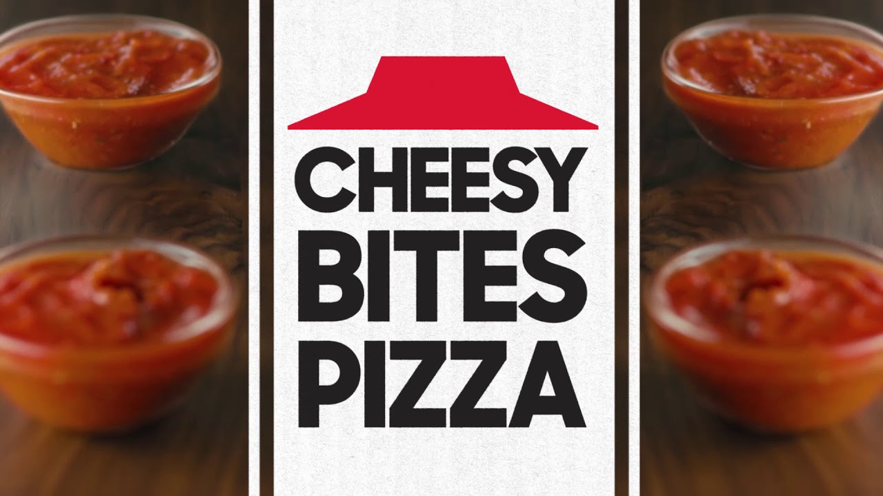
However, the original red roof design, which was used between 1967 and 1999, still looks timeless. Check out the revived version in action in the video for Pizza Hut's relaunch of its Cheesy Bites pizza crust (above). It's a good example of best practice logo design in action: it's got simple shapes, crisp colours, and a clear message that all come together in one effective piece of branding.
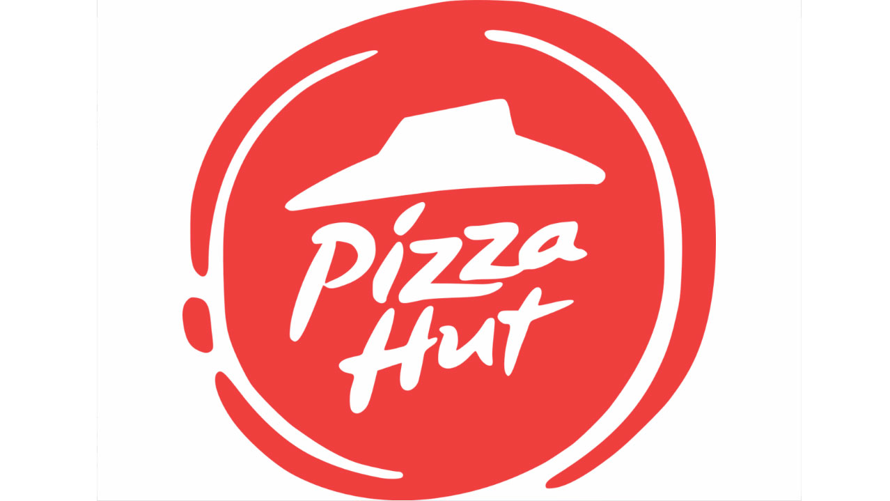
Article continues belowMeanwhile the logo that rolled out in 2014 (below) inverted the colours and to make the red roof white. The accompanying circular graphic brought to mind tomato sauce smeared on a doughy base, but even for the time it looked a little passé.

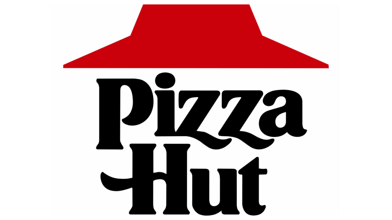
The new logo isn't identical to its predecessor (below) though. The colour of the roof has been bumped up from a dull carmine shade and now pops from the screen in a vibrant red.
Traditionalists will be happy to see that the flowing serifed lettering is still present and correct. It's also now accompanied by the slogan 'No one outpizzas the hut', but the less said about that the better.

So why did Pizza Hut bring back the design? According to its chief brand officer Marianna Radley, it was because the chain wanted to reconnect with its roots and be "a little braver, a little bolder in our choices".
Sign up to Creative Bloq's daily newsletter, which brings you the latest news and inspiration from the worlds of art, design and technology.
Given that Pizza Hut is the first national US pizza chain, it's got a lot of legacy to draw on. Lately it has been losing ground though, with Dominos overtaking it to become the largest pizza company by sales in 2017.
But with a new, old logo, NFL sponsorship and revitalised menu, Pizza Hut hopes to claw back the public's affection. "We need have more guts in what we're doing and be more confident," Radley told The Drum. "I think we shied away from that over the years."
Expect to see the new identity appear on Pizza Hut's communications and promotions in the coming weeks.
Related articles:

Dom Carter is a freelance writer who specialises in art and design. Formerly a staff writer for Creative Bloq, his work has also appeared on Creative Boom and in the pages of ImagineFX, Computer Arts, 3D World, and .net. He has been a D&AD New Blood judge, and has a particular interest in picture books.

