Designer unmasks the secret of the PS5 logo
Sony's process is turned on its head. But does this fan theory hold up?

Sign up to Creative Bloq's daily newsletter, which brings you the latest news and inspiration from the worlds of art, design and technology.
You are now subscribed
Your newsletter sign-up was successful
Want to add more newsletters?
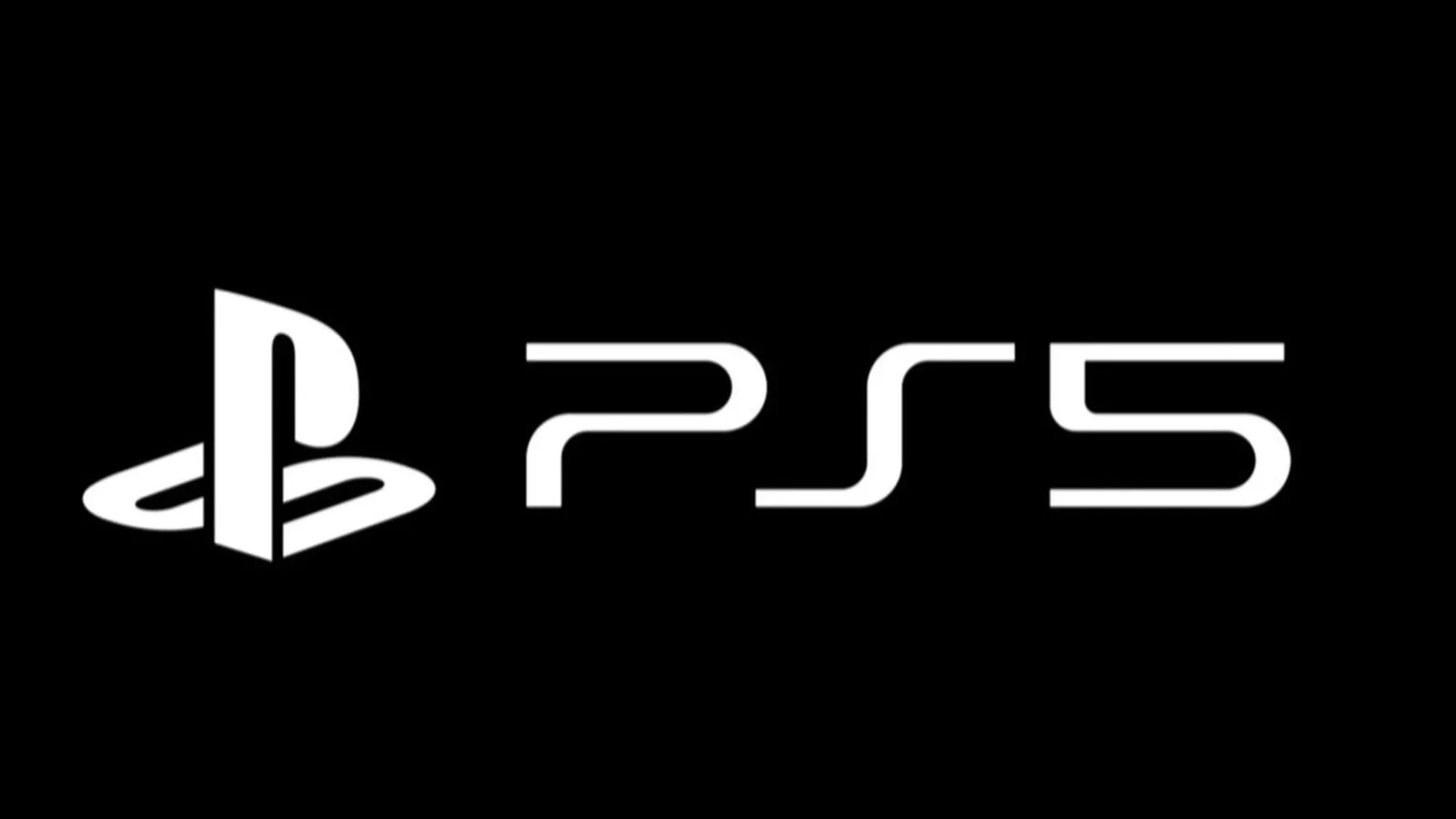
However you feel about it, Sony's not-particularly-new logo for the PlayStation 5 has definitely got people talking. Revealed this week at CES 2020, the new logo (above) is remarkable for its similarity to the PS4 logo, and indeed the PS3 logo – prompting some savage but hilarious reactions from the design community.
Obviously it's never going to make it into anyone's list of best logos, and somehow we doubt that Sony even cares. It's almost as if the designer simply opened up SONY_PS4_LOGO_FINAL.AI, deleted the '4', typed in a '5' and saved it as SONY_PS5_LOGO_FINAL.AI before going home early. And fair play to them.
That explanation's just not cutting it for some people, though. And while we're with Occam and his trusty razor when it comes to divining the process behind the PS5 logo, we can take a certain delight in this particular theory of how it came about:
Article continues belowPosted on Reddit by user DeBeard – we're not entirely sure if it's their work or not – this neat little animation surmises that the '5' in the PS 5 logo was created by copying, pasting, rotating and flipping the 'P'. And then drawing out an arm on the top, because that's definitely a lot less effort than hitting Backspace and pressing '5'.
That said, though, we've all occasionally found ourselves in a position where, due to lack of the right fonts, we've had to cobble together the odd glyph from bits of other characters, right? Right. And just maybe Sony's been a little careless with its in-house assets, and someone really did have to make a '5' out of the 'P'. These things happen!
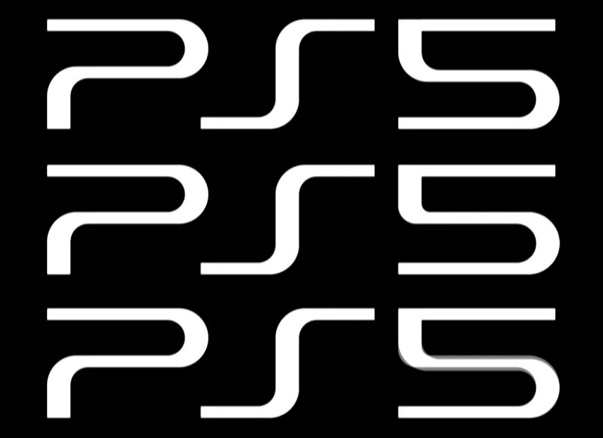
Sorry, but no. Finding ourselves with just a little too much time on our hands this morning, we decided to try it for ourselves. And while it kind of fits, on closer inspection you can see that no, it doesn't quite fit enough. Take a look:

The top logo is one made by flipping the 'P' and drawing out an arm to turn it into a 5. The middle logo is the actual logo, with slightly mode pleasing curves around the midsection. And at the bottom we've overlaid the two; the grey areas are where things don't quite match.
Sign up to Creative Bloq's daily newsletter, which brings you the latest news and inspiration from the worlds of art, design and technology.
So there you have it. Didn't happen. Sorry about that. To make up for it, here's a lovely tweet we found where someone remade the PS5 logo in the style of previous PlayStation designs.
PS5 logo with previous designs pic.twitter.com/ZsbHgvJh2PJanuary 7, 2020
Related articles:

Jim McCauley is a writer, performer and cat-wrangler who started writing professionally way back in 1995 on PC Format magazine, and has been covering technology-related subjects ever since, whether it's hardware, software or videogames. A chance call in 2005 led to Jim taking charge of Computer Arts' website and developing an interest in the world of graphic design, and eventually led to a move over to the freshly-launched Creative Bloq in 2012. Jim now works as a freelance writer for sites including Creative Bloq, T3 and PetsRadar, specialising in design, technology, wellness and cats, while doing the occasional pantomime and street performance in Bath and designing posters for a local drama group on the side.
