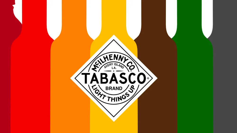
Who doesn't love Tabasco sauce? It goes well with everything, from tacos to vodka to the ubiquitous food trend of the millennium, avocado toast. Celebrity chef Nigella Lawson even recommends keeping a bottle in one's handbag for emergencies. And while the brand's instantly recognisable for the shape of its bottles and its diamond label, it's now been given some extra kick with a full visual identity – and it's on fire.
The ingredients for this blazing hot bevy of new Tabasco-flavoured assets? A new tagline, a bold colour palette, strong typography and improved photography. Beyond the famous bottle and label, the McIlhenny Company now has a modern, unified look for materials ranging from print ads to social media content, menus and more, refreshing a brand that dates all the way back to 1868. Looking for inspiration for your own work? See our guide to the best branding books and our roundup of more great examples of colour in branding.

Created by New York agency Mrs&Mr, this is the famous Louisiana hot sauce's first complete, unified visual identity. Very sensibly, they've not messed with the things the McIlhenny Company already had spot on – the familiar Tabasco sauce bottle and label. But they've backed them up with bold graphics that do justice to the sauce's fiery reputation.
Refreshingly, they've avoided many of the cliches associated with hot sauces – so no grilled stakes, infernal flames or spontaneous combustion. Instead, we get vibrant patterns, halftone graphics and rough illustrations with a tactile, handmade feel and plenty of healthy-looking greens.


The work shows that a brand can really be given a boost through the creation of a unified visual identity that goes beyond, but backs up and even enhances its core logo (see our guide to how to design a logo for more on that). Also, this week we had another example of strong branding from a condiment giant when Heinz demonstrated that it's even recognised by AI. Not all branding is so memorable, however – take a look at these logos you might be remembering wrong.

