This luxurious typeface was 25 years in the making
The latest typeface from Fontsmith has taken a quarter of a century to perfect.

Sign up to Creative Bloq's daily newsletter, which brings you the latest news and inspiration from the worlds of art, design and technology.
You are now subscribed
Your newsletter sign-up was successful
Want to add more newsletters?
When you’re working on a creative project, whether it’s an experimental piece of packaging design or an eye-catching concept for a vintage poster, it often helps to put the idea away for a while so you can let it gestate. That’s exactly what happened with FS Siena, the latest typeface from Fontsmith, which has been 25 years in the making.
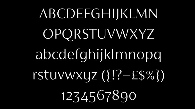
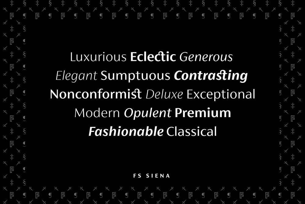
First drawn by Fontsmith founder Jason Smith at the tender age of 18, FS Siena is an elegant font that balances classical proportions with modern, economical lines that make it perfect for high-end brands who want communicate both heritage and modernity.

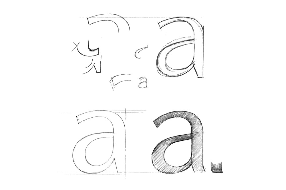
Originally drawn with a Rotring pen at art college, Smith squirrelled away his typeface until the time was right. “I’ve always wanted to do something with it,” he explains. ‘Phil Garnham (Smith’s co-director), has always rolled his eyes whenever I’ve mentioned it. But we see so much today that is samey. I wanted to bring some elegance back and develop a full set of weights that brands can use across a range of media, design and advertising.”
Article continues belowThe contrasted sans serif typeface can trace its origins all the way back to Roman inscriptions, which were a starting point for Smith when he first committed to the design. He was also influenced by the contrasted sans face, Optima, designed by Hermann Zapf in the 1950s. The design was tweaked over time as Smith chased ‘what felt right’.

Fontsmith designer Krista Radoeva was determined to preserve the nonconformist subtleties found in a typeface that took decades to produce. “It’s about choosing the right balance of the letters together, rather than having all the letterforms following exactly the same pattern,” she explains, in regards to contrasted typefaces.
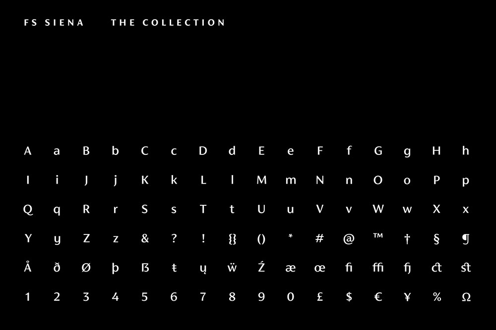
With various idiosyncrasies, including the smooth connection between the ‘h’ and ‘r’ amongst others contrasting the corners of the ‘b’ and the ‘p’, FS Siena is an unusual typeface with a flavour all of its own.

“The eye expects to see a serif at the end of the thin stems so you need to compensate with the subtle curves and flares found in some letters and a little extra weight in the stroke endings of others,” adds Krista. “It’s something of an optical illusion.”
Sign up to Creative Bloq's daily newsletter, which brings you the latest news and inspiration from the worlds of art, design and technology.
Along with many other distinctive quirks found inside its lettering, FS Siena is a combination of oddball charm and elegance that looks like it'll be well worth the wait.

Dom Carter is a freelance writer who specialises in art and design. Formerly a staff writer for Creative Bloq, his work has also appeared on Creative Boom and in the pages of ImagineFX, Computer Arts, 3D World, and .net. He has been a D&AD New Blood judge, and has a particular interest in picture books.
