Please tell me the controversy over Dwayne Johnson's XFL logo is a joke
The daftest design debate of 2022?
Sign up to Creative Bloq's daily newsletter, which brings you the latest news and inspiration from the worlds of art, design and technology.
You are now subscribed
Your newsletter sign-up was successful
Want to add more newsletters?
We've seen plenty of logo disputes over the last couple of years and, weirdly, lots of them have involved celebrities. From Kanye vs Walmart to Drake vs Bellroy, it seems A-listers have knack for generating copyright cases. Here's another – and it might just be the most ridiculous yet.
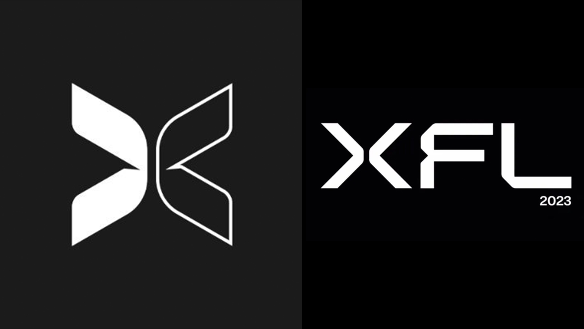
To much fanfare, actor Dwayne 'The Rock' Johnson revealed the new logo for the 2023 XFL football league yesterday. And to even more fanfare, footballer Megan Rapinoe called out its similarity to the branding for Togethxr, a company founded by Rapinoe's wife. Except, I'm struggling to find more than a couple of minor consistencies (such as the fact that neither are best logos of all time material).

Both logos feature a sans-serif 'X' with a split down the middle. And from what I can see, the similarities end around about there. While Togethxr, a media company that "aims to change the way society views traditional roles for women," uses just an 'X' as its logo, XFL's logo features all three letters. And the 'X's aren't even that similar aside from the split in the middle – Togethxr's is rounded and two-tone, whereas XFL's is sharp, and all-white. They say X marks the spot, but I'm having trouble locating the issue here.
Article continues belowA post shared by TOGETHXR (@togethxr)
A photo posted by on
Togethxr appears to have taken particular umbrage at a moment in the reveal video for XFL's new branding, which features the two halves of an 'X' surrounding the word 'together'. Sure, once that word enters the mix, things start to feel a little more similar. But it appears to be a seconds-long moment created specifically for the trailer rather than a key aspect of XFL's new identity.
"So nobody can use the letter X in their logo again?" One Twitter user asks, while another adds, "I think this is a huge reach. Logo is a split X. That's the only similarity." Indeed, some are wondering whether Togethxr's complaint is at best a joke, or at work a marketing ploy designed to draw attention to the brand.
Sigh. Seems like a great fight to pick for free publicity, no? The letter “X” is super common in branding and marketing nowadays and this is a reach. https://t.co/ZXD7bP8DvxApril 10, 2022
Last year it was Chanel vs Huawei, and I have a feeling this might just be the most ridiculous logo dispute of 2022. Anyway, if you want to create a design that absolutely, definitely won't be accused of ripping off another, check out our guide on how to design a logo.
Read more:
Sign up to Creative Bloq's daily newsletter, which brings you the latest news and inspiration from the worlds of art, design and technology.

Daniel John is Design Editor at Creative Bloq. He reports on the worlds of design, branding and lifestyle tech, and has covered several industry events including Milan Design Week, OFFF Barcelona and Adobe Max in Los Angeles. He has interviewed leaders and designers at brands including Apple, Microsoft and Adobe. Daniel's debut book of short stories and poems was published in 2018, and his comedy newsletter is a Substack Bestseller.
