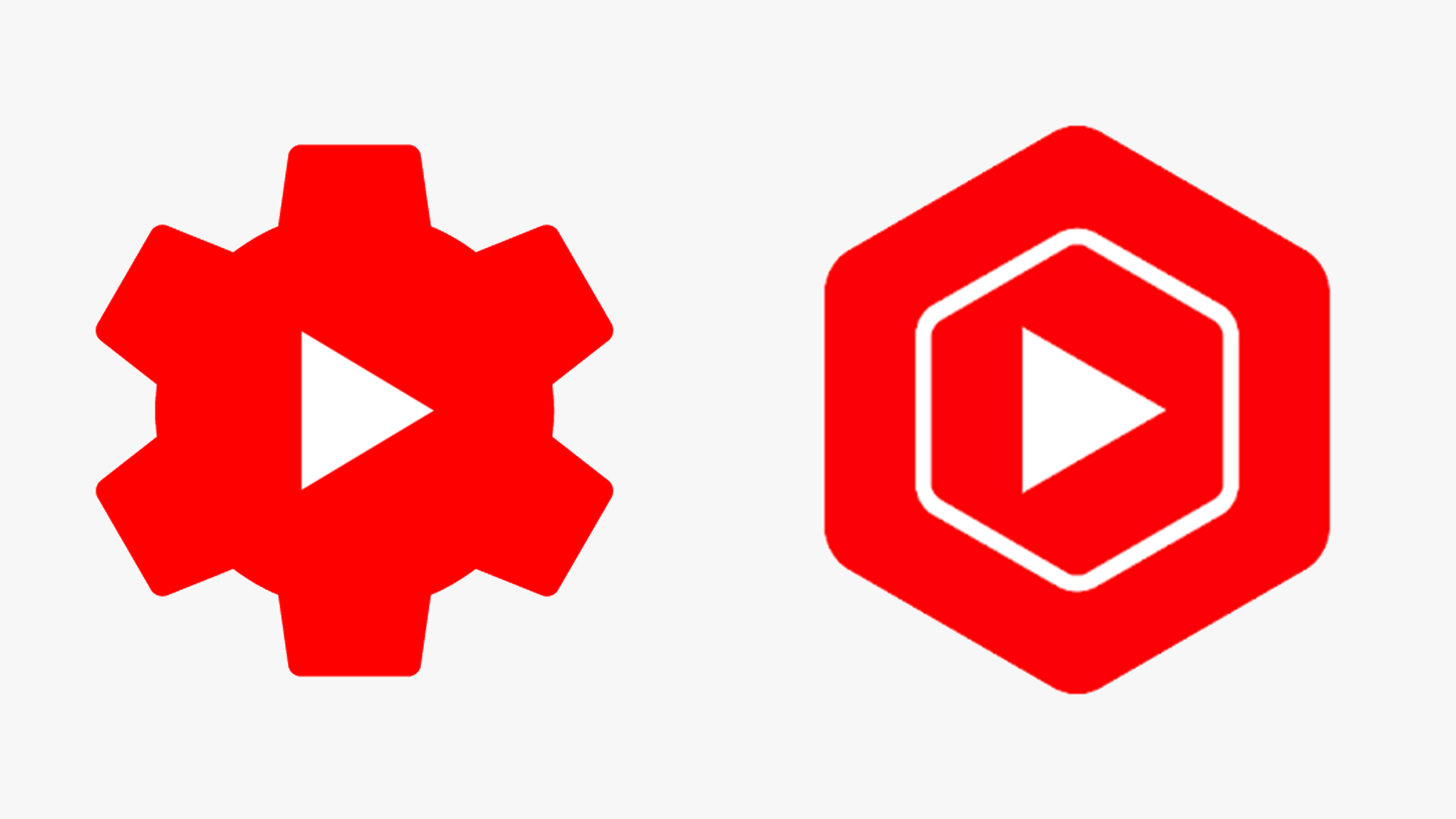
The new YouTube Studio logo is really grinding users' gears
New iOS icon isn't proving popular.
Sign up to Creative Bloq's daily newsletter, which brings you the latest news and inspiration from the worlds of art, design and technology.
You are now subscribed
Your newsletter sign-up was successful
Want to add more newsletters?
If there's one requirement for any great logo, it's that it must not be easily confused for another. It's surprising how many software companies forget this – your homescreen or dock is probably filled with bafflingly similar icons. And the latest offender is none other than YouTube.
The company has quietly rolled out a new app icon for YouTube Studio, which creators can use to gain insights about their content. Gone is the distinctive gear design, replaced with a smooth red hexagon with a play button in the middle. As many have pointed out, it looks just like the YouTube Music icon. It seems someone didn't consult our logo design guide.

The update began rolling out to iOS users last week, and is already grinding users' gears. Creators have taken to Twitter in their droves to lament the loss of the gear icon, with many arguing that the original logo evoked the sense of a 'studio' much more strongly.
Article continues belowThe new #YouTube Studio app Icon is horrendous. How is a hexagon more “studio” than a gear??? pic.twitter.com/y3jHj18KJCJune 28, 2021
wtf is this YouTube studio bring back the gear icon pic.twitter.com/FU61MrYfXdJuly 1, 2021
And then there's the similarity with YouTube Music. Last year, Google got its users riled up by rolling out a series of confusingly similar Workspace logos, and it seems the company hasn't learned its lesson (Google owns YouTube, remember).
New YouTube Studio icon is awfully similar to the YouTube Music logo. pic.twitter.com/9iFUpmW9xNJuly 1, 2021
Until now, YouTube's suite of apps have featured somewhat varied logos, each with their own unique take on the original YouTube logo (below). YouTube kids, for example, features a cartoon version of the play button, while the previous 'gear' icon for studio stood out thanks to its jagged edges.

But with this update, it seems YouTube's icons are starting to suffer a little from Google Workspace-syndrome. Still, while they might look alike, at least YouTube's designs are otherwise inoffensive – which is more than could be said for Amazon's disastrous attempt at a new app icon this year. If you fancy designing an icon of your own, check out today's best Adobe Creative Cloud deals below.
Read more:
Sign up to Creative Bloq's daily newsletter, which brings you the latest news and inspiration from the worlds of art, design and technology.

Daniel John is Design Editor at Creative Bloq. He reports on the worlds of design, branding and lifestyle tech, and has covered several industry events including Milan Design Week, OFFF Barcelona and Adobe Max in Los Angeles. He has interviewed leaders and designers at brands including Apple, Microsoft and Adobe. Daniel's debut book of short stories and poems was published in 2018, and his comedy newsletter is a Substack Bestseller.
