How to design a book in InDesign
Follow these top tips to create and lay out a book using InDesign.
Sign up to Creative Bloq's daily newsletter, which brings you the latest news and inspiration from the worlds of art, design and technology.
You are now subscribed
Your newsletter sign-up was successful
Want to add more newsletters?
06. Page numbers
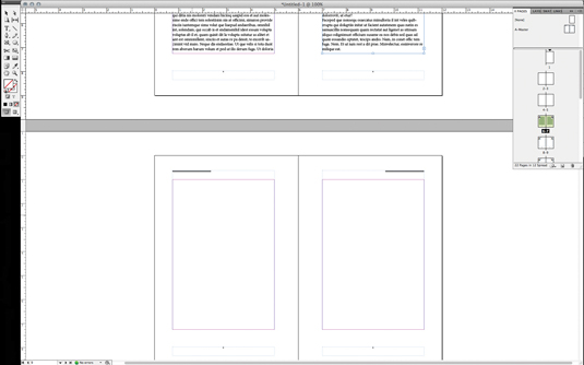
You can automate page numbering by making a text box and typing in a number wherever you want page numbers to appear in your layout. Select the number you typed, ctrl/right-click on it, and from the pop-up menu that appears select 'Insert special characters > Markers > Current page numbers'.
You will see the number change to the letter A. This signifies that your page numbers are now applied to all your pages.
07. Populate opening pages

Now, click on the first page of your document in the Pages panel and you'll see the items you created on your master pages have been applied. The first page is typically a 'half title' page, typically followed by a full title page with the subtitles, and name of the author and publishing house.
Article continues belowCreate these and a table of contents before flowing in the main body copy. To remove master items from a page, cmd/ctrl+shift+click on an item and it will be broken out of the master, then hit Delete.
08. Flow in text
Now flow in the text. cmd/ctrl+Shift+click on the first text box and then press cmd/ctrl+D and select the text file on your hard disk. Your text will flow into the first spread.
Select the second text box and click on the small box at the lower right corner. Hold Shift and it turns into an Auto-flow cursor icon. Click in the first text box on the next spread, and flow it in to the end of the document.
09. Adjust font

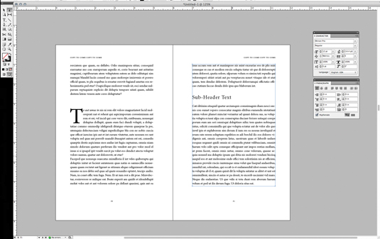
Using your Text Selection tool and Character and Paragraph panels, adjust the font, size, colour and other character attributes that may be needed. Justified text is common for book body text. Your font size should be 10-12pt, with leading 13-15pt.
Sign up to Creative Bloq's daily newsletter, which brings you the latest news and inspiration from the worlds of art, design and technology.
Your text should have few hyphens and have an over all 'greyness' to it when viewed with a squinted eye. Good fonts are designed to have ideal kerning pairs but make sure headers, sub-headers, section breaks and drop caps get extra attention for a breathable hierarchy. For kerning tips, check out this article.
10. Tidy up
You can apply any number of text treatments to your page, as well as import images to flow throughout your text. You can create any number of differently shaped boxes to import images into.
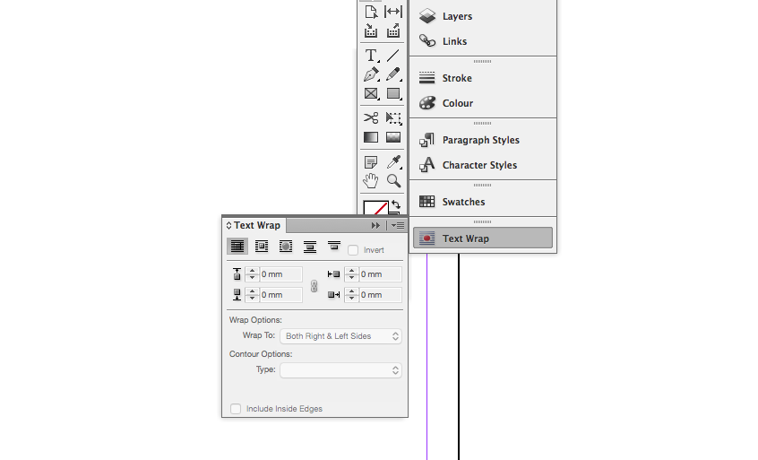
Using the Text Wrap panel, set a 'runaround' so that text can flow around the images. Once done, export your book for press by packaging your document, saving it as a PDF for print, or ebook or e-pub formats.
Liked this? Try these...
- 10 steps to freelance success
- The secrets to better client relationships
- The designer's guide to working from home

