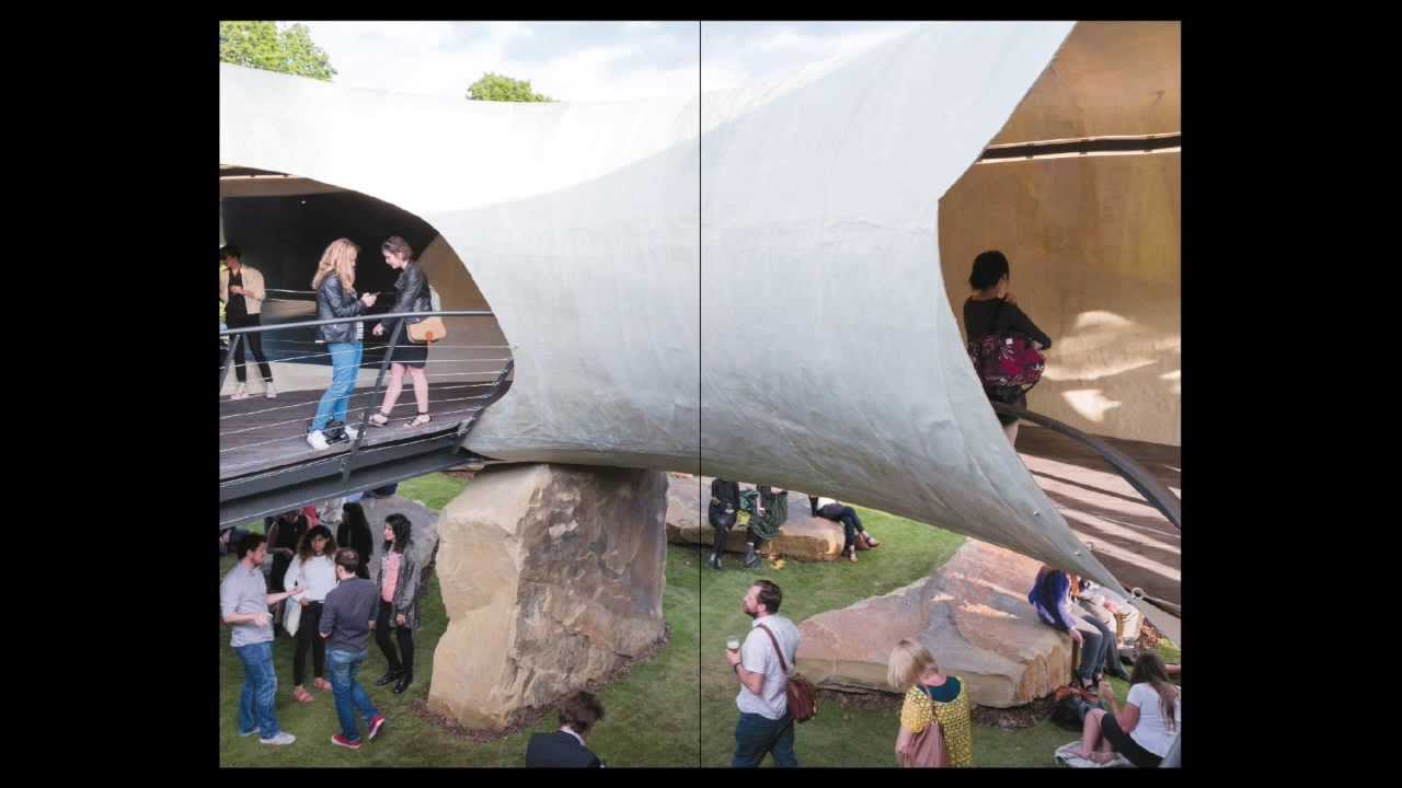
How to design and produce an art catalogue
Rose designer Harry Bingham walks through the creative process of making a catalogue for London's Serpentine Gallery.
Sign up to Creative Bloq's daily newsletter, which brings you the latest news and inspiration from the worlds of art, design and technology.
You are now subscribed
Your newsletter sign-up was successful
Want to add more newsletters?
British design agency Rose was commissioned to design a catalogue to commemorate Smiljan Radic's Pavilion structure at London's Serpentine Gallery. The idea was to pay homage to the architect's creative process by resembling one of his sketch-filled notebooks. Designer Harry Bingham explains…
The summer Pavilion at the Serpentine Gallery in London's Hyde Park is a highlight of the London art scene. The impressive and provocative 2014 commission by world-renowned Chilean architect Smiljan Radic, continues its tradition of cultural shock.
The Gallery invited Rose to collaborate with Radic on an accompanying catalogue to commemorate the Pavilion. He is a prolific sketcher and note-maker, and fills endless Moleskine notebooks with his thoughts and inspirations.
The resulting recommendations for the catalogue, its format and the most appropriate way to editorially convey the eclectic content and media within, felt like a fitting culmination of his vision for this ambitious project…
You can either follow this walkthrough using the short video, above, or via the written steps below...
01. Know your subject
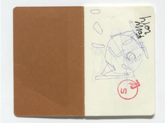
A pivotal part of the process in designing any art catalogue is becoming familiar with the subject matter. In this case, the architect's precious sketchbooks informed the design of the book; they became an important feature in the content and the final catalogue took on the same A6 format.
02. Flexible grid
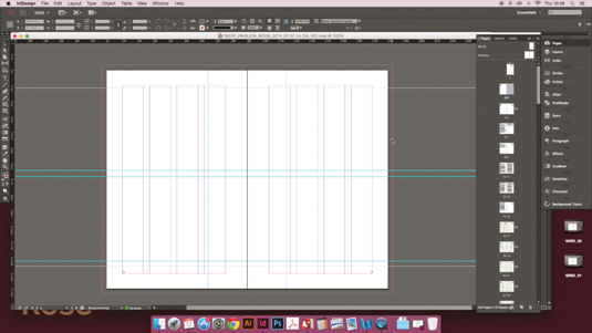
After defining the format, in this case A6, we created the most appropriate grid for the content. This content varied considerably from long essays, to imagery-driven sections.
Sign up to Creative Bloq's daily newsletter, which brings you the latest news and inspiration from the worlds of art, design and technology.
This variety led us to a flexible system that worked in both portrait and landscape, which is another key feature in Smiljan's process work.
03. Typeface selection
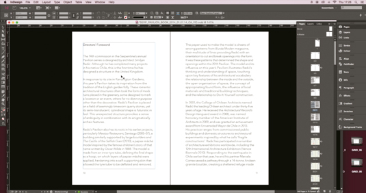
Further to defining the grid, our choice of typeface was key to creating a refined solution. We wanted a clean, contemporary face that would not conflict with the characterful imagery associated with the work. Avenir gave the refined subtlety we were aiming for, while retaining legibility at small sizes.
04. Defining sections
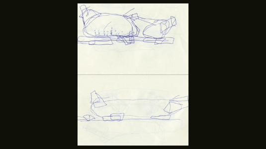
Having defined simple rules for the catalogue, we were then able to create defined sections within the book. On reading the book, the orientation changes several times, in particular when viewing images from Smiljan's design process, to further accentuate the association with his sketchbooks.
05. Using landscape
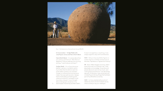
The interview with Smiljan was a particularly great opportunity to utilise the landscape orientation of the catalogue. The shorter bursts of text fall nicely in two narrow columns, and allow for full-bleed landscape imagery to occupy the opposing page.
06. Typographic details
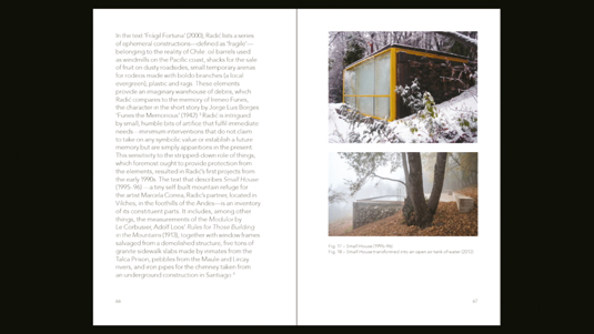
Typography is incredibly important when designing publications like this, and we spent considerable time working with the chosen typeface and the specified grid.
We wanted to find the best settings (such as hyphenation and justification) to achieve a pleasing rhythm for the book without any unsightly gaps or rivers.
07. Process of development
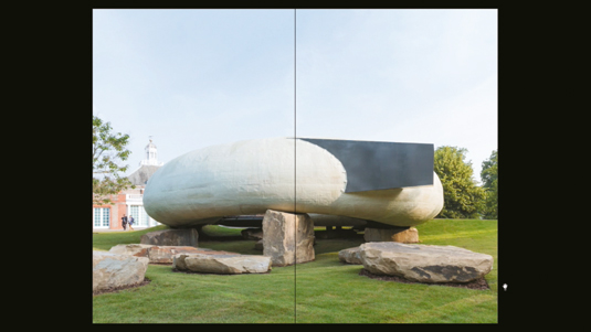
The whole book follows the chronology of Smiljan's process, from initial sketches, to maquettes and models, to images of the final pavilion itself.
This creates a very enjoyable process for the reader as they eventually discover the final form of the pavilion towards the latter pages of the catalogue.
08. Stock considerations
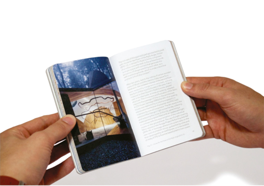
There were several important decisions to make when printing the book. The text stock needed to hold images well with minimal show-through, but also light in weight to keep a narrow profile in the final format. We selected end papers to emulate the limestone boulders supporting the pavilion.
09. Rounded corners
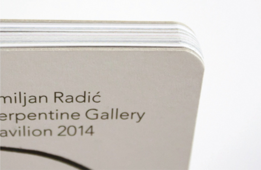
We chose to utilise rounded corners as another association with the architect's sketchbooks. We also decided to have exposed grey-board on show around the edge of the cover; this aligns with Smiljan's vision that the pavilion should feel unfinished and rustic in its appearance.
Since 1999, Rose's work has received more than 100 global creative accolades, including Best of Show at CA's inaugural Brand Impact Awards. Have you entered your best branding to 2015's scheme?
Half-price CA subscription offer!

To celebrate 2015 degree show season, you can get an incredible 50 per cent off an annual subscription to Computer Arts magazine. For £39 you'll receive 12 months of industry insight, opinion and inspiration, delivered to your door.
Plus: sign up by 7 July 2015 and you'll receive Computer Arts' New Talent issue, featuring an extensive guide to 2015's most outstanding design graduates.
Liked this? Try these…
- How create the perfect exhibition in a week
- 5 pro techniques for post production in Adobe Photoshop
- Free Photoshop brushes every creative must have

The Creative Bloq team is made up of a group of art and design enthusiasts, and has changed and evolved since Creative Bloq began back in 2012. The current website team consists of eight full-time members of staff: Editor Georgia Coggan, Deputy Editor Rosie Hilder, Ecommerce Editor Beren Neale, Senior News Editor Daniel Piper, Editor, Digital Art and 3D Ian Dean, Tech Reviews Editor Erlingur Einarsson, Ecommerce Writer Beth Nicholls and Staff Writer Natalie Fear, as well as a roster of freelancers from around the world. The ImagineFX magazine team also pitch in, ensuring that content from leading digital art publication ImagineFX is represented on Creative Bloq.
