University challenge: designing the Shanghai Ranking
Design duo Sawdust explain how they developed these cool bespoke numerals, based on folded ribbons, for a new university guide.
Sign up to Creative Bloq's daily newsletter, which brings you the latest news and inspiration from the worlds of art, design and technology.
You are now subscribed
Your newsletter sign-up was successful
Want to add more newsletters?
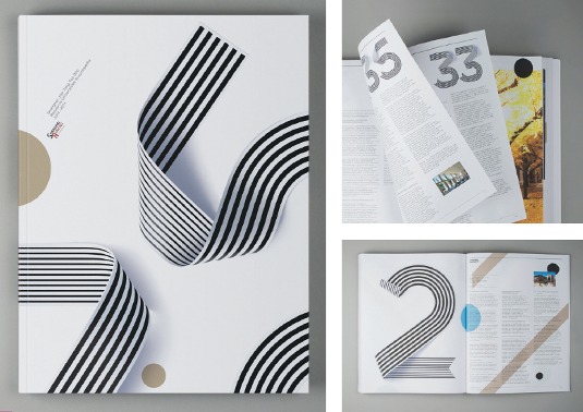
Sawdust was commissioned to design the first printed version of the Academic Ranking of World Universities (ARWU), known as the Shanghai Ranking, turning the content into a 350-page book. The design duo handled art direction and layout, and created a full set of custom numerals.
The design brief
This book is the first of its kind. The Academic Ranking of World Universities, known as the Shanghai Ranking, is a list of the world's top 200 universities. It was established 10 years ago, but this is the first time the information has been published in printed form.
Our client was the independent entrepreneur Alisdair Jones, who has been working closely with Shanghai Ranking. He wanted to create a printed book version and approached us to help realise this ambition. The project originally began with another designer, but wasn't progressing in the right way, so the client started looking around for someone else.
Article continues below 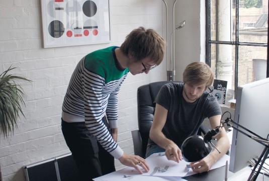
Having seen our portfolio of work online he emailed us to arrange a meeting, we had a good chat and the project went from there. When we first met with Alisdair to discuss the brief, we wanted to make him aware that if we did decide to take the project on we would want to do something quite radical and diff erent.
The initial brief was fairly simple, as the client really just wanted someone to put the content together in the form of a book. From our perspective, this simply wasn't enough – we explained that we would want to bring something more to the table rather than just laying all the information out in an ordered fashion.
Luckily, the client bought into our ideas. We knew the content would make for fairly heavy reading, so our goal was to lighten that by creating something visually rich and developing a graphic language for the book. We wanted it to have a lot of impact, and not feel too conventional. University guides often look like telephone directories - we wanted to give it a bit of art. Alisdair handled the relationship with the printers, so our focus was on creating the look and feel of the book.
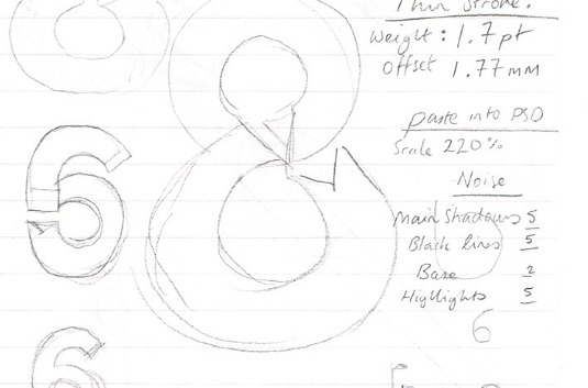
Work in progress
You almost have to feel your way forward at the beginning of a project like this. With so much content, you need to work out an initial structure for how the text will flow and get the logistics - such as the grid and typeface – in place.
Sign up to Creative Bloq's daily newsletter, which brings you the latest news and inspiration from the worlds of art, design and technology.
The concept of the Top 200 countdown was something we felt people would really identify with, so we focused on the numbers and created custom ribbon typography. We added around 30 per cent of cyan, magenta and yellow to create a richer black, while referencing the white directly from the photography. We also used a muted gold stripe throughout the book, which subliminally suggests the idea of gold medals.
It was important to maintain consistency throughout the book, so we decided on one typeface, Hermes Light, adding an underline for emphasis where needed. That said, we also wanted to respect the pages as individual pieces, so we swatched colours from the photography to harmonise the copy and images on each spread.
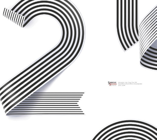
We designed the cover towards the end of the process, so we could see how the inside of the book developed. Our first cover design showed the number 200, but we felt this was too direct. We went on to create an abstract cover using elements of the numerals to create something that looked more like a piece of art.
Conclusion
We're very pleased with the finished book. Speaking from a personal point of view, I really like the fact that it surpasses the expectations of what you might do with this kind of material - you wouldn't necessarily expect a university guide to look like this. It's always a good feeling if you manage to shake something up a bit. We were able to open our client's eyes to the potential for what could be done with this content, and as a result we've produced something that readers will hopefully find visually engaging.
Alisdair was really helpful to us throughout the project. He was editing all the copy while we were in the process of working on the design, so it was a very collaborative process - he was really helpful with issues such as pruning back the text where needed to create sufficient space.
We also appreciated Alisdair's willingness to change the cover design, given he had already signed off on the original idea before we had a wobble and wanted to change it. He listened to our case and the reasoning behind it, which is a great credit to him.
The feedback he's given us has been absolutely fantastic and it seems that we've pretty much blown his mind. It's really nice to hear such positive feedback from a client, and the universities featured in the book have also had really good things to say about it.
There was a bit of pressure on us because we knew all those universities were going to see the finished book, and quite a few of those institutions had bought advertising space and had profile features inside. So it was great to hear that the book was well received by them as well. They put their trust in Alisdair and he put his trust in us, and I think we've created something really fantastic as a result.
Words: Rob Gonzalez and Jonathan Quainton
Liked this? Read these!
- Create a perfect mood board with these pro tips
- The ultimate guide to logo design
- Great examples of doodle art
What do you think of Sawdust's work? Tell us in the comments!

The Creative Bloq team is made up of a group of art and design enthusiasts, and has changed and evolved since Creative Bloq began back in 2012. The current website team consists of eight full-time members of staff: Editor Georgia Coggan, Deputy Editor Rosie Hilder, Ecommerce Editor Beren Neale, Senior News Editor Daniel Piper, Editor, Digital Art and 3D Ian Dean, Tech Reviews Editor Erlingur Einarsson, Ecommerce Writer Beth Nicholls and Staff Writer Natalie Fear, as well as a roster of freelancers from around the world. The ImagineFX magazine team also pitch in, ensuring that content from leading digital art publication ImagineFX is represented on Creative Bloq.
