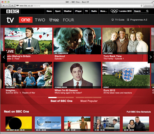
Making BBC One's website responsive
The BBC is slowly but surely making all of its websites responsive. Paul Lloyd speaks to Ste Everington about the redesign of its flagship TV channel.
Sign up to Creative Bloq's daily newsletter, which brings you the latest news and inspiration from the worlds of art, design and technology.
You are now subscribed
Your newsletter sign-up was successful
Want to add more newsletters?
Words: Paul Lloyd
Following the launch of its responsive news site earlier this year, the BBC continues to send more of its sites the same way. This includes the most recent update to its main TV channel sites, including the website for BBC One.
Ste Everington is a designer on the project. “We wanted an experience consistent across the devices available, so you can begin to ignore the device and focus on the content,” he explains.
Article continues below 
While each channel retains its individual branding, all use a common design framework that adapts itself around video content. This uses breakpoints based on common screen sizes.
“We knew that our framework would have to work across any screen size. But these six breakpoints provided us with a great starting point and gave us something substantial to design and test against.”

The site does provides a number of different layouts though. Indeed, it’s one of the few we’ve seen that makes use of height-based media queries.
Homepage requests/size: 76/516kB mobile, 94/1.13Mb desktop
Sign up to Creative Bloq's daily newsletter, which brings you the latest news and inspiration from the worlds of art, design and technology.
This showcase was originally published in .net magazine issue 232.
Now read these!
- 40 amazing examples of HTML5
- 30 web design secrets to boost your skills!
- 101 CSS and JavaScript tutorials to power up your skills

The Creative Bloq team is made up of a group of art and design enthusiasts, and has changed and evolved since Creative Bloq began back in 2012. The current website team consists of eight full-time members of staff: Editor Georgia Coggan, Deputy Editor Rosie Hilder, Ecommerce Editor Beren Neale, Senior News Editor Daniel Piper, Editor, Digital Art and 3D Ian Dean, Tech Reviews Editor Erlingur Einarsson, Ecommerce Writer Beth Nicholls and Staff Writer Natalie Fear, as well as a roster of freelancers from around the world. The ImagineFX magazine team also pitch in, ensuring that content from leading digital art publication ImagineFX is represented on Creative Bloq.
